Mini-apartment in NYC
-
Hello everyone,
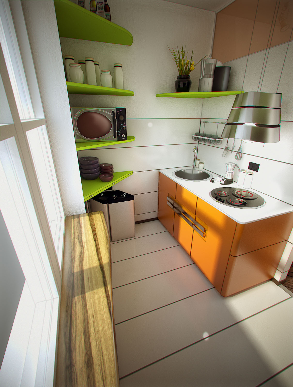
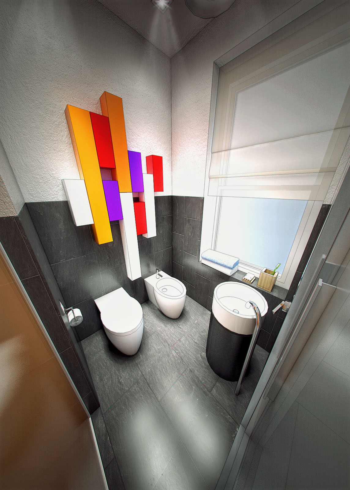
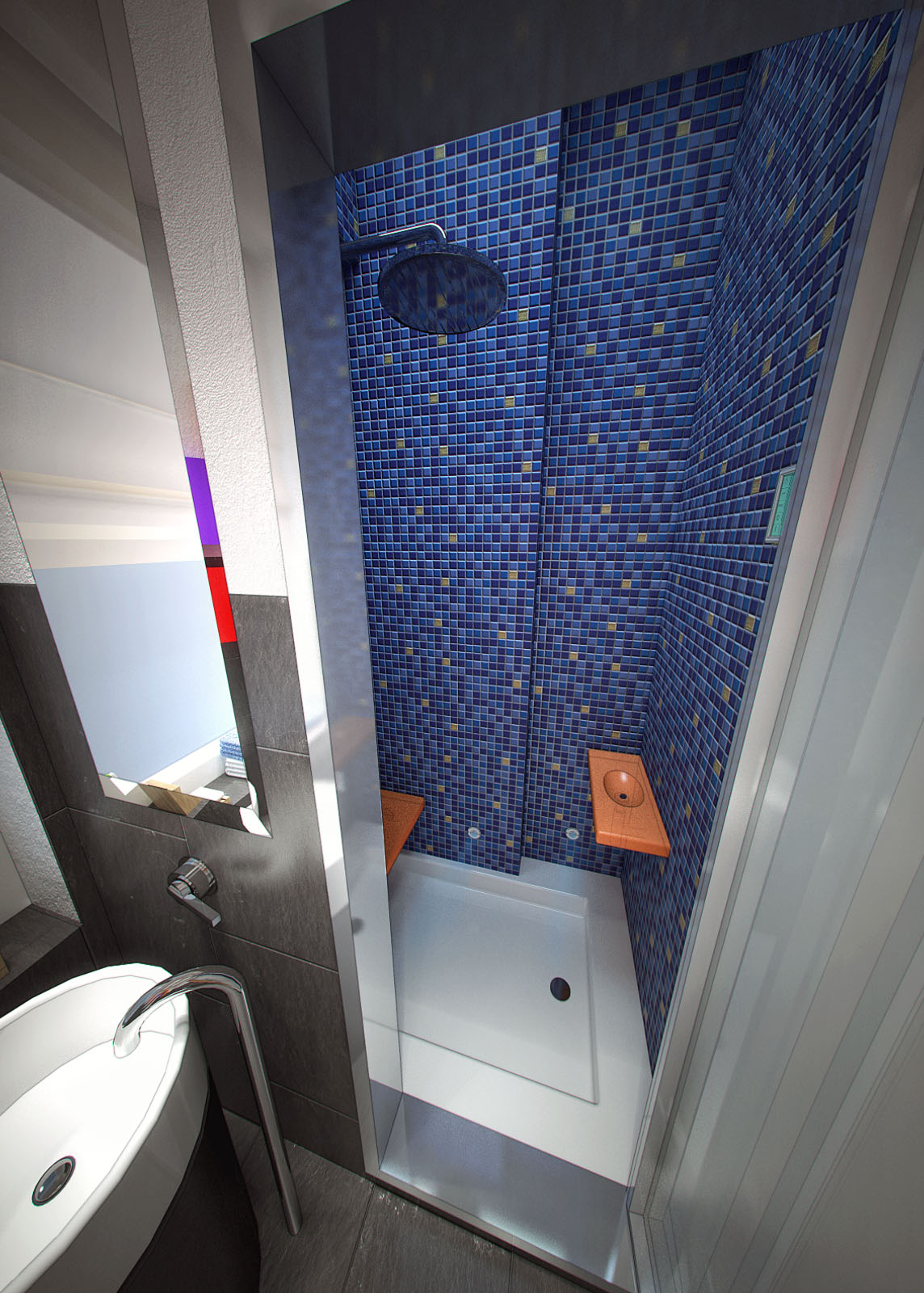
I wish to share with you the images that I made for the following contest:
http://www.jovoto.com/contests/life-edited
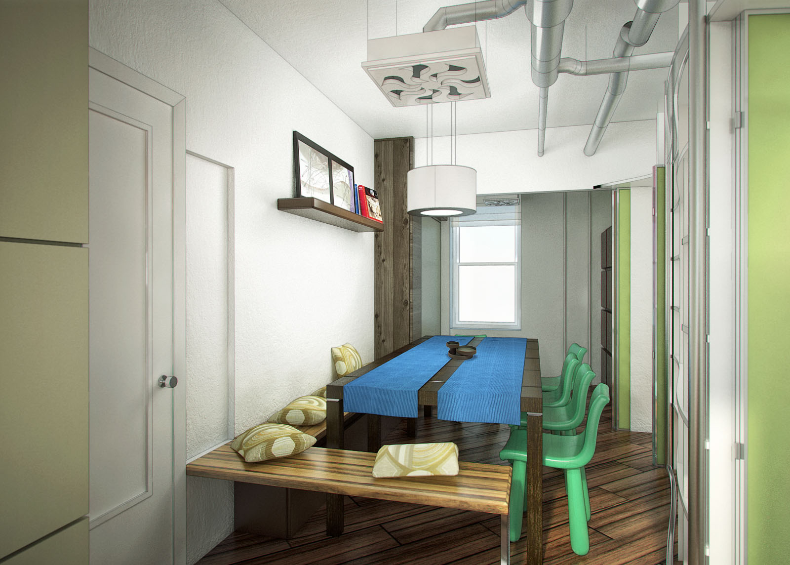
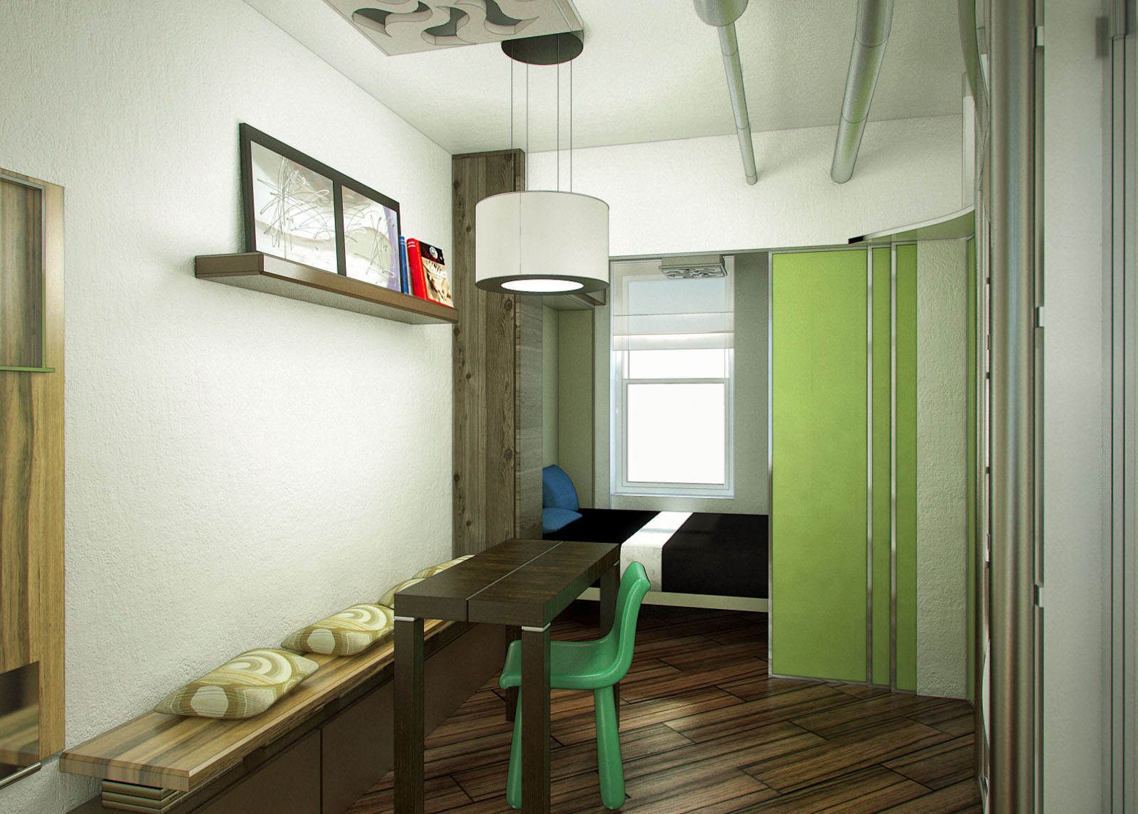
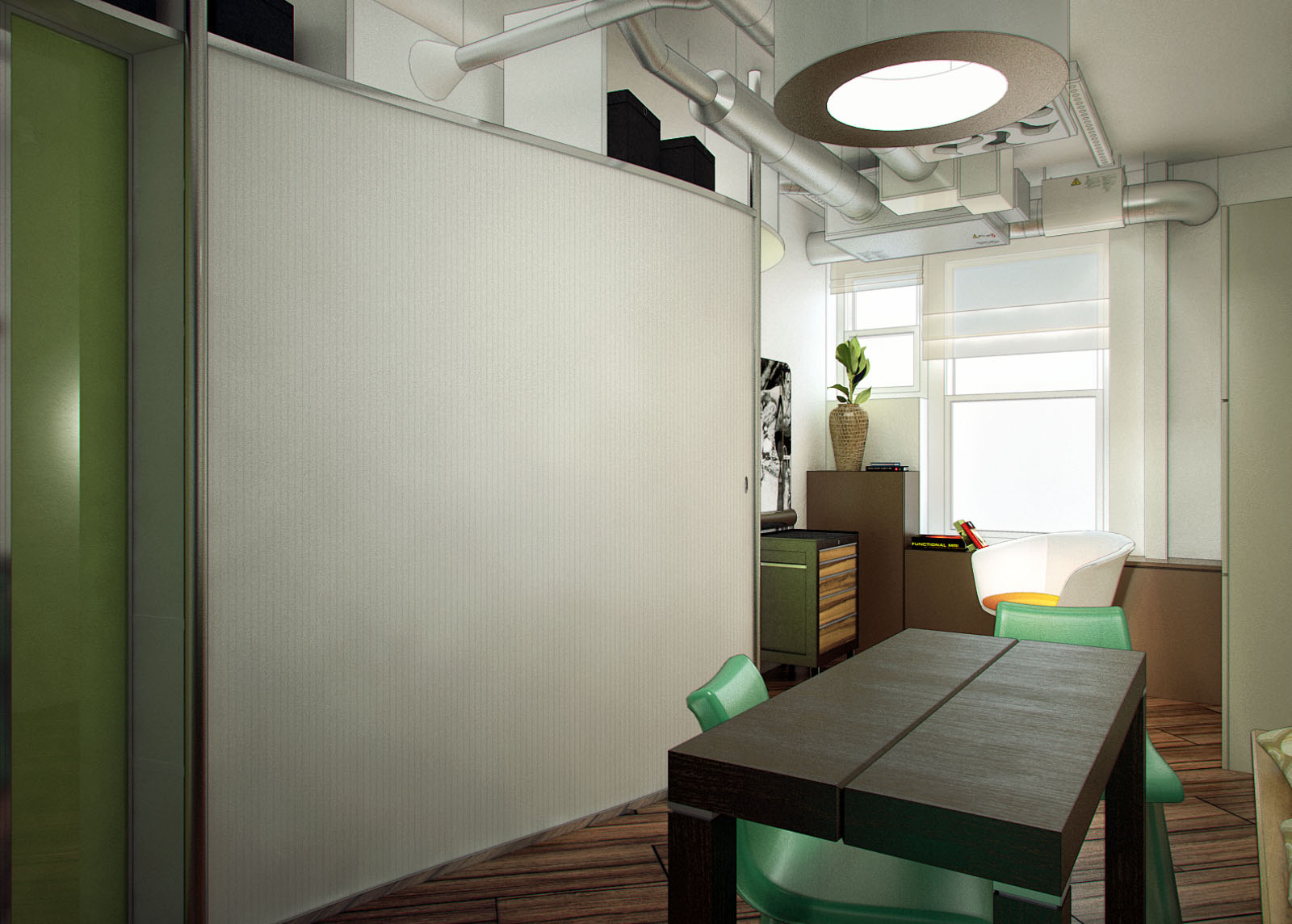
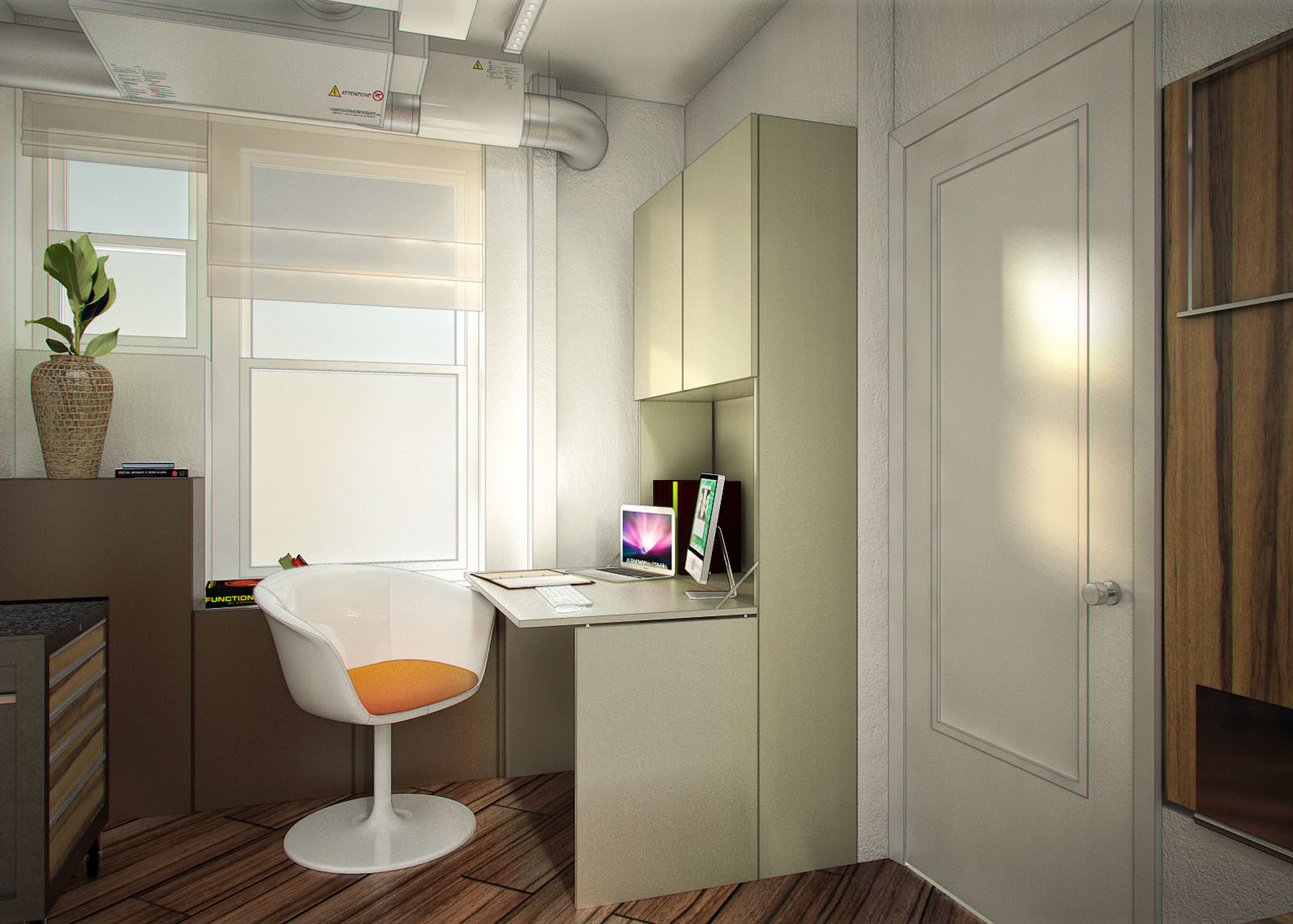
Which requires the following design requirements by the CUSTOMER in only 39 sqm:
"We’re looking for
apartment designs that allow for:
■ a sit-down dinner for 12
■ a comfortable lounging option for 8 people
■ space for 2 guests with some visual and ideally auditory privacy
■ a home office
■ a work area with space for a rolling tool chest
■ a hideable kitchen
As the room function is changed, it should not feel like you are sleeping in your office or eating in
your bedroom. At the same time, it should be easy and quick enough to change the room function
that one would actually do it."The images were created with SketchUp 7, for modelling, Vray4SU for rendering.
Finally Photoshop for post-production.I hope that you like, of course, c&c are really appreciated.
I would also like to invite everyone to see the ideas posted on Jovoto site, many are very beautiful and brilliant.
Also if someone would like to take a look to my entire post, you can go here:
http://www.jovoto.com/contests/life-edited/ideas/10547
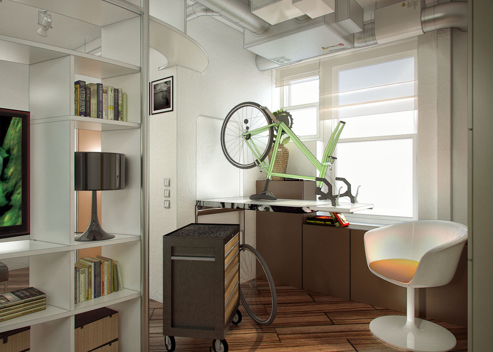
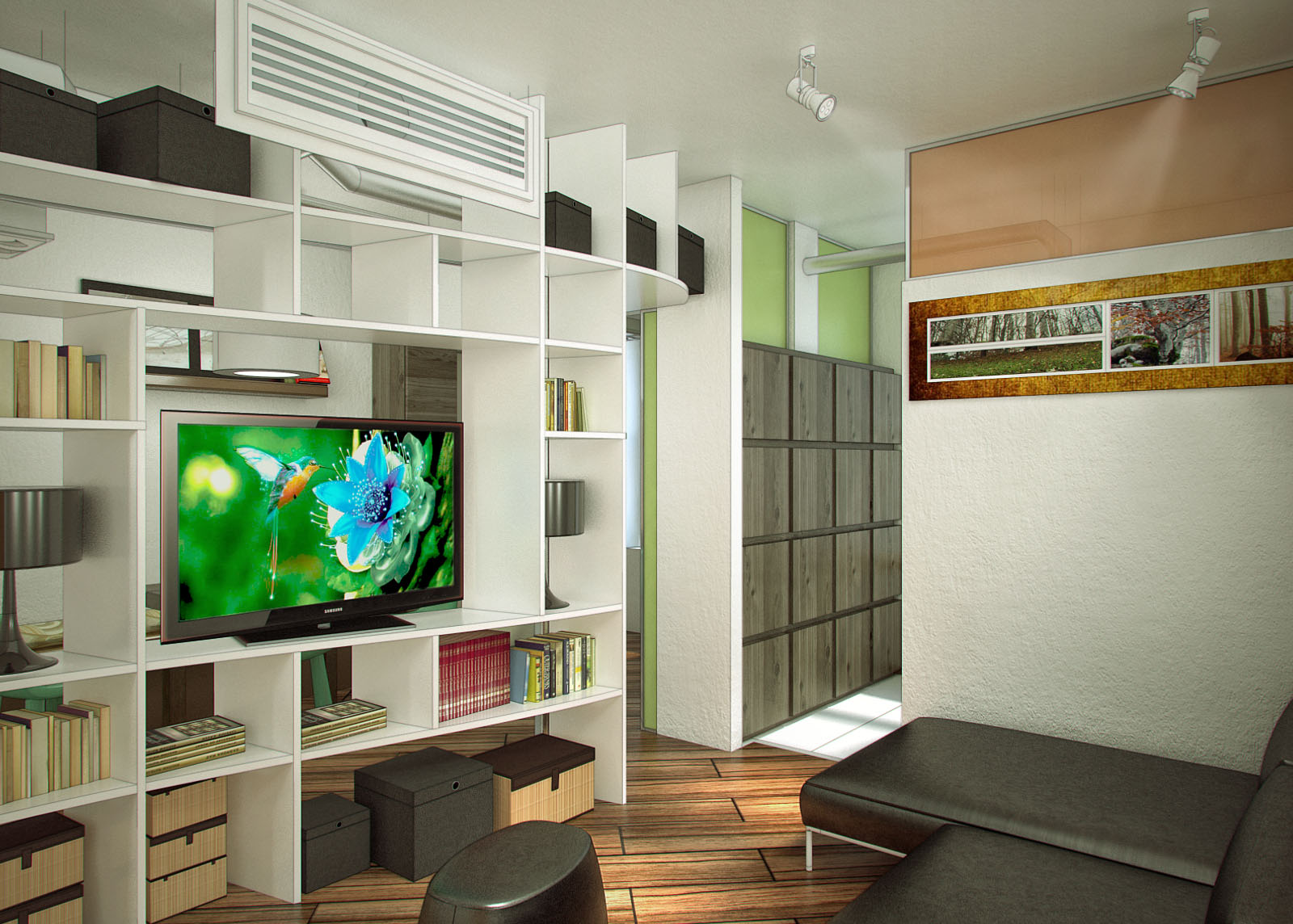
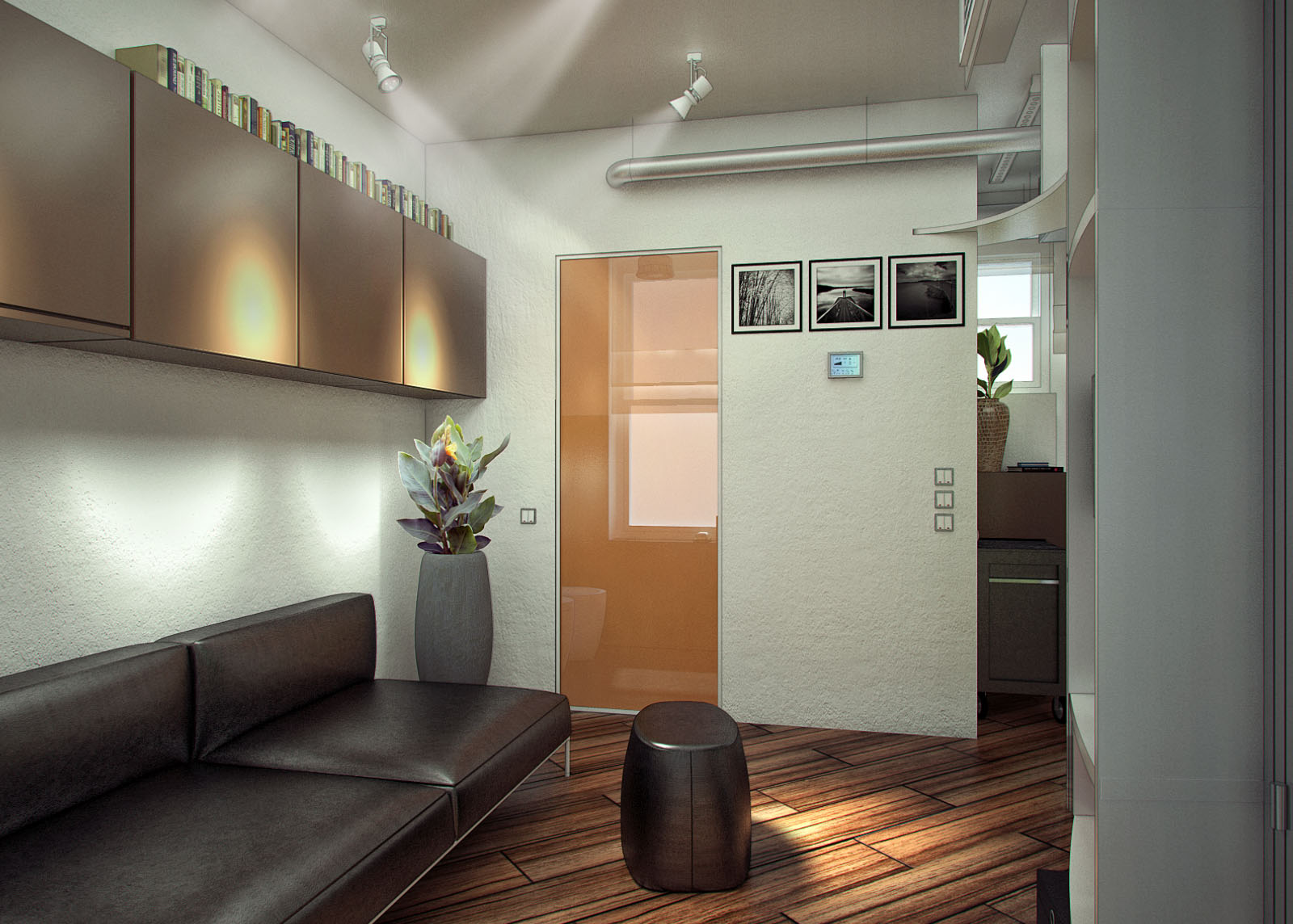
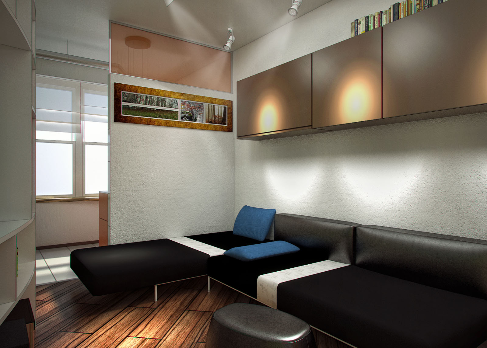
-
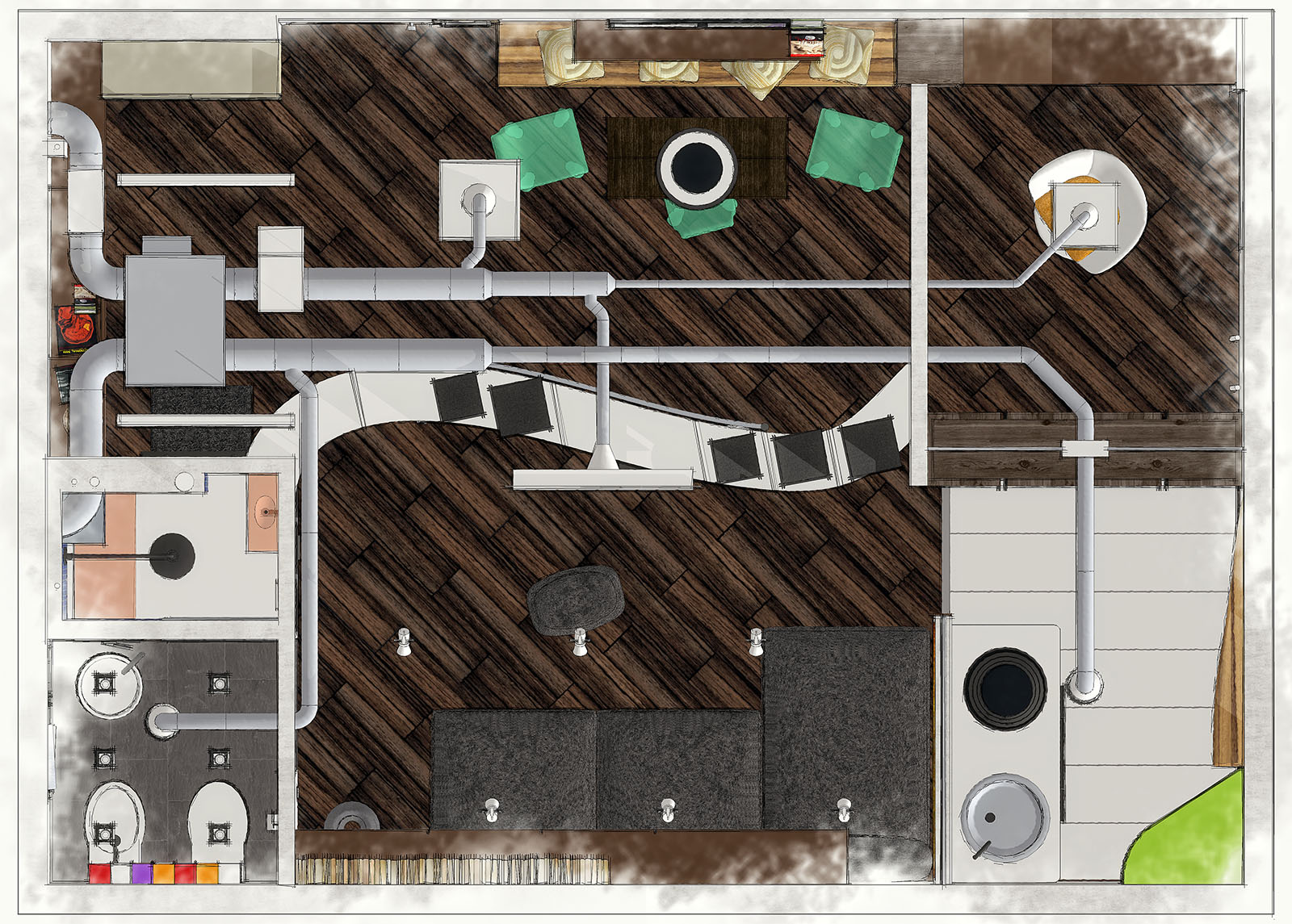
very nice. do you have an axo or something showing the whole unit?
-
Of course, I'll show you some designerstuart
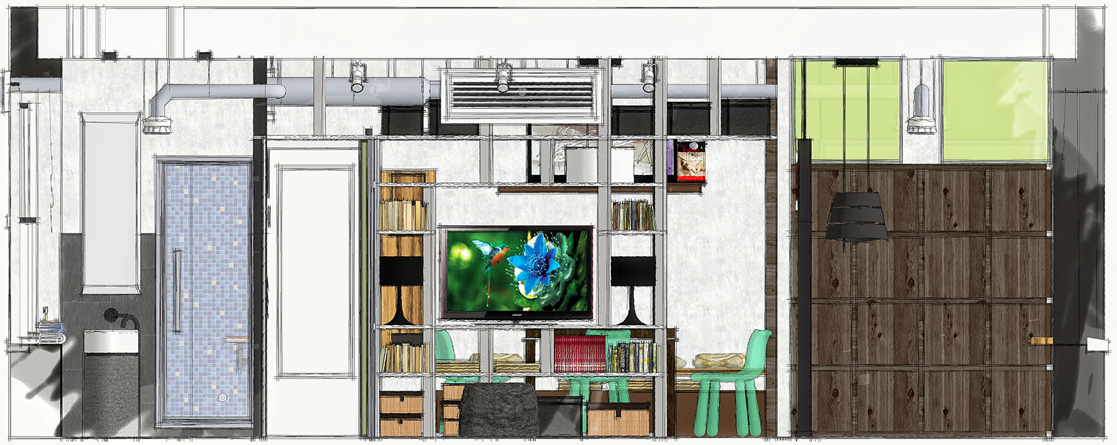
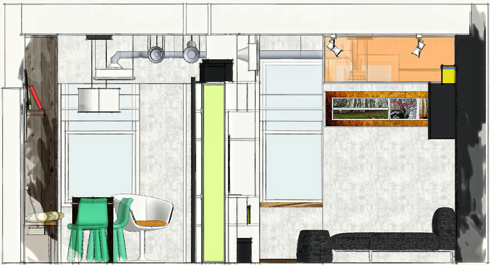
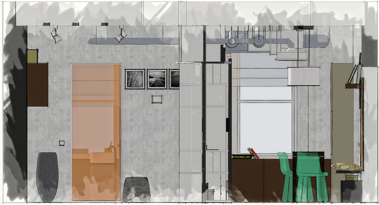
-
Very nice!
I was going to give that contest a go, but the configuration was too small and irregular and some of the requirements were crazy. 400sqft for 2 is doable. For more than 4, nothing I would want to live with.
Your design is very good (damn good actually) and there were also many other good designs in that contest.
Good job large_black!
-
Nice Presentation
I'm curious about lights did you give light volume effect in PS or in Vray? -
Thanks a lot guys,
actually in that competition were presented really brilliant ideas.@_mimarhamza_
The volume effect of the lights is made with PS, I used some brushes that create this kind of special effect, then play a bit with the layer opacity -
Very nice, Large. 2 design comments: 1)Unless required by the program, for such a small space, in the U.S., I wouldn't include a bidet - they aren't that big here, and most people aren't even sure what they are. 2) I'd cover up the ducts and mechanical units - it would lower the ceiling, but the spaces would look less cluttered. Plus, I've noticed in buildings where they are exposed, they become dust collectors.
-
Are u using OVERLAY Style?
Really nice presentation!
-
awesome dude!!
great renders and post production
can u post tips as to how u did the post production in PS?
pleeeeeeaaaase
-
Very well presented and modelled.
I can see you have put a lot of time and hard work into them.
Nice work
-
Thanks guys for your compliments and comments, now I'll try to answer.
First of all sorry for the delayed response, here in Italy we celebrate 150 years of unity and many people (like me) have the opportunity to take a trip.
@ Daniel
I had read something about the lack of bidets in the U.S. bathrooms, but I couldn't keep from putting it. With regard to the ventilation system I can tell you that your point is completely right, but this particular system renews and purifies the air and through an electronic filter minimizes the presence of fine particles and bacteria. Theoretically you should never open the window using this particular type of equipment.@ nickenzyme
Thanks man, if you intend the use of a lines layer overlapped, the answer is yes.@ hassanykb
Thank you very much my friend, I'll try to post something on my way to PP soon.Ciao

-
you coped with apartment's space very well. design so small interior, it's really not easy. furnished - modern and comfortable. nice outputs.
 you deserve to get some price
  .
. -
Thank you very much Dylan and Jarynzlesa for your beautiful words, I also would have hoped to get much higher in the rankings, but then we must also accept the result, even if in the voting phase there were questionable behavior.
Hello! It looks like you're interested in this conversation, but you don't have an account yet.
Getting fed up of having to scroll through the same posts each visit? When you register for an account, you'll always come back to exactly where you were before, and choose to be notified of new replies (either via email, or push notification). You'll also be able to save bookmarks and upvote posts to show your appreciation to other community members.
With your input, this post could be even better 💗
Register LoginAdvertisement


