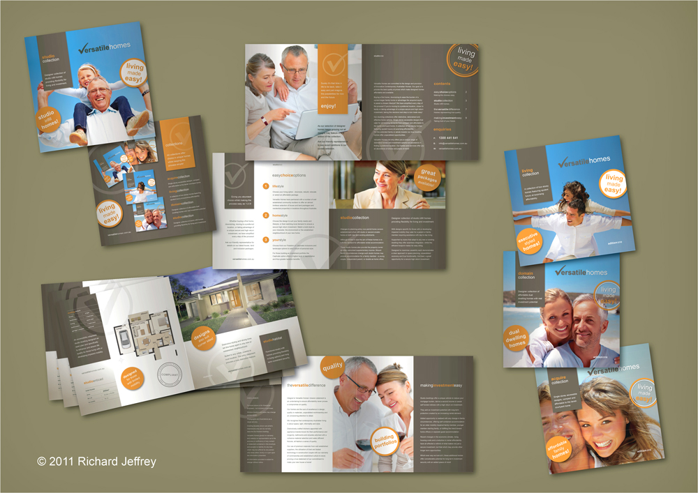
New Home Collection Catalogue Range
-
I've just started a new home catalogue range for a project home builder.
Here is the first completed, the renders are all SU > Maxwell > PS > Indesign. The floor plans LO > PDF > Indesign.
This first for One and two bedroom studio infill homes including designs for people living with or developing impaired mobility is a 16 page cattledog and the others will range from 16 pages to around 44 pages.
Project includes: Brand development, design and style branding, story development, copywriting, some plan design for new designs, external material selection and testing, documentation development, print management.

-
thanks for making me feel wildly inferior today...

-
I like the neat design of the catalogue and the combination of colors.
Everything gray and orange with those bright blue skies

-
Kristoff
Mate you're not alone! Every day I click through the gallery on the SCF I feel the same!
Karina
Thanks for noting the layout and simple colour story, I can tell you I laboured to get it simple and clean! Much of which was text edits and edits and edits to condense all the content the client wanted covered! It does always amaze me though, we (well I) can put so much superflous words to paper when so much more can often be said in so much less!
Yep again "Less is More"!
-
Yeap... sometimes a client wants so many words in a flyer or a triptic that I think "what you actually will need is a book"

-
Excellent work, Richard!
-
Nice work Richard!!
-
As usual Richard very well done. The subtle re-use of the checkmark that forms the "V" in versatile, is almost subliminal, and the clean clean font are two things of many that catch my eye. Excellent taste.
-
Thanks Dale!
The tick in the circle has now become their registered trademark, they liked the tick idea so much they wanted it to the name as well, which I wasn't happy with but agreed as long as they agreed that they are NEVER used on a page together as they clash badly!
Hello! It looks like you're interested in this conversation, but you don't have an account yet.
Getting fed up of having to scroll through the same posts each visit? When you register for an account, you'll always come back to exactly where you were before, and choose to be notified of new replies (either via email, or push notification). You'll also be able to save bookmarks and upvote posts to show your appreciation to other community members.
With your input, this post could be even better 💗
Register LoginAdvertisement


