Film Institute - Uni Project
-
Hey guys.
This is a group project that I just finished working on, in my final year of my BSc of Architecture. We were to design a film institute in the city of Bristol, with the title "Film, Ontology and Architecture".
Not to bog you down with too much conceptual stuff so here's a quick summary so you understand what the building is about. We took the title and broke it down into three bodies: film; human; and architecture. Each body is composed of three entities: the outer layer; the structural layer; the inner layer.
Human: Skin - Musculature - Viscera
Architecture: Facade - Structure - Spaces formed.For film, the cinema and screen formed the outer tangible layer. The structure of the film, we treated as the audience, where without the audience, the film would not stand/exist. The inner layer is the emotions provoked by the film onto the audience.
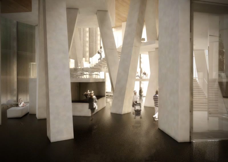
So what we wanted to do is to create a series of transitional spaces that progressively take people out of the world of the reality and into the cinematic world. The form of the building also takes nature of a body with skin and its "organs" floating within the body.
A bit long winded but otherwise I don't think the building would make much sense without it. So... here we go


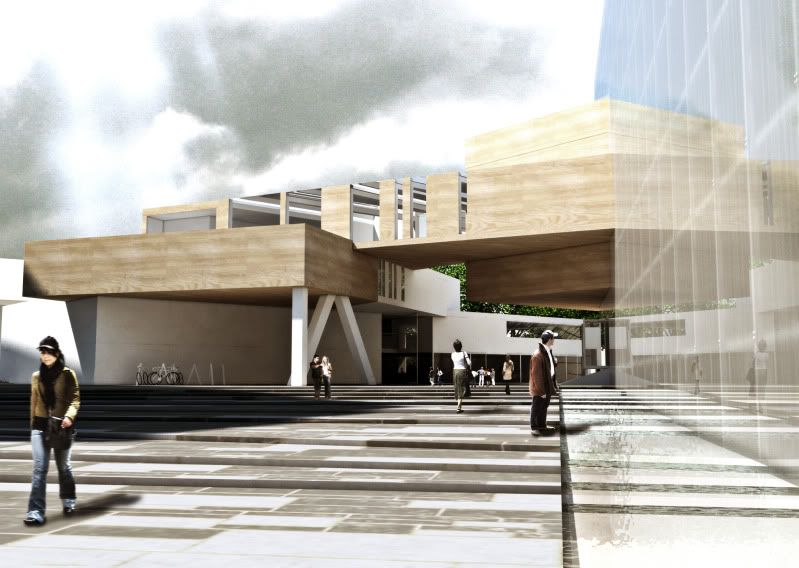
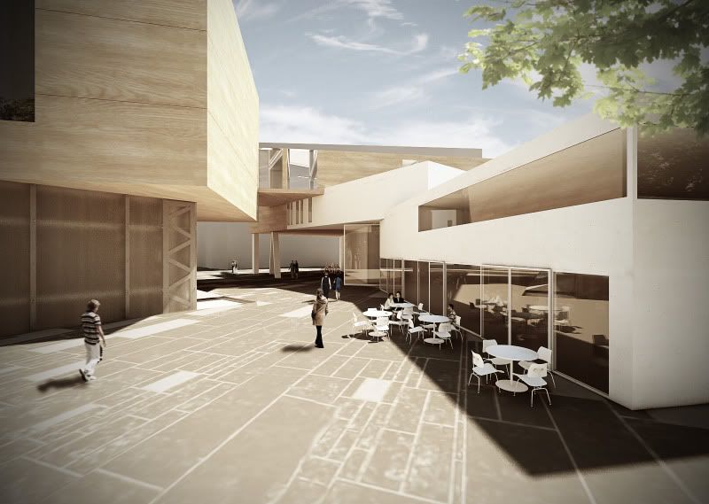
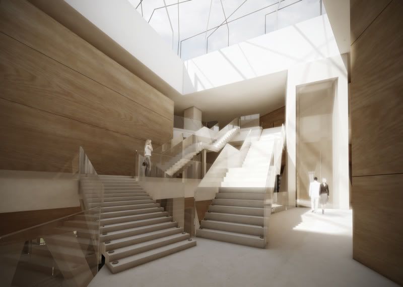
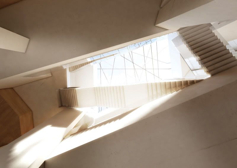
Sketchup, Vray and Photoshop used.
Hope you like it! C&C welcome!
Thanks
-
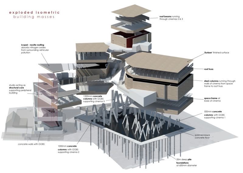
I really like the last exploded view well done!
-
Impressive. Most impressive. Obi-Wan has taught you well....but I think the scale of the wood grain is too large.
-
Thank you!
I couldn't find a high resolution wood texture that sufficed my needs. The texture is supposed to be that of Eurban. It's a composite wood panel that can stretch to 13m long.
-
Very impressive. The lobby makes me kind of dizzy, but the overall design is very cool.
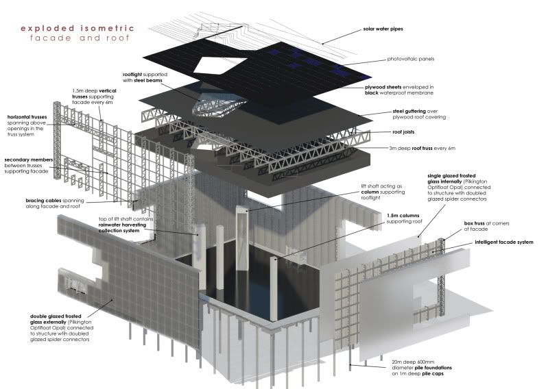
And yes, your exploded drawings alone should get extra credit.
-
nice work
-
Very cool renders. The presentation is really nice. You could sell me on that.

-
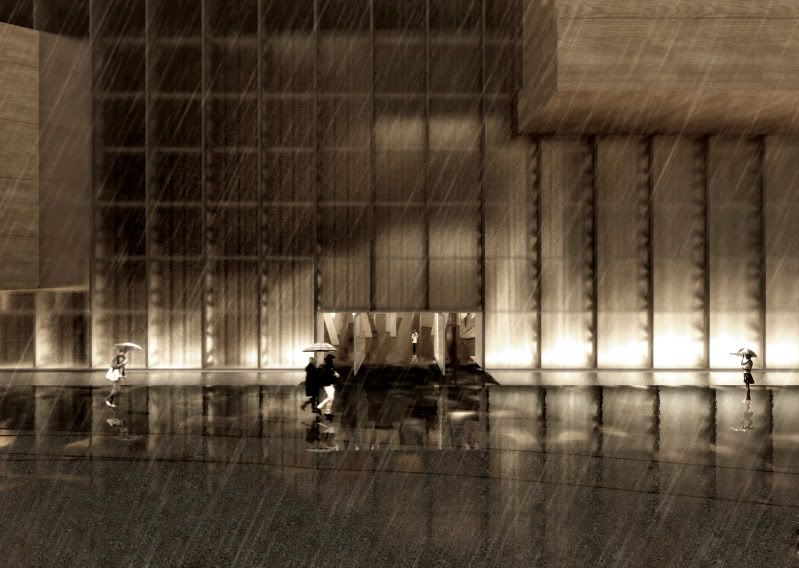
Mate the third image down - looking into the forecourt, grabs me by the balls! I love it!!!!
-
wow these are great renders! +1 on loving the exploded isometric. The only odd thing I can point out is the rain render doesn't really fit with the rest, still a great image though. Good job!
-
Looking good so far Steve,
I'd like to experience the concept as a movie / animation. Would such a presentation process give you an edge in getting your overall idea across. Sound is also a very important element in the cinema experience! Making a movie would allow you to bring this 'mood' in. Maybe have ave a look at Lumion? Or make a slide show with one of those apps that allow for moving around the various images again with sound. Just a thought!
Mike
-
Thank you guys! Means a lot!
Richard - although it's not my intention to grab anyone by the balls, I am glad that my render did!

JSteacy - Thanks. The rain image was actually one of the better received renders!
Mike - The project is actually over, but I am willing to do extra stuff. But, the model is a HUGE file! Over 4 million edges and over 1.6 million faces. Sketchup is really laggy even on my i7 and Quadro FX1700 with this file. I might have to give Lumion a try though when I get the time! Hopefully it'll be able to handle the file a bit better
 . I've actually never really worked with animation before though. Should be fun!
Hello! It looks like you're interested in this conversation, but you don't have an account yet.
Getting fed up of having to scroll through the same posts each visit? When you register for an account, you'll always come back to exactly where you were before, and choose to be notified of new replies (either via email, or push notification). You'll also be able to save bookmarks and upvote posts to show your appreciation to other community members.
With your input, this post could be even better 💗
Register LoginAdvertisement


