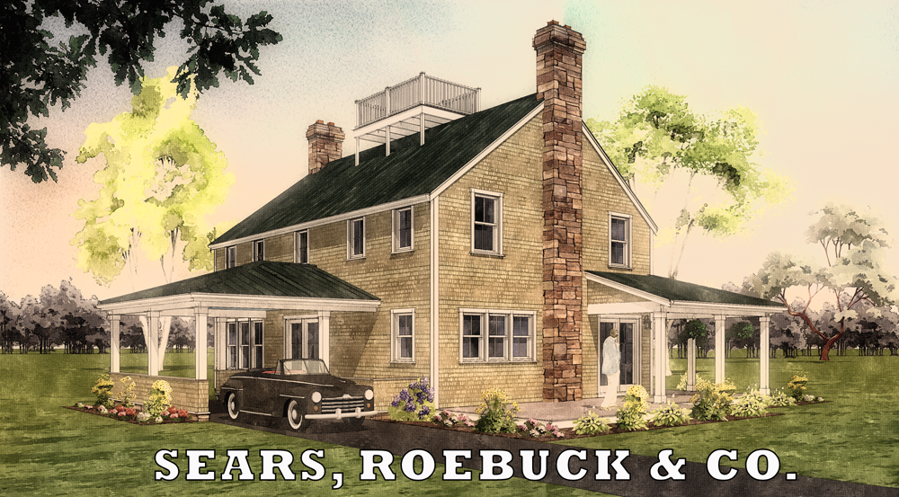
NPR Retro Style
-
This was a for fun project that I've been using to work on my modeling skills. In addition this has been a great exercise in collaboration with another designer.
Modeled in DataCAD/Sketchup with PP in Fotosketcher/Photoshop. Plants/entourage from Entourage Arts.
This was a collaboration with another member of this forum Troy H. who provided suggestions and feedback during the modeling phase. Troy then took the post Fotosketcher image and ran with a retro/sears catalog theme in Photoshop.
I'm thinking about a version with a 2 track or gravel drive, brick chimney rather than stone and some other changes and possibly a fall foliage theme using some of those nice looking trees from Toms Desk.
C/C welcome!
Robert
-
I like it, and it would certainly fit into one of sears home catalogs from way back then. I might suggest moving the treeline closer, makes the yard look huge and unrealistically flat. Other than that I think its great. On a side note, I wish the production home builders of today would pick up some of the home catalogs of the past to learn how to design a home.
-
Looks great, Robert. The only thing that bothers me is the very pale green tree on the left - the color doesn't look natural. You might also want to increase the foreground so the title isn't so close to the building.
-
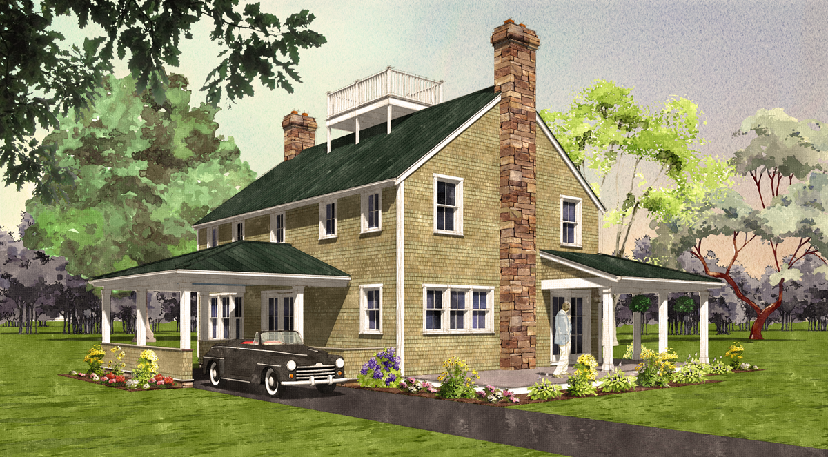
That second watercolour looks great. Inspiring! I particularly like the splatter sky. Moving the background forward was very effective.
If you are considering further changes then the idea of using brick in lieu of the stone should definitely be tried. I'd also suggest modifying the tree that has the red trunk as the red is competing for focus and looks a little odd. I'd also eliminate the transparency aspect of the person - seeing through the person in this instance isn't working for me.
With regards to the model itself, I'm guessing from the form that the door under the porte-cochere is the formal front door and that side of the house is its 'front'. That suggests it should be more of a circular or ached driveway you can drive up to and drop someone off. Backing in the Oldsmobile would be a real drag. If the house was in a town there would likely be a sidewalk running out to the street too. I also notice there doesn't seem to be any connection between the driveway and the porch where the man is. If that is intended to be a more private space it would suggest some form of screening trellis (perhaps with a gate)at the end closest to the driveway.
Regards, Ross
-
Ross,
Thanks so much for the comment and suggestions. I think you're right on in every one of your critique points! The car and drive in particular was discussed in by our collaboration team and I made the decision to "let it go" and see who noticed
 Since this was a "exercise" I had pretty much decided this would be my last change. That being said, there is real value for me in learning how to efficiently make changes so I may update the image later today as time allows.
Thanks again for your time,
Robert
-
Thanks for the excellent feedback....here's a revised version.
Robert

-
Ross your comments are "spot on" you have a great eye and design sensibility. Glad to see that you are graciously sharing your experience and expertise with all of us.
Robert this looks like a fun venture. I have a few "original" S&R catalogs from I have always loved the simple but welcoming renderings of their home kits.
Hello! It looks like you're interested in this conversation, but you don't have an account yet.
Getting fed up of having to scroll through the same posts each visit? When you register for an account, you'll always come back to exactly where you were before, and choose to be notified of new replies (either via email, or push notification). You'll also be able to save bookmarks and upvote posts to show your appreciation to other community members.
With your input, this post could be even better 💗
Register Login


Advertisement