Home 12
-
pmolson's HOMES
(Above is a link to other pmolson homes)Here is another home to be built soon.
modeled in su7
rendered w/ Podium V2
post processing w/ Photoshop elements.All comments welcome. I personally feel that my photoshop
work feels a bit heavy handed or over saturated or...something.
Any advice on creating a more natural feel when working with
images would be very welcome. I have not yet stumbled upon
a typical "style" for my images and I feel like I am aiming for photo real
& falling short which leaves the images in a stylistic limbo.Here are the latest in the Home series:
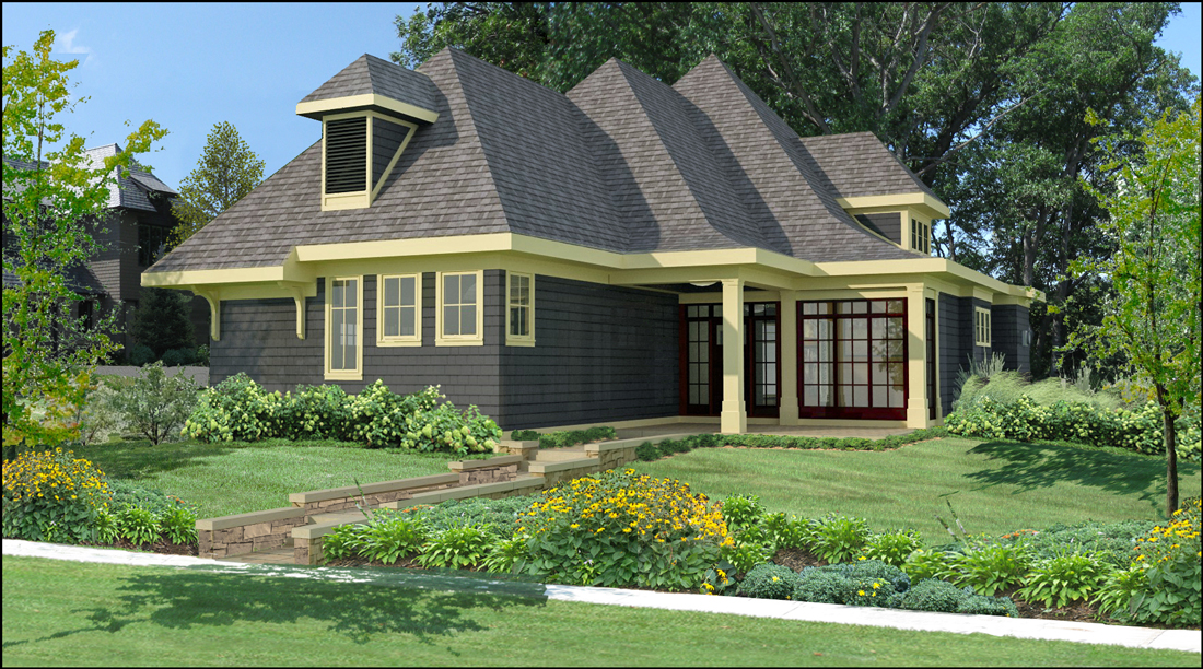
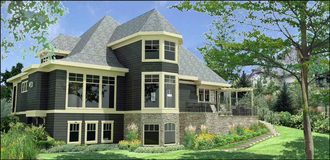
-
beautiful... awesome landscaping.
-
Indeed! Beautiful job on the landscape. I did a quick play in photoshop with the saturation levels and color balance to add a little more realism. Hope you don't mind.
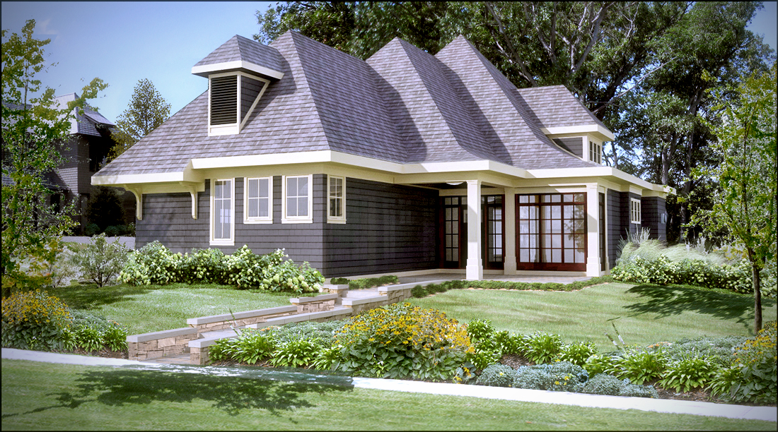
-
Thanks Krisidious!
EarthMover, I do not mind at all. Your adjusted image is absolutely better! Cleaner looking.
It feels as if I have cleaned my glasses and can now see properly.Some of the colors of building materials may have lost a little punch, but I have
the Roof, siding, stone, grass, & trim all on separate layers w/ brightness/contrast and
hue/sat adjustment layers linked to them, so I could easily bring back some saturation
just to the areas that need it.I have been hesitant to apply adjustments globally and I can see by your example that I
need to go ahead and globally adjust.Thanks
-
Yes, selective saturation adjustments are best, or you could use a layer mask and paint back in the details where you need them. The images look very yellow to me and greens a little to saturated. It's a white balance and tone mapping issue out of certain render engines. I think the sketchup default material tends to render weird as well, so watch out for that.
I tried to do a screen record of the post work, but it failed twice.
Here's the second image with a little less adjusting. I added a blue photo filter to tone down the yellow, darkened the green saturation a little, adjust the levels and curves a tad and added a sepia photo filter at the end. Also added a touch of bloom and slight vignette, and swapped the foreground trees to hide the ghosting.
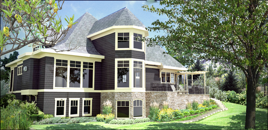
-
Great images
I agree with the rest that you have done a fantastic job of the landscaping.
I just think that the house model needs a gutter. This is really easily done by drawing the
profile of the gutter. Then using the follow me tool along the edge of the fasica. -
personally I don't like showing gutters... unless they're special copper or something to that effect. some gutters are built in to the roof, and the drains into the walls... expensive and not wise in my opinion.
-
Thank you James.
Holmes 1977, Funny you should mention Gutters. During the design phase I added copper gutters (very detailed and the looked great) in key areas
such as over entry roof. I was asked to leave them off for presentation and we will add them back in for construction documents.Krisidious. I have in the past done the through wall downspouts and hidden gutter trick, and It makes me a bit nervous as well. There has to
be an awfully compelling reason for me to go that route.EarthMover, Thanks for your continued advice.
@earthmover said:
I tried to do a screen record of the post work, but it failed twice.
What does this mean? What is a screen record and how is it of value?
@earthmover said:
swapped the foreground trees to hide the ghosting.
Did you remove the original trees by cloning from original background and then
just plunk a new tree on top relying on the density of foliage to hide any imperfections
in the removal of the original trees? I played around a bit trying to do the swap, but it
was taking more time and fussing than it should so I must be going about it wrong.Here are the images again with green & yellow saturation/hue adjustments and a little color level adjustment.
I will need to go back to the psd file and adjust the siding color.I like what your suggestions have done to the plantings.
Thanks
p
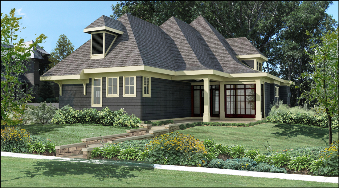
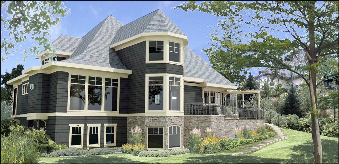
-
Paul, by screen record, I meant a video capture of the photoshop process I did on the image. I use Jing, which gives me a 5 minute time limit. I did the post process work in that five minutes, including swapping out the trees, but for some reason it failed to output the video. I tried it a second time and it failed again, so I just posted the final image.
To overlay the trees, I just used the foliage density to hide what was beneath and a little clone stamp behind the one on the right. I rushed it to try and beat the video time limit. In the future, it's better to hide the foreground trees from rendering and just add them in photoshop after. You can find high res foreground trees online......check here - http://vyonyx.com/2007/09/16/482/#more-482 & http://www.howardmodels.com/digital-content/index.html
Revised renders look much better. The greens could probably be set a to a little darker in the saturation panel.
-
good work in post...i appreciate good PS...its where you make your money as an arch visualiser IMO
-
EarthMover , Thanks for the tree link.
I think I need to remember what size the final image
will be viewed at when I am changing foreground items.
I tend to get hung up on making the stuff one will not see
correct and that takes time. I am zoomed into individual
pix level too often when I am editing.So, Thanks again for your and others advice.
Viztecture,You mean I will make money at this someday?

Paul
Hello! It looks like you're interested in this conversation, but you don't have an account yet.
Getting fed up of having to scroll through the same posts each visit? When you register for an account, you'll always come back to exactly where you were before, and choose to be notified of new replies (either via email, or push notification). You'll also be able to save bookmarks and upvote posts to show your appreciation to other community members.
With your input, this post could be even better 💗
Register LoginAdvertisement


