Render This - Chair Loft
-
Yup, your first one Dale was my favorite until your 2nd one came along. The color palette is just perfect.
-
Thanks Chris, I still can't quite get volumetric lighting.
-
I like this scene so much...

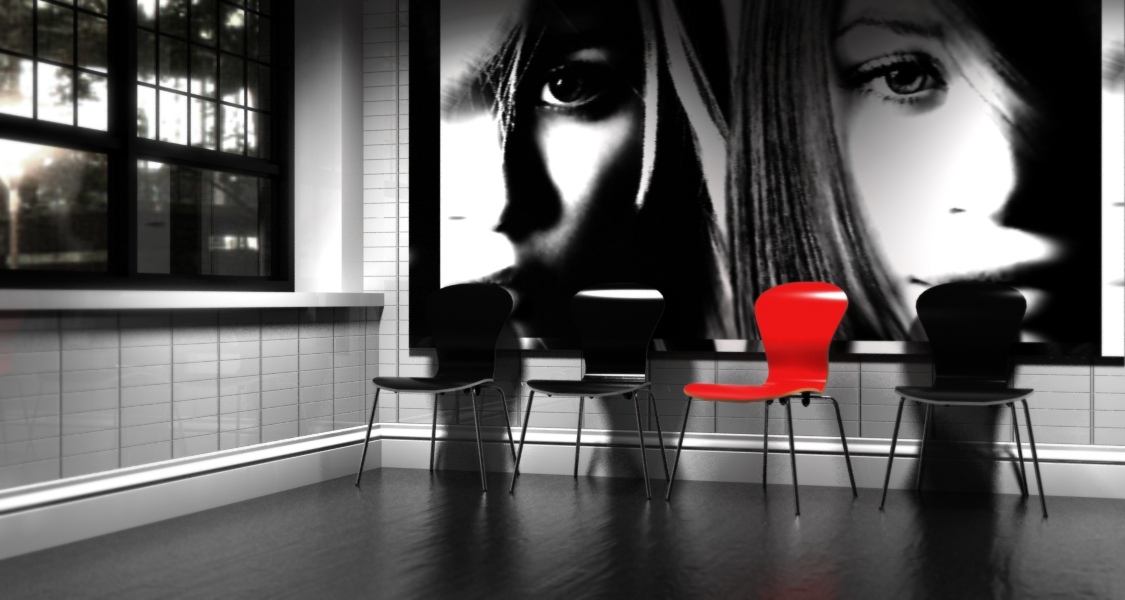
another one with Thea, biased engine 36min, dof and some tone correction with Gimp.
-
Wonderfull scene ! (thanks Solo, I'm definitely going to use tis scene to test some things out)
Fantastic renders so far. You guys and girls are a real source of inspiration
This is my attempt... (still kind of dark but I 'm beginning to like the gloomy-Eighties-east-European atmosphere in the scene
 )
)Kerkythea - MLT - 215 passes - +18 hours of rendering
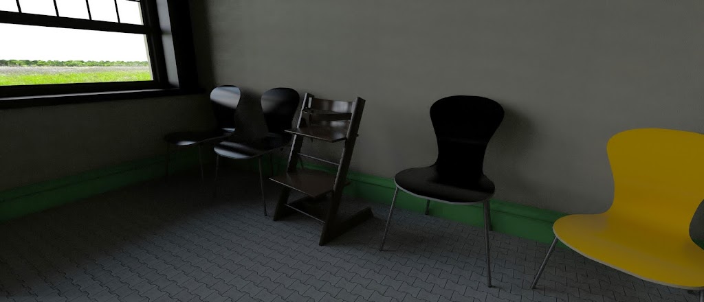
I added a chair that I just finished modeling in the scene, but it looks kind of out of place (it's a baby chair). Well, let' just say it was on purpose to enhance the alienation effect .... not

Flapsy
-
Fantastic Luca!
-
FlapsyD: Is that a trip trap chair? I've had one of those for 23 years, the wooden one! it may be a baby chair but I still use it!
-
@olishea said:
FlapsyD: Is that a trip trap chair? I've had one of those for 23 years, the wooden one! it may be a baby chair but I still use it!
Yep that's the one all right. Finally had some time to model something and the chair was the first thing that caught my eye. (We have two of them). Great design and very confortable !
 We bought it for our daughter and ten years and four kids later we still use it. Haven't come across something better in the meantime.
I 've put the chair on the dutch SU-forum: wasn't sure if it would be good enough to put it here in the gallery section
 . Maybe I'll post it in the newbie section ...
Flapsy
-
Nice one, Flapsy...

Tripp Trapp sure is a great design...@olishea said:
it may be a baby chair but I still use it!

-
@frederik said:
Nice one, Flapsy...

Tripp Trapp sure is a great design...@olishea said:
it may be a baby chair but I still use it!

You can adjust the height of the seat etc....it slides out and slides back into other grooves. I'm not a midget lol

I use it more as a 'perch' when doing work!
Its nice to see they haven't changed the design in over 20 years, I actually got mine reconditioned I like it that much!! I think I got a chair fetish, I put it next to my mini ant chair! man i'm weird

FlapsyD: put it in the components, materials styles section.....not newbie forum.
-
@Mike1158: Hmm, the sky outside looks like after the sunset but there is still a lot of sun in your scene
-
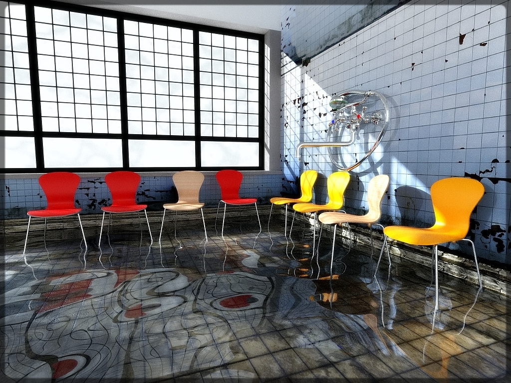
My Fantasy
-
Alvis, that's trippy
 looks like an abandoned psych ward
Can you tell how you made the floor like that? ...and what is that on the wall? Did you use Thea?
-
@alvis said:
My Fantasy
yeah i love the industrial style with the colorful chairs sticking out, usually it would look pants bt it sort of comes together to contrast itself, dont know how to really explain it but I like it!!!!
-


Thanks for the comment. use KERKYTHEA (MLT 50 Passes 3 hours) The floors are tile. water is above the tile with a bump and 1.3 refraction. wall could not be good. as too low resolution texture, and it is repeated. -
nah still gives a god effect the eye isnt drawn to the walls didnt notice them till you mentioned haha
-
Nice one alvis.

-
@alvis said:
... use KERKYTHEA (MLT 50 Passes 3 hours) The floors are tile. water is above the tile with a bump and 1.3 refraction.
Thanks, Alvis

-
Alvis...love it!
-
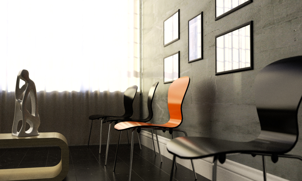
Hi to all, thanks Solo for the scene

My contribution, Thea render unbiased method.
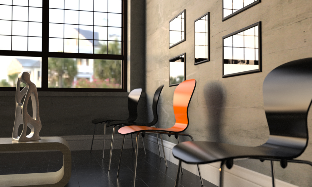
-
Awesome one mr_jo, and welcome to SCF.
Here is a quick one I did, not enough time to play these days.

Hello! It looks like you're interested in this conversation, but you don't have an account yet.
Getting fed up of having to scroll through the same posts each visit? When you register for an account, you'll always come back to exactly where you were before, and choose to be notified of new replies (either via email, or push notification). You'll also be able to save bookmarks and upvote posts to show your appreciation to other community members.
With your input, this post could be even better 💗
Register LoginAdvertisement


