Need some font help
-
Okay this just happened to me and I have NO idea why, I'm completely baffled as to how this came to be.
Anyway I'm designing a DVD cover in Photoshop all is good I start typing with my Calibri font as usual, and as soon as I hit the c and k they merge together they actually become one character like some sort of auto-merge. Same happens with the f and l but they stay separate though, so I went through my settings. Nothing seems to be out of the ordinary and the same error cannot be replicated in Word or in any other program, I re-downloaded the font still the same problem. I attached an image with what happens. I did manage to fix it by setting some kind of language setting to Bulgarian or something really odd.Anyway if someone can explain to me how this is happening all of a sudden and how I can correct this I would really appreciate it!
ps The Internets didn't spit out an answer as to the why for me. Also this only happens with the Calibri font as far as I have checked.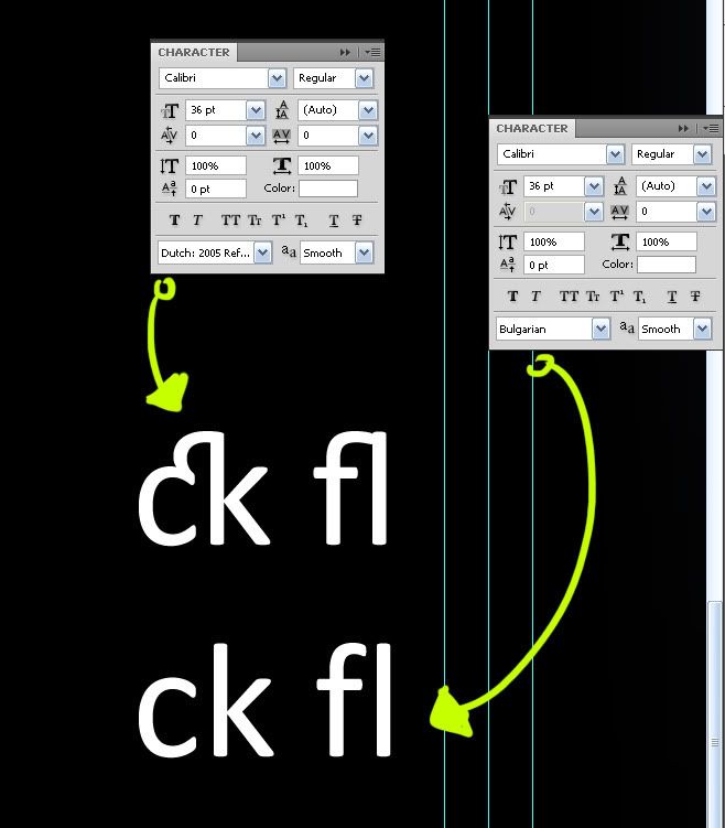
-
Looks like your set to Bulgarian. Is that on purpose? If not, change it to the correct language and perhaps it will go away.
Chris
-
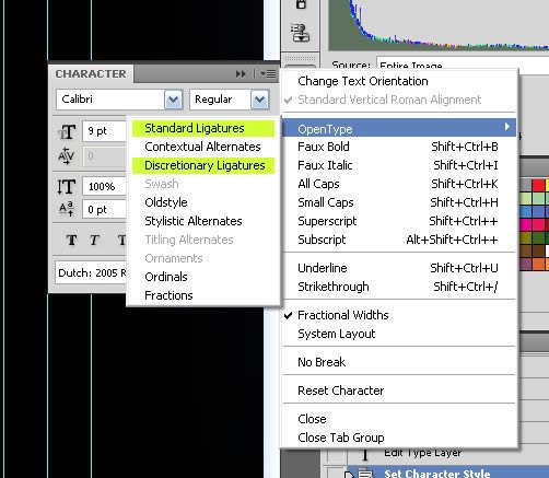
No the bulgarian was on purpose to try and fix this problem, it fixes it but it affects different things I found out, when I put it to a normal setting (dutch english US whatever) it reverts back to the same problem. I did found out that this is called ligature, no idea what that entails though and how to fix it.
-
Okay once you know what it's called it's easy to fix.
@unknownuser said:
"A ligature occurs where two or more graphemes are joined as a single glyph. Ligatures usually replace consecutive characters sharing common components and are part of a more general class of glyphs called "contextual forms" where the specific shape of a letter depends on context such as surrounding letters or proximity to the end of a line."
wikiThis does come in handy when needed but most certainly not when you are designing DVD box cover art Titles.
Now you know. As to the fix:
-
Oh gotcha, I see now how the bulgarian is working and the dutch is not - I missed that.
Oh good, glad you found it and got it working!
Chris
-
@robmoors said:
Okay once you know what it's called it's easy to fix.
Hi Rob,
Glad you found your answer. When I started reading the thread I was thinking "He needs to know that it's called a 'ligature'" and fortunately I kept reading and found out that you had found out.
The reason it's in one font and not another is up to the font designers. If a designer takes the time and trouble to design a ligature, it will be there in the font, and if not, not. There are also fonts that have "swash" capitals in addition to normal capitals.
The most commonly used ligatures are f-i, f-f, and f-f-i in Times and Times-like fonts. In the f-i and f-f ligature, the "ball" at the top of the 'f' merges with the dot on the 'i' and in the f-f forms the crossbars on the 'f's merge, so the f-f-i has two things going on.
That Calibri c-k ligature is unusual and is more "swash" than most ligatures which are about readabily and compactness. In this case, the c-k does not improve readability nor does it take up less space, but it would go well with "swash" capitals. It certainly should not be there automatically in body type. Swash can be pretentious, but there are times when that is what you want.
I hope this helps,
August
Hello! It looks like you're interested in this conversation, but you don't have an account yet.
Getting fed up of having to scroll through the same posts each visit? When you register for an account, you'll always come back to exactly where you were before, and choose to be notified of new replies (either via email, or push notification). You'll also be able to save bookmarks and upvote posts to show your appreciation to other community members.
With your input, this post could be even better 💗
Register Login


Advertisement