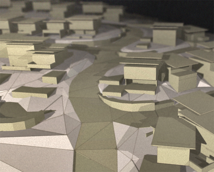
This is cool! SU render - yep SU!
-
Thanks Majid
I hope now I get to see some people trying it out for great results (hint, hint)!
-
Just wondering if anyone has had a go at this yet with any results?
-
@richard said:
Just wondering if anyone has had a go at this yet with any results?
Yes, I am starting to use the method at work. Not quite at the same level as you yet, but it is refreshing to use the D method.
Can't put the office images here though. -
@kwistenbiebel said:
@richard said:
Just wondering if anyone has had a go at this yet with any results?
Yes, I am starting to use the method at work. Not quite at the same level as you yet, but it is refreshing to use the D method.
Can't put the office images here though.Darn! Would love to see someones attempts!

-
Just testing again with the same model to work out a defined workflow - this time using a depth image (black fog, front/back faces white) to mask the lens blur.
This seems to give better and more predictable results.
I followed a slightly different work flow with this one;
SU export: monotone mode light faces are reversed normals (could be done with just face colours though)
- Fog, shadows left, line on (light front face, dark back face)
- Fog, shadows left, line off (light front face, dark back face)
- Fog, shadows right, line on (light front face, dark back face)
- Fog, shadows right, line off (light front face, dark back face)
- Fog, shadows off, line off (white front face, white back face) depth map
PS edit:
A. Normal blend 1 and 2 to get preferred line weight, merge layers
B. Normal blend 3 and 4 to get preferred line weight, merge layers
C. Black fill background layer
D. Apply layer mask to A / B layers using depth map
E. Apply lens blur (with noise) to A / B using mask as source
F. Apply filter > Artistic > film grain to A / B layers
G. Normal blend Layer A / B to get preferred shadow cast
H. Copy merged > paste new layer
I. Apply Filter > render > lighting effects, create lights from direction of light sources and adjust to suit
J. Apply Filter > distort > lens correction - use negative correction to add distortion, lighten vignetting to light extremes from light source,
K. Use shadows and highlights edit to fix shadow depth etc.
L. Adjust levels.This image uses three lights in PhotoShop all added in same action
- Bottom left toward center
- Bottom right toward center
- Top left toward back center
Still amazed this can be done with SU.

Close Up

-
for some reason the image does not show up here in China.
could you repost it? -
I've attached it Dennis (just the close up anyway)!
I think you'll find this pretty cool when you consider it is pretty much just two SU images with little bit of PS.

-
lens blur is particularly effective.
I felt like I'm back to school and staring at a photo of a card board model. -
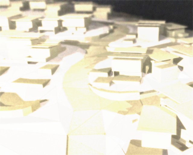
Richard, maybe add some 'BLOOM'

Sorry, could not resist.
-
And here comes the bloom...
Same photo, but with the wrong flash setting:

-
-
Just revisited this thread. I still feel these look great. Come on, Richard, do some more! Chop-chop!
By the way ... Ecuadorian, how did you create the below image? Looks just like a Tuymans painting.
-
Yeah bit surprised Stinkie that we haven't seen a few more attempts at this style seeing it is so easy, even from myself!
-
Dunno about the 'easy' part, Richard. I've not been able to match your images so far.

-
@unknownuser said:
Dunno about the 'easy' part, Richard. I've not been able to match your images so far.

Oh! Wasn't sure anyone had given it a go! Maybe it is simply in part the context of the shots lending themselves very well to this type of render!
-
Possibly. Going to keep at it, though. Interesting process.
-
Mate I think the two most important processes are to get two differing sun shadows - you can test this in SU by bringing your first image in as a watermark! Then the other is ensuring your light effects added in PS post pro match closely the sun directions from SU!
Also obviously the choice of line type and density on at least one of the SU exports!
Hello! It looks like you're interested in this conversation, but you don't have an account yet.
Getting fed up of having to scroll through the same posts each visit? When you register for an account, you'll always come back to exactly where you were before, and choose to be notified of new replies (either via email, or push notification). You'll also be able to save bookmarks and upvote posts to show your appreciation to other community members.
With your input, this post could be even better 💗
Register LoginAdvertisement


