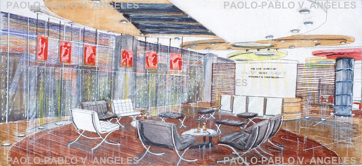
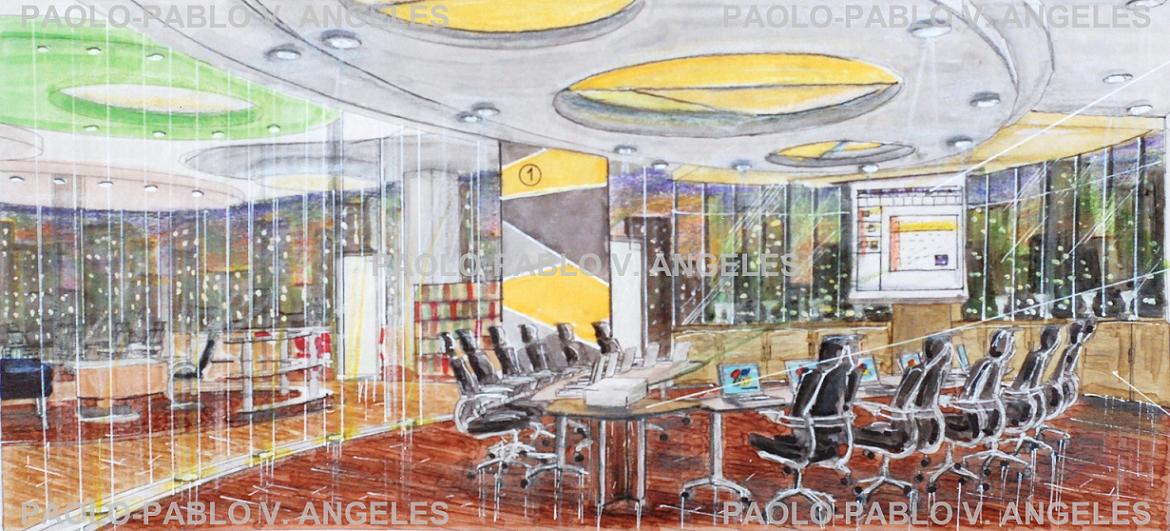
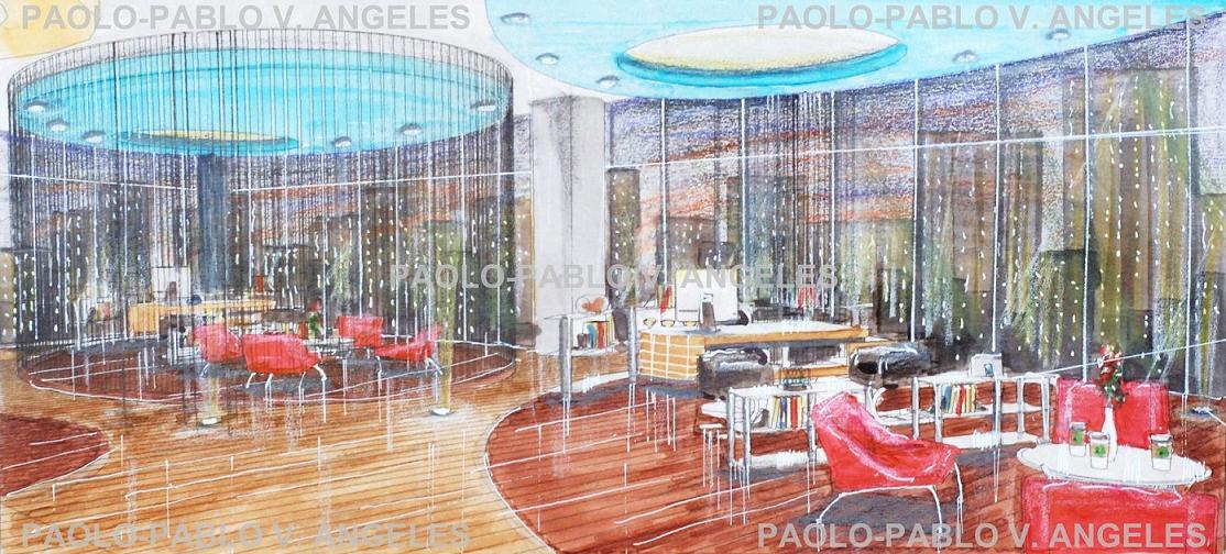
Interior Design: The Law Office of Paolo dash Pablo
-
"I didn't want it to look like my grandfather's law firm" - paolo-pablo
hahaha... see the design and you know what I mean! Wish I could build something like this in the future! I got the open layout idea from one of my archi books!
3d modelling with SU + manual rendering
medium used: kuricolor and touch markers, colored pencils, pencils, white ink, eraser, metallic inks, soft pastel


-
This looks very interesting, I like the different style, I am getting tired of the lifeless "photoreal" wannabee renders. This one has a soul

cool
-
Nice renderings that show the original way that we used to render. Nice use of the media.
Your last pic (Senior's office) - I had to chuckle a bit as it reminded me of the old Get Smart TV shows and the 'Cones of Silence'.
 Sorry, but I have a warped sense of humor - no reflection of you or your beautiful renderings.
Rick
-
love seeing how people use SU in different...very cool renderings and you look like you have a good hand for that type of illustration.
-
@andrija posarić said:
This looks very interesting, I like the different style, I am getting tired of the lifeless "photoreal" wannabee renders. This one has a soul

cool
Thank you! yeah I prefer manual rendering too haha that's because I'm not good at photoreal rendering hahaha manual looks more architectural.
-
@rickgraham said:
Nice renderings that show the original way that we used to render. Nice use of the media.
Your last pic (Senior's office) - I had to chuckle a bit as it reminded me of the old Get Smart TV shows and the 'Cones of Silence'.
 Sorry, but I have a warped sense of humor - no reflection of you or your beautiful renderings.
Rick
Thanx!!! haha honestly, what does cones of silence mean? haha really dont know that sorry!!! Thanx again!
-
@steelers05 said:
love seeing how people use SU in different...very cool renderings and you look like you have a good hand for that type of illustration.
sketchup is a very good modelling software! it's very versatile. Thank you!!!
-
Very nice. Yep, it brings back some memories.
Well done!
-
@unknownuser said:
Very nice. Yep, it brings back some memories.
Well done!
Thank you bryan! se my other works, they're all manual rendered!
-
@unknownuser said:
"I didn't want it to look like my grandfather's law firm" - paolo-pablo
hahaha... see the design and you know what I mean! Wish I could build something like this in the future! I got the open layout idea from one of my archi books!
3d modelling with SU + manual rendering
medium used: kuricolor and touch markers, colored pencils, pencils, white ink, eraser, metallic inks, soft pastel
Whow this is nice work. stylish.

-
@sketchnl said:
@unknownuser said:
"I didn't want it to look like my grandfather's law firm" - paolo-pablo
hahaha... see the design and you know what I mean! Wish I could build something like this in the future! I got the open layout idea from one of my archi books!
3d modelling with SU + manual rendering
medium used: kuricolor and touch markers, colored pencils, pencils, white ink, eraser, metallic inks, soft pastel
Whow this is nice work. stylish.

thank you sir! sytlish it is, because its not my grandfather's law firm! haha
Hello! It looks like you're interested in this conversation, but you don't have an account yet.
Getting fed up of having to scroll through the same posts each visit? When you register for an account, you'll always come back to exactly where you were before, and choose to be notified of new replies (either via email, or push notification). You'll also be able to save bookmarks and upvote posts to show your appreciation to other community members.
With your input, this post could be even better 💗
Register LoginAdvertisement


