Small bathroom remodel
-
Thanks for the comments, it does mean alot coming from you guys since there's always such great work posted on the forum. I feel my renders have improved quite a bit but something still doesn't sit right with me, missing that "something" to take my renders to the next level, any suggestions to improve these? Thanks again.
Mike
-
Very Nice. My only crits would be that the material on the lights look a bit flat. Also, is that an outlet plate on the mirror? I would more that to the other wall as that is a bit distracting and I would doubt they would do that but I have seen wierder things.
Scott
-
Scott, yes that's a GFCI oulet, we actually had the glass company cut two holes in the mirror for the electrical boxes, one for the oulet and one for the lightbar. The oulet cover is also mirrored, it actually looks pretty neat in real life. The plumbing and electric were a real nightmare on this project, this house was built in 1900 by the Pittsburgh Fire Company and advertised as a "fireproof" home, all the exterior and interior walls were terra cotta block and the floors concrete and this bathroom was on the second floor. We built 2x4 walls against the existing walls at the vanity and shower wall with the glass block to accept the plumbing and electric. Thats also why theres that chase at the double switch. We didn't want to frame out all the walls as the space was pretty small to start with. Thanks for your comments.
Mike

-
Very nice renderings. I know its probably a small scene and the camera would get distorted, but id like to see more in your scenes. The views just seem too close. But great work with the materials and lighting.
-
really nice renderings......looking like real photographs!!! which renderer have u used??
-
@steelers05, yeah, it was difficult to get decent views as the space is only 9'6"x7'6". Kept ending up inside walls and with a wider fov everything was way too distorted. How do you guys deal with these situations?
@arjunmax09, these were render with Vray, not the new version though, decided to wait for a patch before I upgrade.
Mike
-
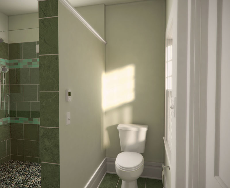
Alpro: I think these are a very good start. It's good to see someone rendering smaller spaces that many of us live with. In the first render I would allow the vanity lights to put some warmer incandescent lighting into the room. There just isn't enough natural light to help the render be special. The render facing the toilet with the sunlight through the window gives a much more pleasant feel to me. In the other render I would expect the exposure at the window to be more blown out, since the interior camera aperture would be very open. That would add some realism too. Also, the pebble texture on the shower floor has too much contrast. It wouldn't look that way in real life I don't think.
-
i agree about the pebble floor- something perhaps too distinct or repetitive or contrasty about it. Otherwise this is really good work.
-
Thanks for the comments, this is what I'm looking for to help improve my renders. As for the exposure at the window, I did have one that I applied diffuse glow to, to try and get that blown out look but it just didn't seem right to me, maybe I used too much glow, should of did it using another technique, or thats how it would look for real. The pebble floor comes in 12"x12" mats so it is a little repetitive, all I did was take a picture and in PS fill it behind with a dark gray for the grout, however when we installed it, I did notice that you saw alot more of the grout and alot less of the pebble so maybe that has something to do with it.
Mike
-
I don't think diffuse glow is the way to go. Maybe take some photos inside your bathroom to get some sense of what the exposure would look like, or look at similar photos on the web. Then you should be able to paint that onto a separate layer in Photoshop to simulate the overexposure. I don't use Vray, so maybe the Vray gurus here can help you with getting the exposure in the render.
Adding the pebble texture in post is certainly fine, just keep an eye out for lighting and how well the image overlay fits with the color balance and contrast of the rest of the image. -
red-shift, sorry if what I said was alittle confusing. I didn't add the pebble post pro, I did make a material by taking a picture of the mat, there was no grout at the time, in PS I just used a fill color behind the picture. This made grout lines perfect with the pebble when in reality the grout actually came up the pebbles some so you actually saw more of the grout and less of the pebble, hope that makes sense.
Mike
-
nice. could be great if you had better wood texture (looks flat) and i think the shower floor texture needs to be toned down. and probably scaled down too, seems a little like the floor tiles are too big?
Hello! It looks like you're interested in this conversation, but you don't have an account yet.
Getting fed up of having to scroll through the same posts each visit? When you register for an account, you'll always come back to exactly where you were before, and choose to be notified of new replies (either via email, or push notification). You'll also be able to save bookmarks and upvote posts to show your appreciation to other community members.
With your input, this post could be even better 💗
Register LoginAdvertisement


