[WIP] house - C&C
-
not a fan of the mirror on the island showback - understand why you would use it though.
Don't like the colour of the worktop - would be better using a colour similar to your cabinet doors in a kitchen style like that.
All the other aspects of the render are spot on in my very "un-render-educated" opinion. I would be very pleased if I could produce something half as good as that.
-
Looks pretty good, although I would expect more lights in the ceiling, and maybe not as shiny a ceiling.
-
Just spotted another wee error on the model - the extractor hood is way too low to be practical - need at least 600mm between the top of the cooking surface and the bottom of the extractor to give a workable height for moving pots & pans easily. Sorry to criticise
-
You left your rangetop on. Could burn the house down:-)
-
first of all, thank you all for your C&C
@dermotcoll said:
Don't like the colour of the worktop - would be better using a colour similar to your cabinet doors in a kitchen style like that.
wouldn't it make the area to WHITE?
I really do apreciate your advice, because this might be the house that i end up building to live in, so any advice does help.@d12dozr said:
Looks pretty good, although I would expect more lights in the ceiling, and maybe not as shiny a ceiling.
I'm going for an indirect illumination, this is why i have the reflective ceiling
I'll post later on some images of the window/doors so you can see that even without turning on the light it's still going to have enough light coming through.@dermotcoll said:
Just spotted another wee error on the model - the extractor hood is way too low to be practical - need at least 600mm between the top of the cooking surface and the bottom of the extractor to give a workable height for moving pots & pans easily. Sorry to criticise
actually it is exactly 650mm

maytbe because of the angle of the shot it looks a bit narrow,
but there's quite enough space.
I sat down with my "Neufert's Architects' Data"book when i was drawing up this house
@honoluludesktop said:
You left your rangetop on. Could burn the house down:-)
oooops let me go turn it off hahaha

-
a small update....
in the second image you can see that the windows are big enough to let a lot of natural light come trough....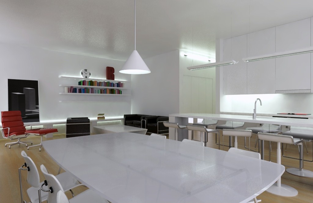
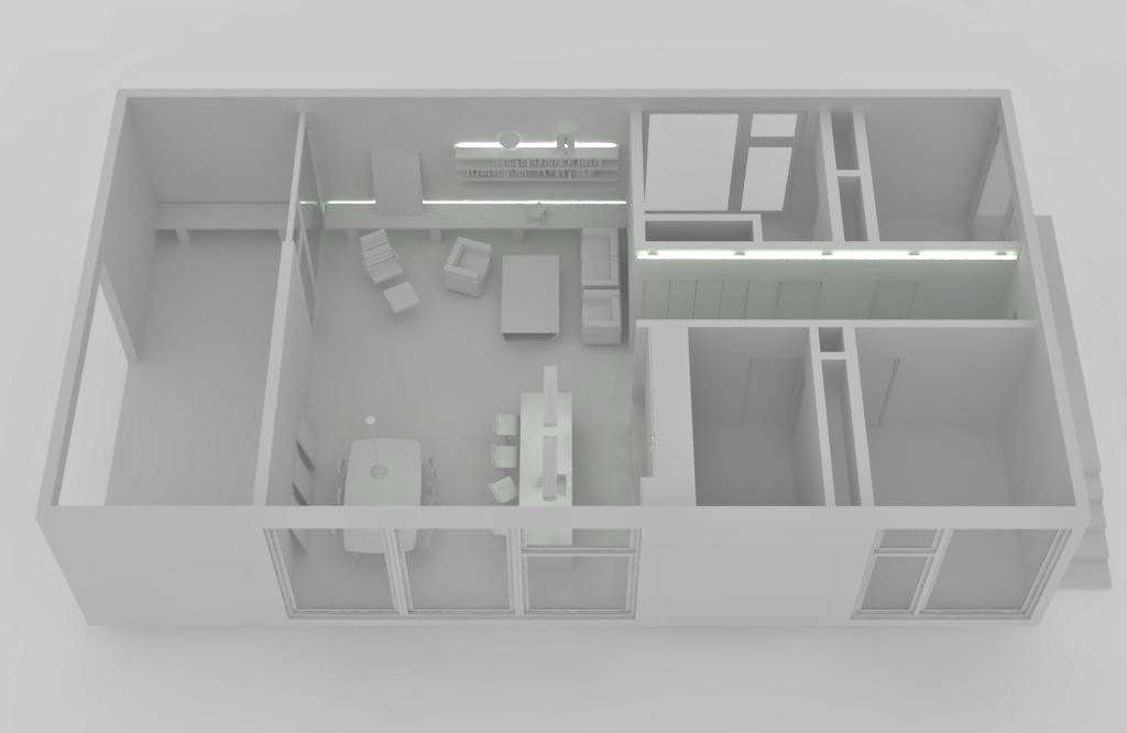
-
Hmm looking nice, as a point of view from an interior architecture student I would add some more color as the following;
-It looks like you like the color red, white and red are a good combination you've made IMO but I would make the color
come back on some spots, like on some walls, here an example of which walls I would make red (btw, if you plan to use it don't
use plain red, but a somewhat deeper red which will create a nice mood with your indirect illumination.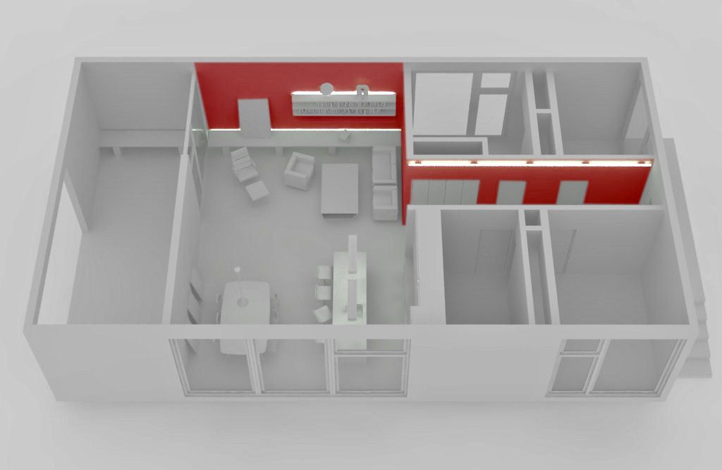
-Also you could try to use a warmer coloured wood, don't get me wrong by saying warmer more 'red', but a darker
wood with more brown in it.Hope this might help you and you like it, of course this is just based on what I would prefer to have and some knowledge from school..
Cheers,
FoXy ^^ -
@foxar said:
Hmm looking nice, as a point of view from an interior architecture student I would add some more color as the following;
-It looks like you like the color red, white and red are a good combination you've made IMO but I would make the color
come back on some spots, like on some walls, here an example of which walls I would make red (btw, if you plan to use it don't
use plain red, but a somewhat deeper red which will create a nice mood with your indirect illumination.-Also you could try to use a warmer coloured wood, don't get me wrong by saying warmer more 'red', but a darker
wood with more brown in it.Hope this might help you and you like it, of course this is just based on what I would prefer to have and some knowledge from school..
Cheers,
FoXy ^^Yes it does help, because i did kind of feel like it was getting a little too white, if you know what i mean, i do appreciate your input and insight, i really love your ideas, and will be implementing them pretty soon. the wall will be no problem, but I'll have to find a good texture for the floor material, because right now i have non hahahaha, but I'll try to find something that fits your description, so i can implement it in,
and again thank you for you help. -
Great to hear these were helpful, yes you were right, it was getting to white, if I may suggest an other thing, I get why you're making a mirror in the island, it
'creates' more space, but I really wouldn't do that tough, if you still want to create a somewhat larger looking space I recommend you to make it anodized aluminum (doesn't scratch too easy) with an indirect illumination that comes from the countertop down to the ground, you get what I mean?And not to forget, here you have the wood texture (I took this from the maxwell material library: http://resources.maxwellrender.com/ and credits go to paxreld.
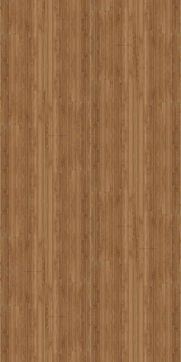
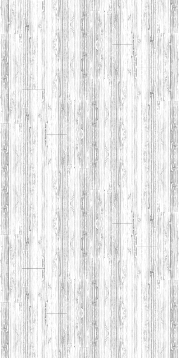
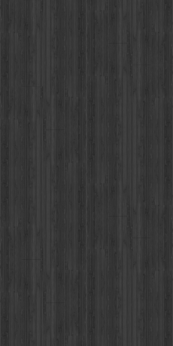
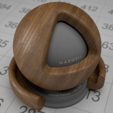
Cheers,
Mr. Fox ^^ -
A little update on my Project
your C&C again are welcomed,
oh and thnx again to everyone for there help and advice,
hope you like the final outcome


on the left is the original v-ray output and on the right, a PostPro image


on the left is the original v-ray output and on the right, a PostPro image


on the left is the original v-ray output and on the right, a PostPro image


on the left is the original v-ray output and on the right, a PostPro image


on the left is the original v-ray output and on the right, a PostPro imageSorry i was not able to uplad the images directly to SketchUcation...

-
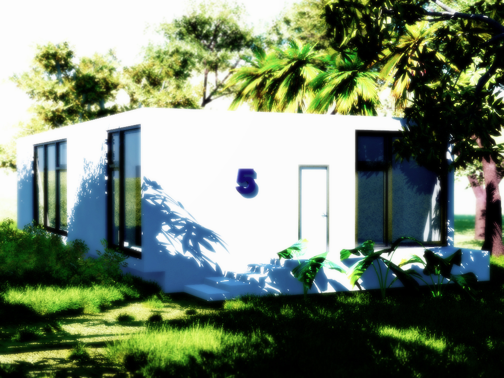
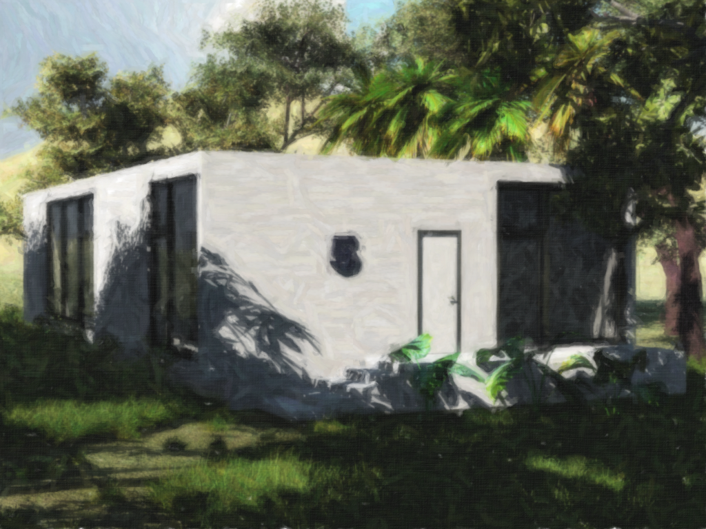
Hi again guys,
another update here,
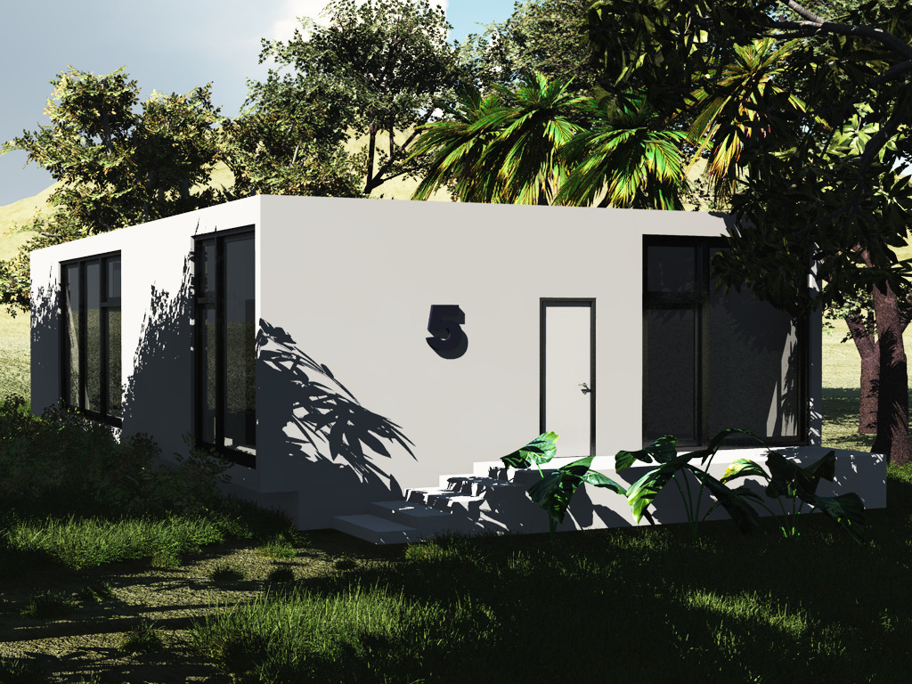
i used VUE to render the exterior of the house
and photoshop to PP the renderhope you guys like it, and every comment and crit is very welcomed
Hello! It looks like you're interested in this conversation, but you don't have an account yet.
Getting fed up of having to scroll through the same posts each visit? When you register for an account, you'll always come back to exactly where you were before, and choose to be notified of new replies (either via email, or push notification). You'll also be able to save bookmarks and upvote posts to show your appreciation to other community members.
With your input, this post could be even better 💗
Register LoginAdvertisement


