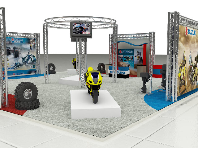
3rd render
-
hi guys here's my 3rd render to share all your comments are most welcome here to improve my 3D, thanks God Bless you all & Mabuhay Philippines

-
hi stann_ph
Nice start:).
You should look into gving some bakground or better yet use an hdri and that will give you better reflections on the materials too. Your white tiles textures in the ground are too big to look real. And try to give some light emiter on the tvs and fade out the colours a litle in the screen. And i don't know if it's the lack of something to reflect (like and hdri) but the metalic and shiny materials in the bikes and the engines could be more reflective and use a litle more work.Hope you don't mind the critic.
David
-
@unknownuser said:
..Your white tiles textures in the ground are too big to look real. ..David
totally agree, also the carpet seems oversized.
about lighting, I believe is too diffuse, exibition environment normally has many strong lights and relative shadows and reflections all around the stand; metallic items don't need more reflection
Hello! It looks like you're interested in this conversation, but you don't have an account yet.
Getting fed up of having to scroll through the same posts each visit? When you register for an account, you'll always come back to exactly where you were before, and choose to be notified of new replies (either via email, or push notification). You'll also be able to save bookmarks and upvote posts to show your appreciation to other community members.
With your input, this post could be even better 💗
Register LoginAdvertisement


