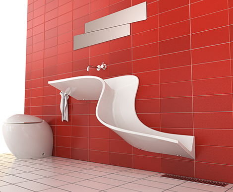
Red Bathroom
-
I like it! Twilight?
A nice change from blue Mediterranean tiles, very cool looking sink.
-
@kwistenbiebel said:
..Perfect for a big family where they fight to get bathing time. You won't spend more time there than necessary
 ...
..... to clean the blood on the walls???

-
Sexy sink!
The red is striking and it doesn't put you at ease.
Perfect for a big family where they fight to get bathing time. You won't spend more time there than necessary .
.Nice render.
The wooden door is a bit off...not sure if it is the render or a 'faux pas' in the concept. It looks like it belongs to another bathroom. -
Yeah, I can't help thinking about Psycho...
-
I assume that you've forgotten to apply a chrome material to i.e. door handle, faucets and towel racks...
 (or maybe it was on purpose...?)
Any way... It's a really nice render...!!

Personally I would make the mirror MUCH bigger...!
Just out of curiosity... Is this a real project design or just a free imagination idea...??
-
Interesting!
Are those entities above the sick mirrors?
Also, the sink looks like it could be used from everything from a sink to a urinal (lower part) to a butcher's basin. Just make sure the white grout has plenty of sealer!
-
Crazy sink. If I saw that at someone's house I'd pee in it!
-Brodie
-
is that a sink or a bidet?! i would definitely wash my ass in that!-just because it's there!!
too much red, but not saying red can't look great in a bathroom.
great render eric looks very real
-
From a website:
"The Abisko Washbasin from Eumar isn't even a basin. It's a freaking waterslide"
I can see my boys making paper boats and playing in the bathroom for hours.
-
Thanks for all the comments guys.
Twilight yes.
Fredrik, the towel hooks and faucet had chrome but they were lost in the red tile so I made them porcelain like the sink. The door is a brushed metal but does not work I agree.
Not an actual project, just a rendering around the sink. I built everything you see in the room, from the makeup brushes on the shelf to the laundry basket.
You found the sink yes Pete. I made it for FF yesterday and could not pass up the chance to render it.
The mirror idea came from the product image on the Eumar site.

-
That basin is positively freaking me out!
-
nice render bro! i like the idea!
-
nice!
is that supposed to be a combination sink/urinal or would i be in trouble there?
-
Imagine trying to clean the razor stubble out of that sink or soap scum...that would take an hour. And all those sharp edges in the bathroom makes me nervous. It's a nice render and all but the hair on the back of my neck is standing up just thinking about being in this room.
-

-
I like the design and the render is great. Like someone said, a nice change from blue tile. I'm surprised no one said anything about someone peeing in the sink by mistake. You certainly wouldn't want your drunk friends using the bathroom! Very cool tho!
Jeff -
Very nice, Eric. Love the red tile. A slight gap between the door and the frame jambs, and below the door, would help the rendering.
-
Slightly more yes. I have a gap but it did not translate.
Thanks again for all the constructive comments, and the funny ones too

-
Here is an update:
Hello! It looks like you're interested in this conversation, but you don't have an account yet.
Getting fed up of having to scroll through the same posts each visit? When you register for an account, you'll always come back to exactly where you were before, and choose to be notified of new replies (either via email, or push notification). You'll also be able to save bookmarks and upvote posts to show your appreciation to other community members.
With your input, this post could be even better 💗
Register LoginAdvertisement


