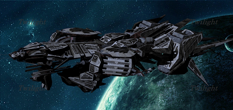
Some random shiny things - a bit of fun
-
cheers, twilight
-
yeah that second image is really awesome...twilight serves u well
-
Thanks, easy to set up materials - 5 minutes! I'm surprised it didn't crash though, twilight is very stable!
-
Very cool Oliver,
Thanks for sharing those. They look great. I must now go and reflect on my renderings options

I have both twilight and V-Ray and am only now able to put some time into learning. I have been playing with displacement in V-Ray the last two days....getting the hang of it AND understanding. I'll post something soon.Cheers,
Jeff
-
wow dude...those came out beautiful! these smaller render engines are constantly impressing me. i need more time/talent!
-
That second render looks amazing.
Twilight seems to be very performant on transparent materials. -
wow!!
-
Looks good Oli...especially the second render.
-
Fantastic - these rock, Oli!

Care to talk about the lighting/background setup? HDR, I'm guessing?
-
First image:
Light grey studio backdrop (the curved screen thingy-took 1 minute to make)
Satin Plastic template applied to this grey, shininess set to 15.
HDR lighting only - studio image set at 0.7 brightness
Sunlight disabled
Skull coloured red, applied a flint template and reduced alpha a bit
Progressive preset 10Second image:
Same setup with materials (although I made the floor a darker grey) and same HDR.
No studio backdrop this time....just one one huge ground plane (so you can't see the edges from view angle). The HDR is too blurry to be on display as a background...I use it only for lighting and reflection. Make sure you have rotated your HDR to how you want the light to cast-just do a few tests. A proper lighting setup with emitters would be better for these sort of 'product' renders. I find these HDR scenes very quick and simple, albeit with less control over specific lighting.Take advantage of twilight tone mapping-the renders looked so much better after I dropped gamma a little bit and upped the exposure. You can also mix your different exposed images in photoshop. I did standard PP on images; different overlays, curves, saturation, levels, vignette, colour balance and HIGH PASS FILTER overlay-this really brings out the details and light.
It looks more work than it is.....twilight users know that this is just a few clicks.
Hope this helps and thank you for the compliments.
-
 second image is amazing. I must pick up twilight sometime and give it a go. Im still struggling with Vray just havent got the time to put into it.
oli you seem to have mastered Twilight quickly
-
Yes its quick to pick up, but I have far from mastered it!! Haven't done much architectural stuff with it yet.
I really can't tell much difference between vray and twilight renders, I mean it's degrees of excellence really. How real do you want it to be?! Why struggle with vray when you can enjoy twilight? I sound like I'm promoting it but I just really enjoy the twilight process. Try the trial version-I guarantee you will have a nice render within the hour and all completely within sketchup.
-
Thanks for the detailed explanation, Oli, it definitely helps!
@olishea said:
Make sure you have rotated your HDR to how you want the light to cast-just do a few tests.
How do you rotate the HDR? or do I just rotate the model to adjust the lighting?
-
wow, me too oli. Excellent renders.


"HIGH PASS FILTER overlay-this really brings out the details and light. ". Actually this is "unsharp mask". -
Ah, never mind my question Oli, I see where to rotate the image right under where you insert it...Duh!

-
Twilight is very good, it took me about 15 minutes to make a decent adjustment to rendering, and i've never used a rendering program succsesfully.
example

it works very well, only a hundred $ for the full version which is pretty good compared to most programs, i think...
-
 Are you the "mr.jumpman" of the Mech robots in the 3D warehouse?
Welcome to the SCF!

-
yeah man keep it up and you'll be a whizz in no time. michalis unsharp mask does pretty much the same but high pass filter looked better with these refractive materials. I wrote it in capitals because it really improved the image above any other adjustment but yeah unsharp mask is good for most applications.
cheers for comments
-
yes i am Mr.jumpman from the warehouse =p
here is my more recent account
and even recenter...dont ask why i have 3...
were is the URL name creator?
Hello! It looks like you're interested in this conversation, but you don't have an account yet.
Getting fed up of having to scroll through the same posts each visit? When you register for an account, you'll always come back to exactly where you were before, and choose to be notified of new replies (either via email, or push notification). You'll also be able to save bookmarks and upvote posts to show your appreciation to other community members.
With your input, this post could be even better 💗
Register LoginAdvertisement


