Exterior & Interior - Rehabilitation Centre
-
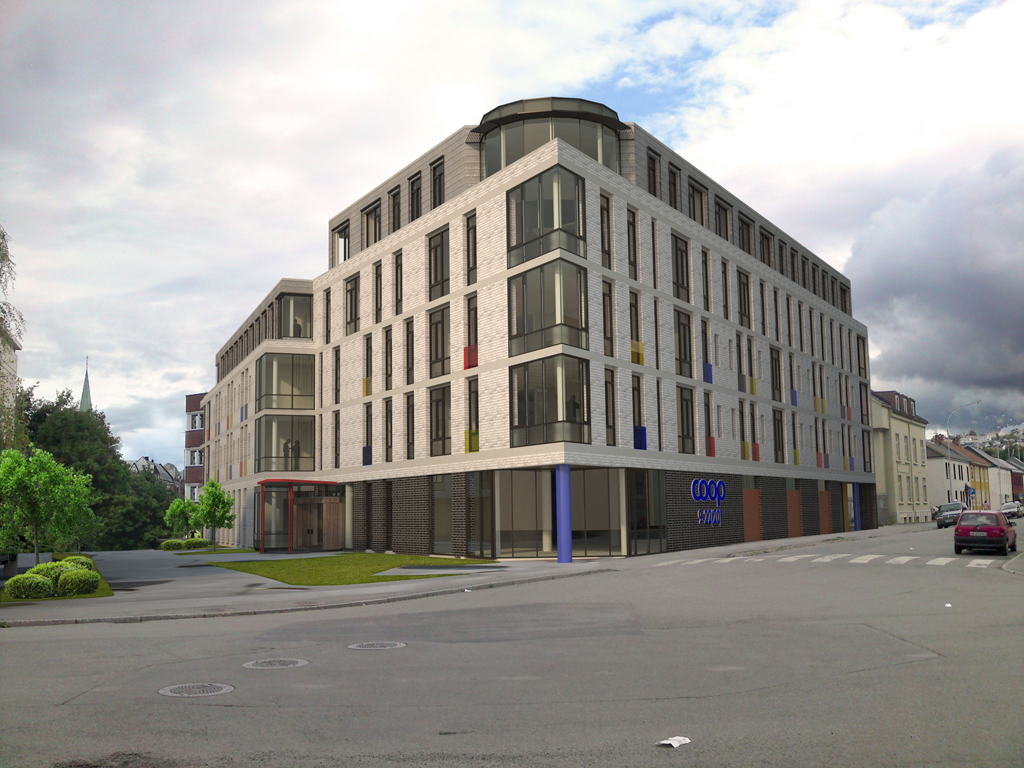
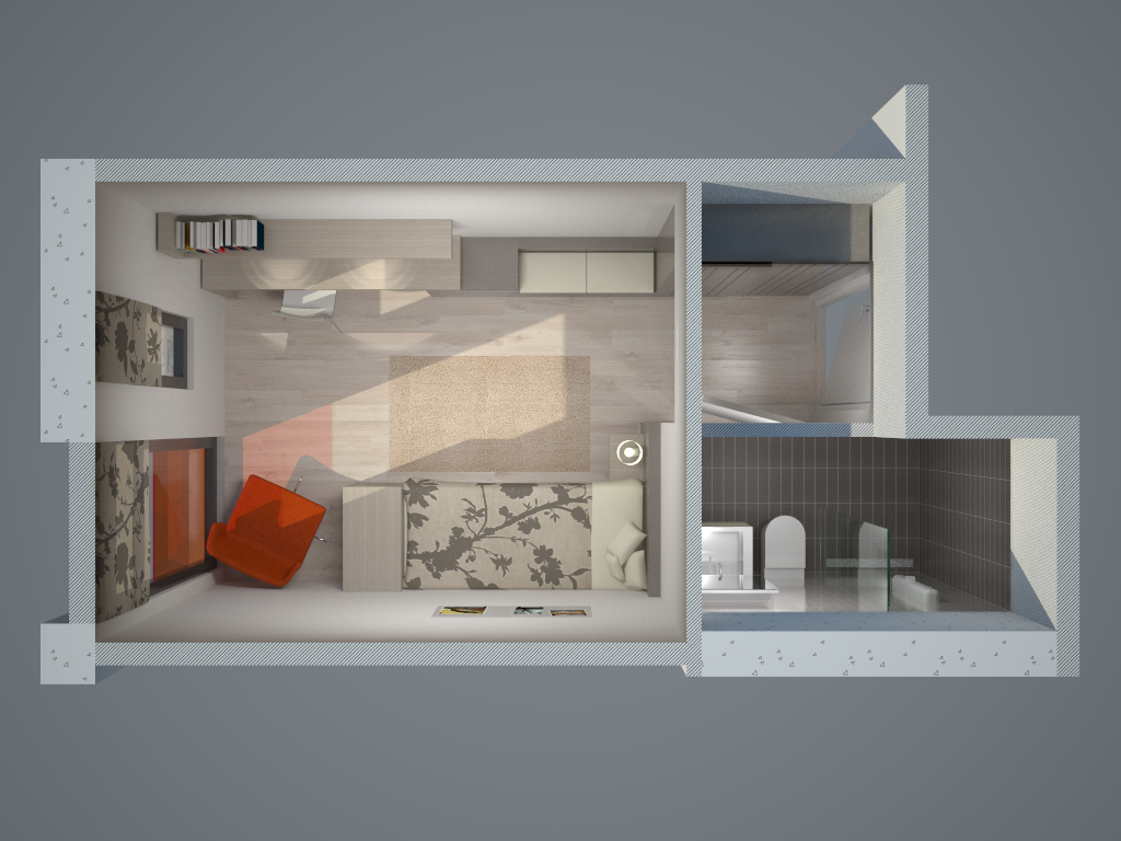
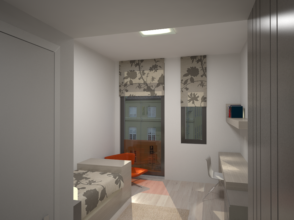
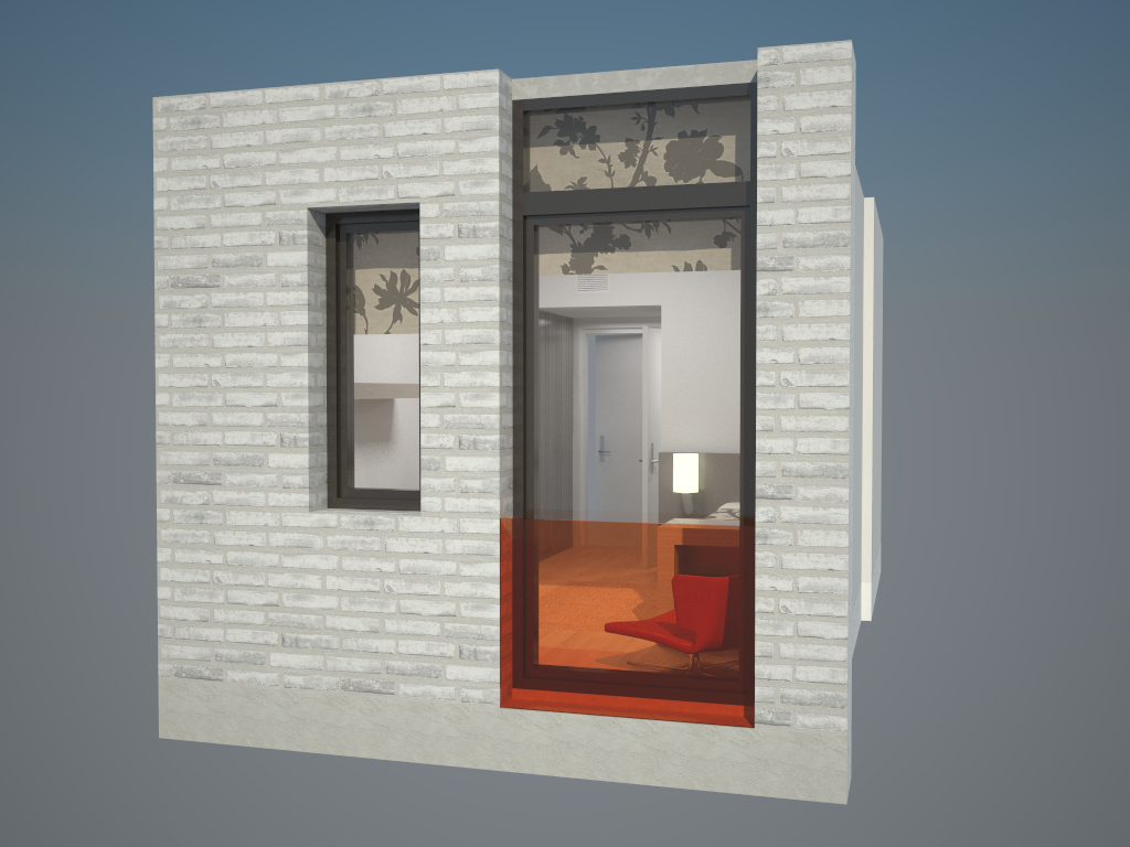
The Photomatch feature was useless for this perspective - had to manually adjust the camera to match.Patient Room
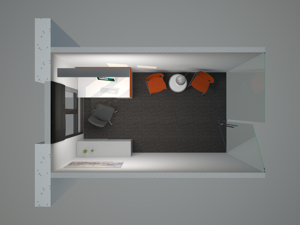
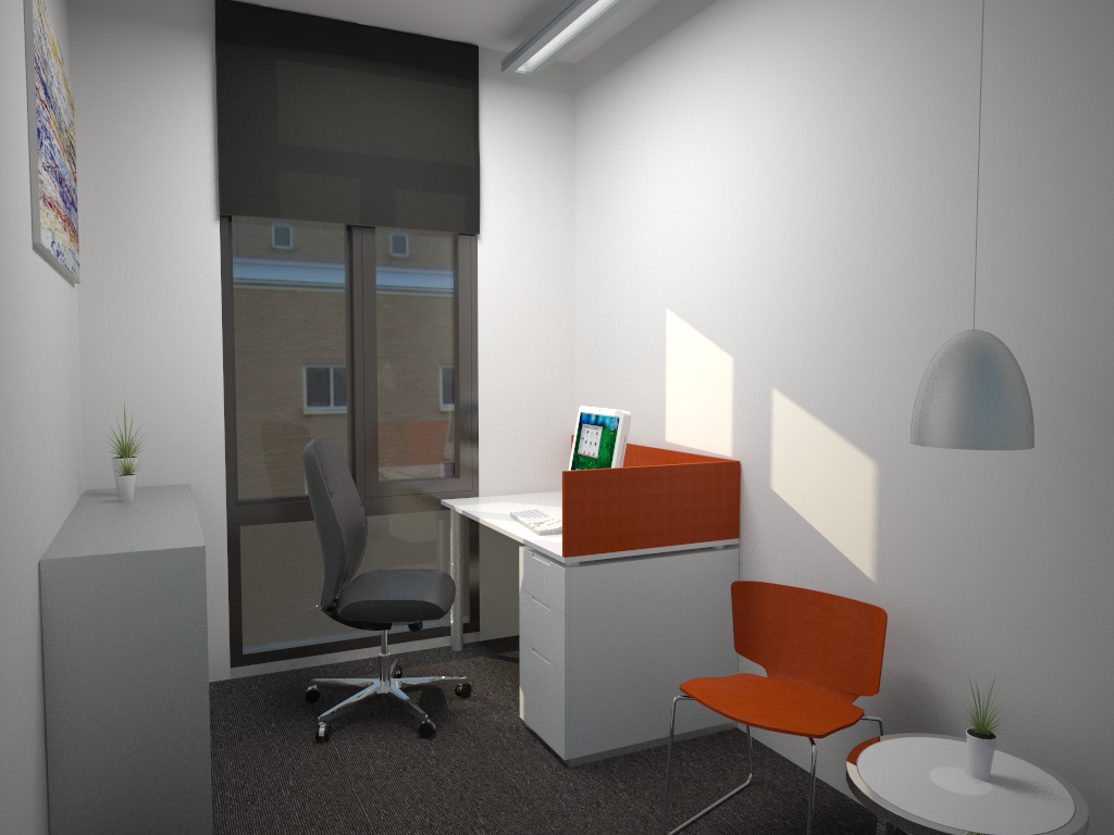
Meeting Room
-
thomas
very nice work -
I like this Thomthom, nice views good photomatch, what render engine?
Strange coincidence, I'm also busy with a rehab at moment

-
-
Seems very calm

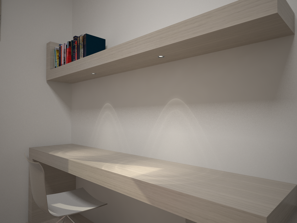
Are those lights over the desk using IES files? -
The down-lights in the patient room are fake IES lights, yes - using the method described at the ASGVis forums.
They caused me problems as I wanted them to be Inverse Square so they wouldn't leave such a distinct pattern on the floor - but then I would have to crank up the intensity so much that it's burn the closer are it lit up. So instead I set it to Inverse. Still not happy with them. -
I like these and I really like the look of the building.
It fits very well in the image.Two things that I notice in the first image.
The three trees I think you have added would look a little better if the colour was a closer match to the trees in the photograph behind.
The blue letters COOP look a little false as if they were added afterwards. They seem to stand out too much to me. Maybe change the colour to match the column. -
Thanks everyone for your kind words.
@unknownuser said:
The three trees I think you have added would look a little better if the colour was a closer match to the trees in the photograph behind.
You're right. I'll keep this in mind for the next revision.
@unknownuser said:
The blue letters COOP look a little false as if they were added afterwards. They seem to stand out too much to me. Maybe change the colour to match the column.
Yea - that bit bothers me a bit. There's a shop in the bottom floor and that's the kind of sign they have. I can't do much with the colour though - as it's pat of their logo. But I do like to do some kind of change to it so it doesn't stick out that much. Maybe some illuminating on the backside of the letters against the wall. I did that on another project it that made it fit in better. Will have to do some tests.
-
The photo match looks very good. I think some reflections on the ground floor glass will make it perfect.
-
Great work Thom, really nice texturing on both the exterior and interiors. Nice to see all the components of this project come together.
As a reknowned perfectionist I'm surprised you didn't clone stamp out that piece of trash in the foreground in the photomatch though!

-
@jackson said:
As a reknowned perfectionist I'm surprised you didn't clone stamp out that piece of trash in the foreground in the photomatch though!
Actually, ...
 ... that will be cropped out - too much useless ground. The outside area is awaiting some more changes - so I didn't do much with it.
 -
Aaaah, I thought it wasn't like you to miss something like that!
-
Those dark splotches in the pathway going alongside of the house: flat cars from the aerial photo, also to be edited. I guess it's only me that knows they are cars - just looks like weird shadows. But I don't like'em.
-
Great work
-
Amazing! Nice work with VRay~
I prefer the wood on the wall.
-
great work as always! nice photomatch without using Photomatch
Hello! It looks like you're interested in this conversation, but you don't have an account yet.
Getting fed up of having to scroll through the same posts each visit? When you register for an account, you'll always come back to exactly where you were before, and choose to be notified of new replies (either via email, or push notification). You'll also be able to save bookmarks and upvote posts to show your appreciation to other community members.
With your input, this post could be even better 💗
Register Login


Advertisement