Mini Media Centres - Studio Test
-
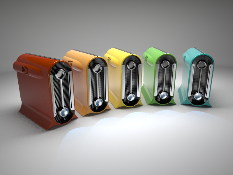
A little test of studio light setup. V-Ray for Sketchup.
Some weird shadow-blotches - annoying, but I'll sort it out for the final render. Also need to improve the power indicator lights.
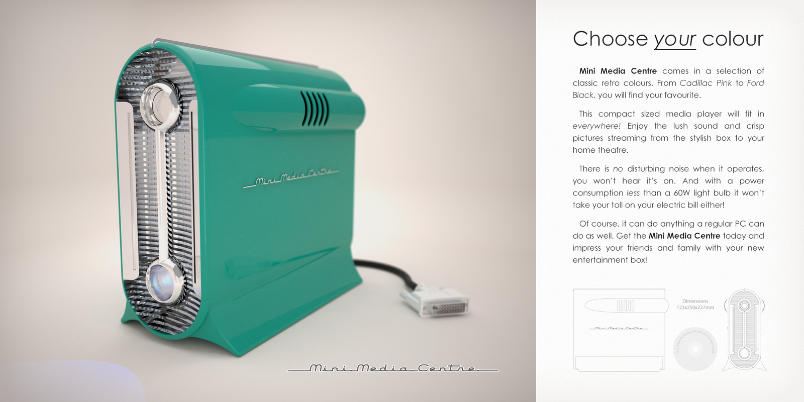
Model from my Final Major Project - a retro computer case design for a mini-computer. http://workshop.thomthom.net/minimediacentre/
-
Its looking pretty slick!!
-
Mate did you design that???? It is SO COOL, mate I want one, like really want one!
I hope you don't mind but I'd possibly prefer to see the front grill with not so much chrome, possibly generically off white with chrome highlights! BTW how can you have a retro computer? Doesn't look like a commodore 64 at all!
As the studio goes, the lighting just seems a bit harsh from above, I'm almost wanting some specular highlights coming from the left of scene given you have rotated this side forward.
Maybe for the final a closer and lower camera and a bit of DOF and possibly all against a black background - remember though its always subjective to ones own tastes!
I've always thought about Box design - and always wondered why no one has come up with an executive series that conbines a nice honned granite sides with dark timber veneers. I know the thing would be heavy as hell though knowing if I put a hot pot on my granite kitchen bench it cools rapidly - metal surrounding hot gear and then trying to cool is just seems to be wrong!
Would love to play with this scene if you care to share the model after submission!
Well done all round mate!
-
Mate I didn't realise till I followed your link that you have actually built this for real! Man reading through your process I was amazed - WELL DONE AGAIN!
I hope that everyone who looks at this post follows your link!
Posted again so they don't miss it!
-
That second image looks amazing Thomas.
You have pulled off a fantastic design and project here.
I can't believe you actually made this thing, that is so good!
A great site you have put together and again, what a fantastic project. Well done
-
Thanks for the kind words everyone.
Richard: Thankyou for your comments on the studio setup. This was my first real attempt at such a thing. I'm mostly doing exterior arch stuff - so this was a new thing to me. Good to get some feedback on this. Was hoping to such when I posted.
Would be interesting to see what other people would make out of this scene. I'll see if I upload the scene - but I'll be after my US trip next week. -
I bet it is fantastic to actually feel this baby in your hands.....I don't know thom....I knew you are a great professional guy, but this...after this I mean, you became another man into my eyes! RESPECT!
-
wow nice work

-
thom
that is beautiful! Find yourself a maunfacturer, I want one!
-
wow. this is inspiring! i want to build something now!
Hello! It looks like you're interested in this conversation, but you don't have an account yet.
Getting fed up of having to scroll through the same posts each visit? When you register for an account, you'll always come back to exactly where you were before, and choose to be notified of new replies (either via email, or push notification). You'll also be able to save bookmarks and upvote posts to show your appreciation to other community members.
With your input, this post could be even better 💗
Register LoginAdvertisement


