Kitchen reno
-
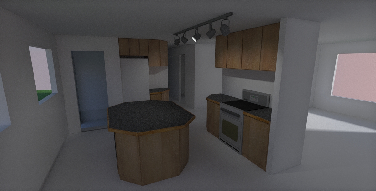
C&C, not so much on the render cause i'm no expert and these are just SU textures. what i'd like is opinions on the layout.
of course any render tips wouldn't go unappreciated.
-
I guess my main question would be, where is the sink? It looks like sort of an awkward space so I don't know if I could really suggest any particular improvements if your pretty much limited to those 2 walls. Personally I'd probably favor a squared off cabinet and countertop on the back side at least with a 12" overhang and some barstools. But maybe that wouldn't suit the needs of you or whoever the kitchen's for. It might also be helpful to show the backsplashes and even some small appliances that will end up on those counters. I suspect they'll fill up quite fast. A microwave would fill up any one of those spaces, then if you/they leave a coffee pot, toaster, knife block,etc. out the others will go quickly. Again, I don't know if there's a solution since you're probably limited in space but it might help to lay it out and make sure it works.
-Brodie
-
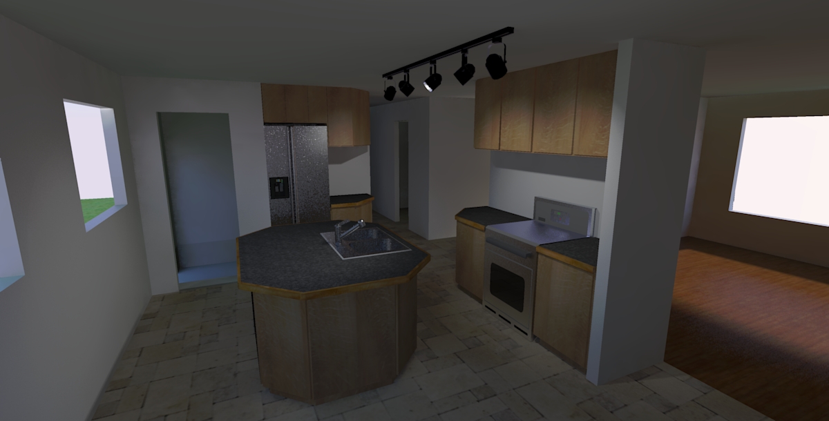
very good points, thankyou. its incomplete so to answer your question, the sink will be in the island. i was also thinking that a breakfast (raised back with stools) might be nice on the island. it really sucks that everytime i do a kitchen there's such limited space. i'll be thinking about this one for a while to make the most of it.
here's an update with the sink and some really bad stainless texture:

-
Hello
I'm relatively new to the forum, but I would like to offer some help. I wonder how you are going to use the window wall? It looks a little bare. I guess you want to keep that side free for traffic flow. Also, how much space do you have between the oven and the island? It looks a little cramped but that could be the perspective. What about a U-shaped island with the sink in the middle? It still leaves traffic flow through the space (leave space at either end too) but takes account of the requirements needed to work with the oven/sink. Curves also soften the space and are quite dynamic. How do you deal with the fan over the oven? Happy renovating! -
thanks for your interest and comments everyone. i've decided to totally redo things and move the cabinets to the wall behind the camera and the viewed area will become dining instead. i will post new layout for opinions when i'm done playing

-
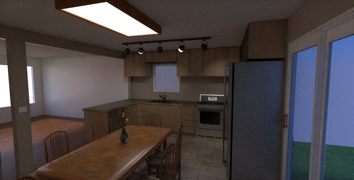
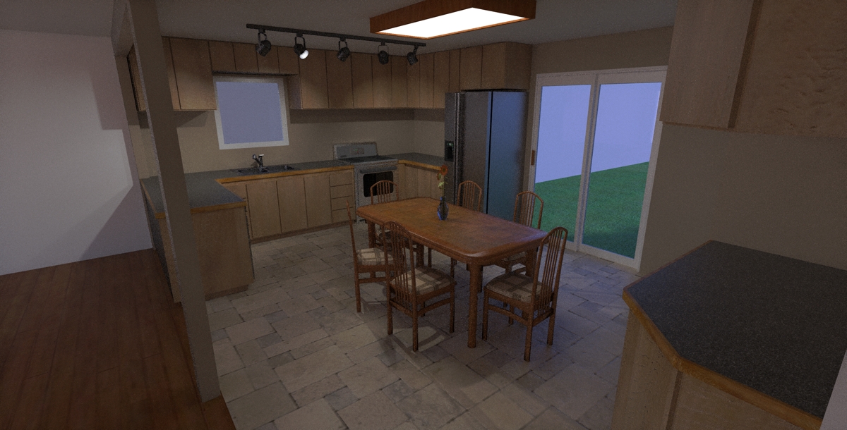
here's what i think i'll go with. total reversal of the room. any thoughts?
-
Nice pics.

-
That looks like a much better setup to me than the previous version. It's more traditional (L-shaped) which I think is good when it comes to kitchens as the traditions are there for functional reasons.
Couple things to think about...I'd put an overhang on your peninsula countertop (12" is pretty standard) with some bar stools on the non-kitchen side. The other thing I notice is the dishwasher that's in the peninsula. I don't think it hurts you to much functionally since the door being open wouldn't block you from standing in front of the sink. However it still sort of wants to be right next to your sink - slightly better functionally and easier plumbing-wise. With your space limitations, though, that might mean a different stove that can go in that peninsula. The downside to that though is that it's nice to have that nice big uninterrupted peninsula top w/o being broken up by a cooktop.
Other than that your detail in the model is looking pretty good so far. Only other thing you might want to show, as I believe these renderings are mostly for you visually, would be the backsplash for the countertop. That might add a little something visually.
-Brodie
-
Rocky, improved design but a few things to consider:
You will need a vent hood over the stove, at least 24" above the cooktop. In some areas, there are also restrictions on the wall cabinets adjacent. You should also consider a washable surface, such as tile or stainless steel, on the wall behind the cooktop, for any food splatter.
The space between the countertop and wall cabinets above is usually around 18". This makes it easier to access items inthe wall cabinets, and still leave enough functional room on the countertop.
As Brodie mentioned, the dishwasher is normally placed next to a sink. The dishwasher's plumbing it typically connected to the sink, plus some items require rinsing off in the sink prior to placement in the dishwasher.
You might want to consider closer task lighting, such as under the cabinets and over the sink.
The table looks too close to the fridge; if someone was sitting in the chair, they'd be int he way of opening it.
Nice renderings.
-
Good call Daniel, lot of things I didn't pick up on. The 18" is almost an absolute and that space is looking more like 24" between the countertop and wall cabinets. Typically the wall cabinets, then, are 30" which puts the top of them at 84" but they also come in 36" and 42". So if you've got 8' ceilings (with no soffit) and want to run them up to the ceiling you should be looking at the 42" high wall cabinets.
Also the cabinet above the stove, as Daniel mentioned, should be shorter. If you're going w/ the 30" cabinets it usually ends up being either 15" or 18" high (adjust the height accordingly if you go with taller than 30" cabinets).
My experience comes from designing kitchens in a big box store while I was going through college so I tend to think in standard dimensions. Of course if you go custom you can do anything but I don't see any compelling reason in your layout to go custom. Where I used to work the kitchen cabinet manufacturers used to put out a really great catalog with every type and size of cabinet they made. I used to pass those things out like pancakes as it gave people a better idea of standard sizes and showed them cabinets and features they never knew they could get. You might think about going someplace local and seeing if they have anything like that. Cabinets nowadays have some pretty cool crap between pull out this and thats, slide out shelves, automatic closing drawers, etc.
-Brodie
-
Awesome, very helpful comments guys!
First of all the dimensions, except for the major ones (countertop & appliance placement) are very loose. this is mostly a layout study, i will be building the cabinets myself so when the time comes i'll use Solidworks and do proper drawings.
 for above the stove i found a microwave+hoodfan at Sears so i think i'll go with that. backsplash will be tile. i'm also considering putting a couple pot lights over the sink. as far as the dishwasher it can easily be reached just by turning and since i'm also doing the plumbing and have easy basement access. i like the cleaner uncluttered look to the cabinet fronts without the dishwasher being crammed in. also i'll add a top view to show the clearance of the table, it seems ok to me.
feel free to give more comments i find them very useful. thanks guys.
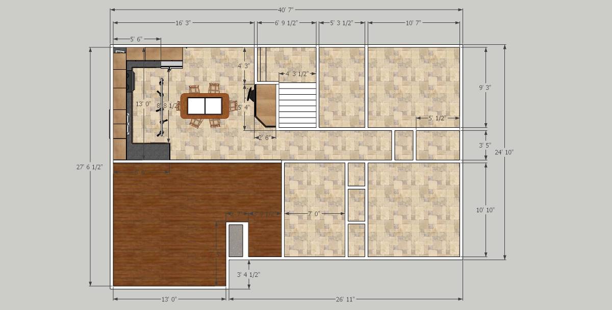
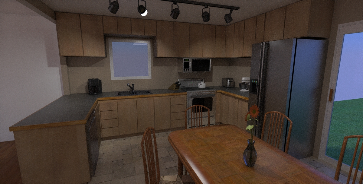
-
Glad to see you've thought out a lot of this stuff already. That's awesome that you're building the cabinets yourself! You'll have to post pics when it's all done.
As for the last rendering I'd recommend raising the microwave up some. I think you'd find that area pretty cramped. Typically the microwave/hoods are 15" and the bottoms are flush with the bottom of the rest of the cabinets.
-Brodie
-
definatly will make the micro/hood higher as well as lowering the upper cabinets. i usually just print off the renders at this stage (when the projects my own that is) then draw over them and make notes. i find it a lot of work at this stage to make those seamingly small changes which will inevitably be made from my notes in the final drawings. (just lazy i guess) maybe next time i'll make them components instead of groups that way i don't have to resize each one.

oh what the hell, i'm bored anyway! i'll post the tweaks later.

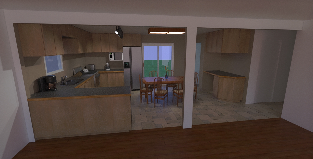
And yes i'll definatly post the real world project when i'm done. meanwhile here's a shot from the living room. i like the idea of the counter seating area but i think i would make it fold away because i was considering place the couch (possibly a sectional)there.
-
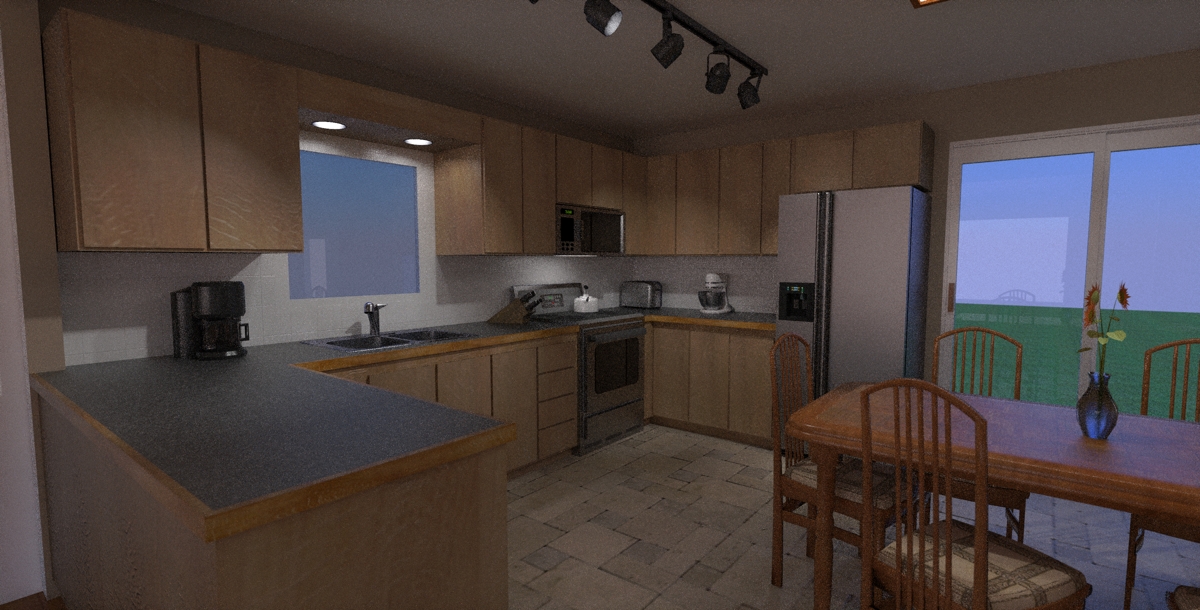
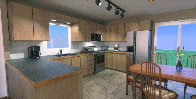
OK here it is: cabinet heights, tile backsplash, extra lighting, the whole nine. Wasn't that bad actually
 I even through in a little DOF just for kicks
any ideas what to do with that space above the cabinets, i do hate it so. it doesn't look right with the cabinets extended up or boxed in ????? or open for that matter!

BTW, what do you guys think of the colors?
-
a
-
hrm...I can't see your last image. Sometimes the internet blocks they have at work here do that too me. Could you attach it like the other images?
-Brodie
-
well i can see it but here it is again, cooked longer now anyways. the DOF isn't even noticable to me!? i set the focal point to the faucet and the f-stop to 4??
guess i'll try 2.8 and see what happens.

-
Wow, that's really coming together. For supposedly not focusing much on the rendering aspect many of your materials are looking quite good (the laminate countertop and stainless steel appliances in particular).
As for the space above the cabinets I've never really seen anything very appealing myself. I prefer the cabinets to go all the way up personally. They end up going way too high to be used on an every day basis but you can always put junk up there you don't need often.
I like your minimalist cabinets but something seems off to me. I'm not sure if it's the coloring (reminds me of unfinished oak) or that the style may not fit the rest of the space (I'm used to seeing those minimalist cabinets in arsty renderings or photos of downtown lofts that no one lives in yet).
Are you planning on doing cabinet knobs or are you sticking strictly minimal?
-Brodie
-
Hi xrok1, Your renders are dark. I did a quick pp on one, but not sure if those are your colors. Upload a SU image, might be easier to evaluate.
Btw, although wood edges look nice along the counter top, they look bad after a few years. Better to use something that wears well, and looks good. The row of track lights will cast your shadow on your work at the counter. Unless you put them there to light the render, move the track closer to the counter top.
-
thanks brodie, i have to admit i am a minimalist, i figure my wife will clutter everything enough that i don't have to.
 i really didn't plan on handle but maybe if i can find some small, curved, brushed metal to match the appliance handles (not the ones in render) i may reconsider??
  BTW, i really appreciate your (and everyones) comments, it great to get other views from experienced people
  . cheers!
honolulu, thanks foe the tip on the lighting, very good point. as for the brightness they look maybe a little darkish not dark on my machine, but the one you did looks a little over bright to me. maybe its because i'm used to mine or maybe because i'm going for a warm area and prefer it a little darker i don't know. opinions anyone?
by the way i'm onto the living room so i'll post some renders of that soon.

Hello! It looks like you're interested in this conversation, but you don't have an account yet.
Getting fed up of having to scroll through the same posts each visit? When you register for an account, you'll always come back to exactly where you were before, and choose to be notified of new replies (either via email, or push notification). You'll also be able to save bookmarks and upvote posts to show your appreciation to other community members.
With your input, this post could be even better 💗
Register LoginAdvertisement


