Clubhouse WIP - Podium renders
-
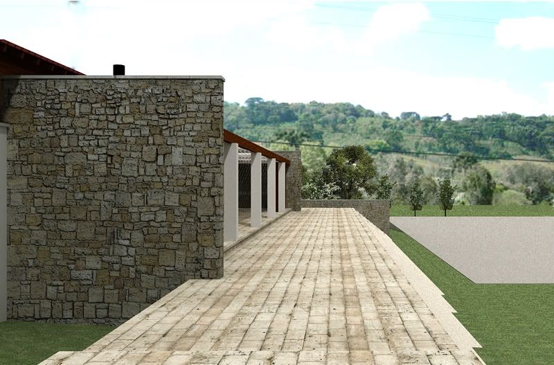
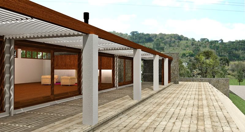
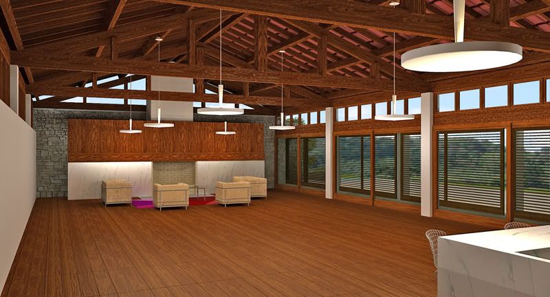
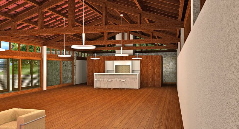
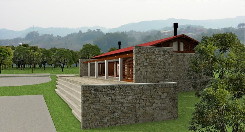
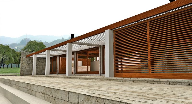
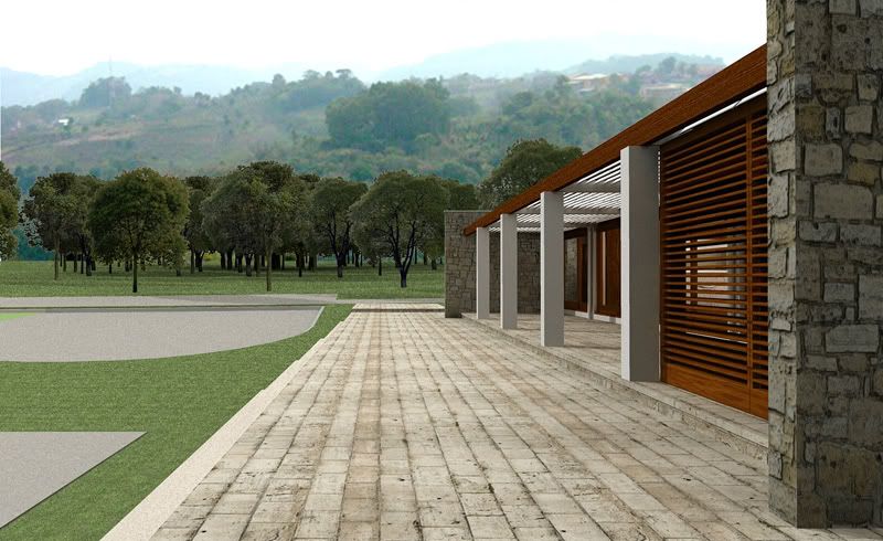
this is for the same housing development as the gatehouse posted here. again there was a previous flat-roofed version that the clients hated. let's hope this one is more successful.
it is a simple pavillion with a porch which also helps to control the late afternoon sun from west.
-
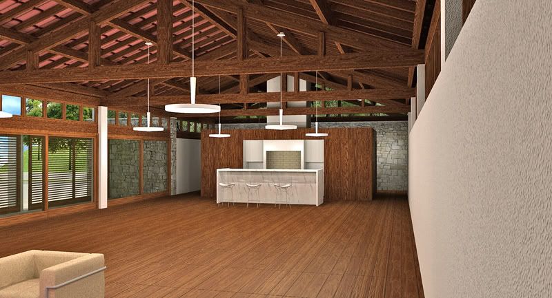
Nice renders. The interiors look a bit over saturated (especially the wood).
Scott
-
The flat roof design looked...dreamier, but this one is sweet too: good work Edson!
-
thanks, tom and scott.
@tom: i wonder if the clients felt the former design was dreamier. to them it must have felt like a nightmare...
@scott: sometimes it is difficult to see well after hours of involvement with a project/render. i will check to see if reducing saturation will improve these renders.
-
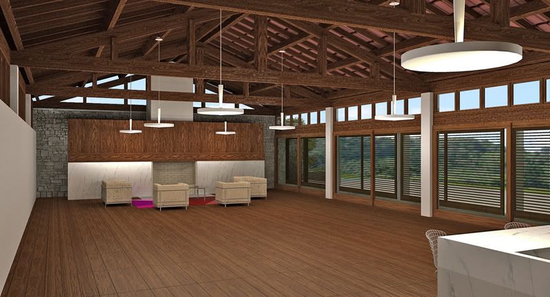
the two interior images desaturated.
-
Great job Edson.
Hello! It looks like you're interested in this conversation, but you don't have an account yet.
Getting fed up of having to scroll through the same posts each visit? When you register for an account, you'll always come back to exactly where you were before, and choose to be notified of new replies (either via email, or push notification). You'll also be able to save bookmarks and upvote posts to show your appreciation to other community members.
With your input, this post could be even better 💗
Register LoginAdvertisement


