NPR Style
-
Hey Guys,
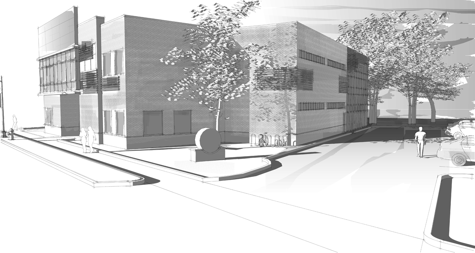
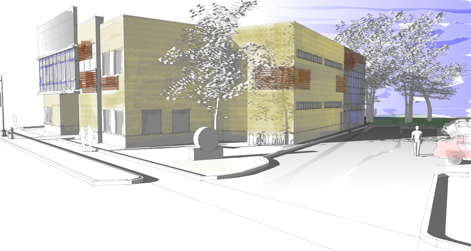
Tried out a NPR style for the first time, with a marker feel. Image will be eventually mounted 28" wide with some more shots. Let me know what you think of B/W vs Color version.
Thanks in advance,
Brett
-
Just lovely, Brett!
I'm partial to the color one myself...very subtle so quite strong. (I think, though, the lower left corner needs something to balance the composition...just a brushstroke of tone or color?)
-
Great work. It is hard to choose as I like them both. But I think I will have to side with Tom on this, the color is nice.
-
Those really look nice. How much photo shop work was involved in that?
-
Thanks guys. About 5-10 mins. Hence why I liked the B/W version. But the color seems to be winning so far
-
More contrast
-
Any chance of seeing a tutorial of how to achieve those results in PS.
-
Ditto, Fossa, this is my kind of output!!!
-
5-10 minutes?! I'd love to know what you are doing there. I prefer the last image you posted. like the colour too but the red car unbalances it for me.
Jon
-
Dont have time for a tutorial right as im still in school, but i'll run through a few things.
I apologize as i forgot to mention this is from Piranesi, not Photoshop. Although the this can be easily done with Photoshop too.
- Export .epx from SU (SU file has the sketchy style with the shadows on as well)
- Open with Piranesi
- Grab a brush, set color and dropped opacity to around 30%
- For faded strokes, set Fade distance and have the Fade eventually drop to transparent
- For the textured stroke (brick). Same as above but with no fade, just layered some strokes. Instead of selecting a color I used a brick texture.
- Other strokes, such as windows were done by playing with the size and opacity.
- Export image (tif, jpg, the B/W version is just exported as Grayscale)
- Bring into Photoshop, adjust curves with a few clicks, and you're done.
The thing about Piranesi is that you can lock onto faces/axes and when you paint, it only paints those.
For photoshop, this is all easily done as well, without the benefit of face locking. I not exactly sure where the brush settings are, I think its in Brush dynamics or something like that, perhaps a more seasoned Photoshop person can chime in. Having a tablet would be nice for this kind of work, wish i had one.
-
Very nice, Brett. I've no preference for one over the other. It would be nice to see the final presentation, with all the images.
-
I wondered how you painted around that tree in the foreground and got that brick texture. I've been playing around a little in PS trying to get the same result. It requires a little more work with the selection process and you already have to have the brick on the building as a sketchy material from SU if you want that brick pattern.
Speed's the name of the game here in regards to 'rendering'. I'm going to throw one of these in front of the boss and see what he thinks. Can't wait to see it get beat to hell.

-
If you have for example like mine - a tree to paint around, why not export the image with no trees. Do your painting and then export an image with just your trees and overlay that on top of your 'painted' image.
I was going to say you can use a texture (such as a brick pattern) for your brush. I guess the trick there is trying to match the perspective or orientation of the brick on the face of the building you are painting on with the brush. If that makes sense? haha.
Hello! It looks like you're interested in this conversation, but you don't have an account yet.
Getting fed up of having to scroll through the same posts each visit? When you register for an account, you'll always come back to exactly where you were before, and choose to be notified of new replies (either via email, or push notification). You'll also be able to save bookmarks and upvote posts to show your appreciation to other community members.
With your input, this post could be even better 💗
Register Login


Advertisement