Clay Renders
-
Hey,
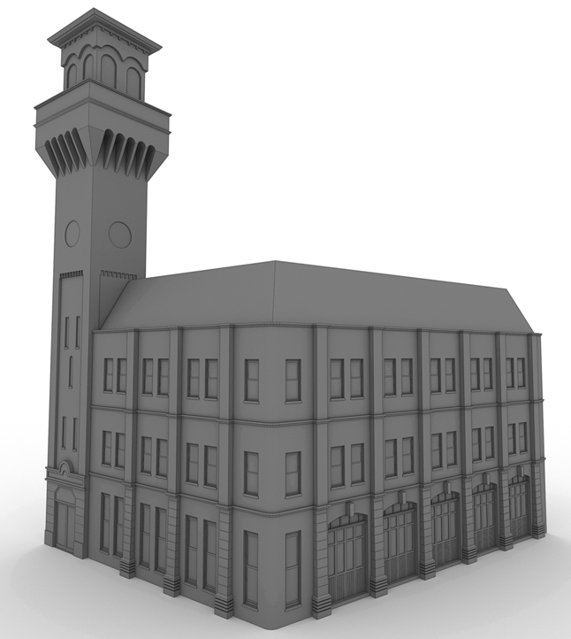
I am currently working on a clay render and I am looking for some tips on how to improve it and give it a bit more atmosphere, all tips and tricks are appreciated.......
zzzSPUDzzz

-
What are you using to render it?
-
I'm Using Vray & Sketchup...................
-
can you post settings?
-
I'm not a v-ray user so I can't give you any program specific advice, but I'd suggest putting in a bump map for the exterior (stone?) and roof materials. i think that would give the building a lot more depth, so to speak.
-Brodie
-
I think you should make your glass transparent and also maybe render it with black and white hdri background.
-
Shadows add alot.. it looks like the shadows are currently behind the building.. change them to the front and angleing slightly right to left or this should help give the building more depth.
-
@zzzspudzzz said:
... how to ... give it a bit more atmosphere ...
Sweet model and some good suggestions about lighting, background, etc., but I'm a little confused about the assumptions and prerequisites here.
It seems to me that "clay" and "atmosphere" are inherently contradictory. Isn't the point of a clay rendering to remove as much texture (which, to me, is all about the "feeling" and thus the atmosphere) as possible and just concentrate on mass and form?
Or is that contradiction part of the artistic goal, to create conceptual tension by having something moody in Gumby-world?
What are you actually trying to do?
August
-
Hey,
Thanks for all the good advice I have added some bump maps and changed the shadows as suggested, I couldn't add a black and white hdri map as I haven't got one, but would like to see what kind of effect you get from this so if you have any images could you post them...
the render settings are just the standard sudio settings that come with Vray......
August your spot on what you said about clay rendering, I guess I was looking for something that would make the drawing stand out a little.......
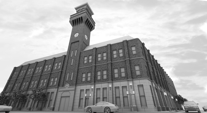
Here is an update with the changes made..........

-
Wow, it's looking really great now! Very dynamic camera positioning as well, really emphasizes that tower. I think it'd be interesting to see with some dark but reflective glass. I think someone mentioned that before. I'm not sure if it'd help or not but definately worth a shot I'd think.
Looks great!
-Brodie
-
@zzzspudzzz said:
August you're spot on what you said about clay rendering; I guess I was looking for something that would make the drawing stand out a little ...
Thanks. I never know how comments like that are going to be taken. Glad you got the positive message that I meant.
This new version has the form-only aspect of clay and yet with the camera angle and the sky you have definitely created something moody. The texture of the brick and the details of the lights and the clock don't really violate the presumptions of "clay", yet they add a realism. With the colorless trees and vehicles, it takes on some of the qualities of deeply moody films from "The Cabinet of Dr. Kiligari" to Gotham in the original Batman movie. Nice effect.
Yours,
August -
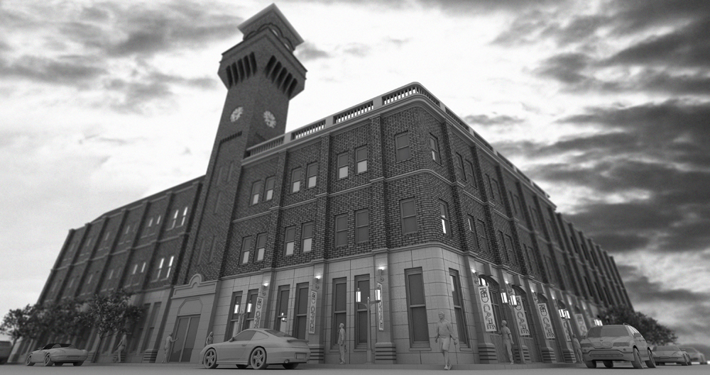
Thanks lads for the comments I appreciate the help........Here is an updated version with reflections in the glass and lens blur.....

-
A #1! Looks fantastic now. Really great work.
-Brodie
Hello! It looks like you're interested in this conversation, but you don't have an account yet.
Getting fed up of having to scroll through the same posts each visit? When you register for an account, you'll always come back to exactly where you were before, and choose to be notified of new replies (either via email, or push notification). You'll also be able to save bookmarks and upvote posts to show your appreciation to other community members.
With your input, this post could be even better 💗
Register LoginAdvertisement


