Institute of Architects of Brasil HQ (Podium renders)
-
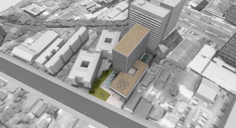
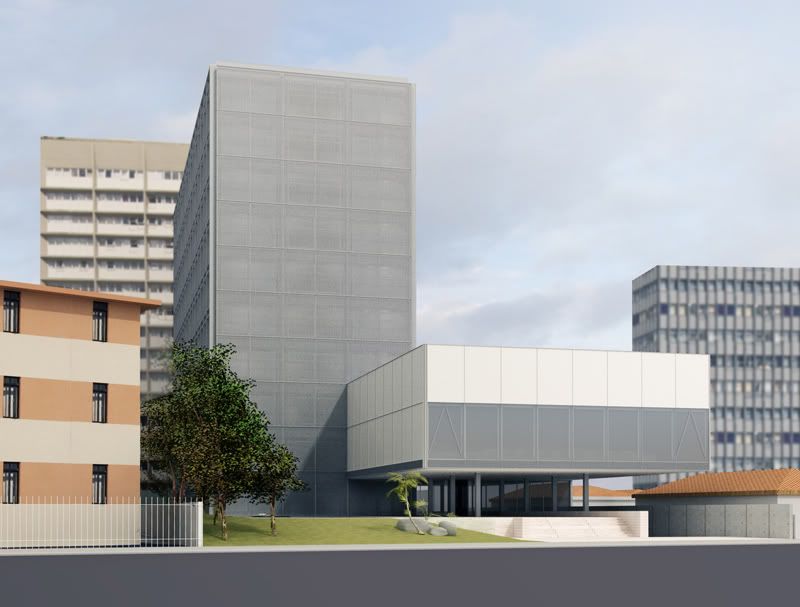
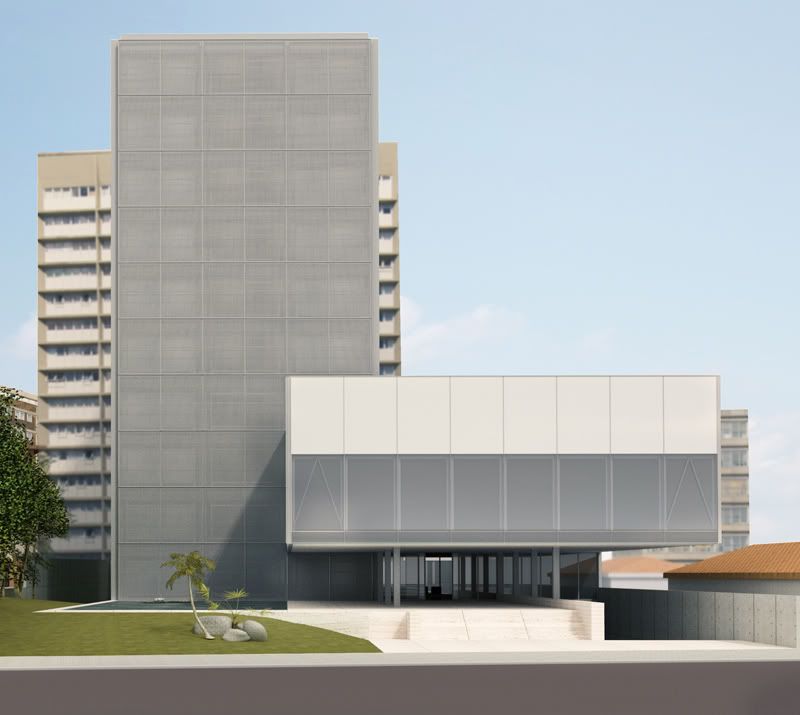
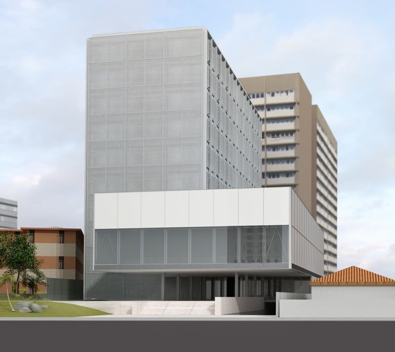
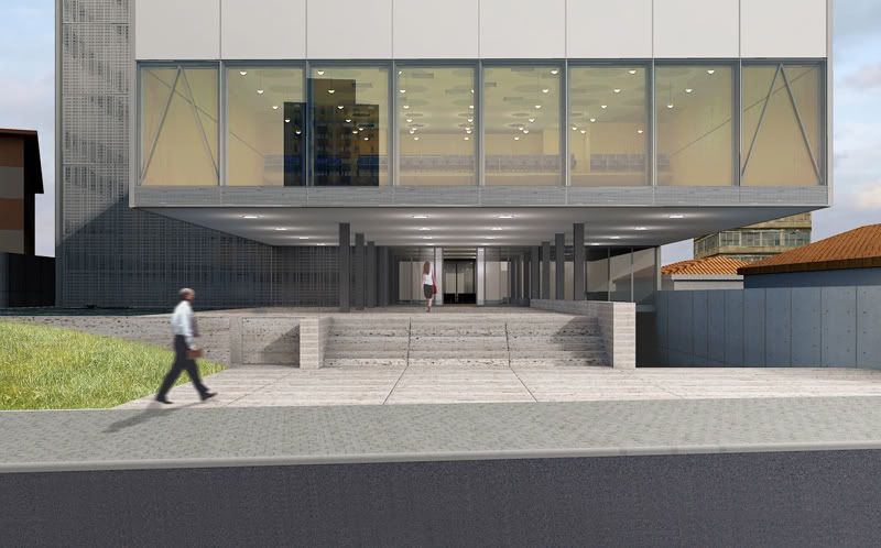
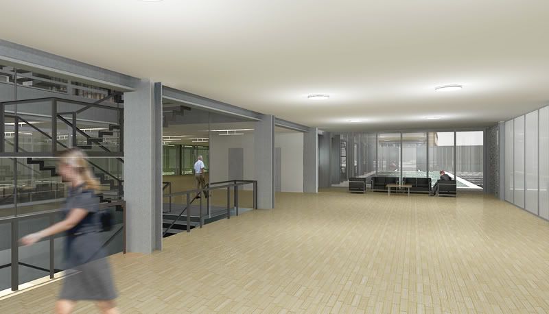
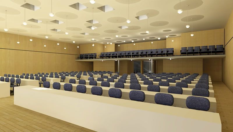
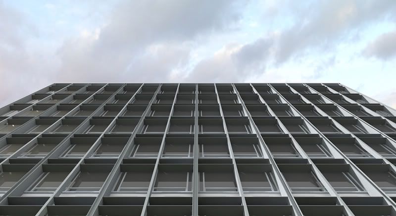
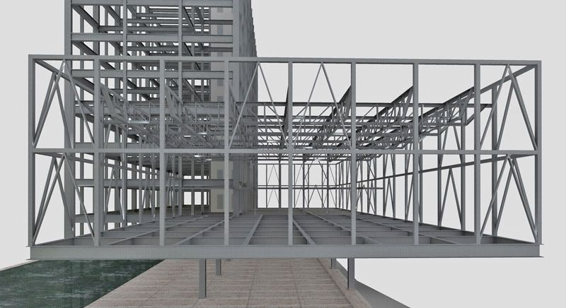
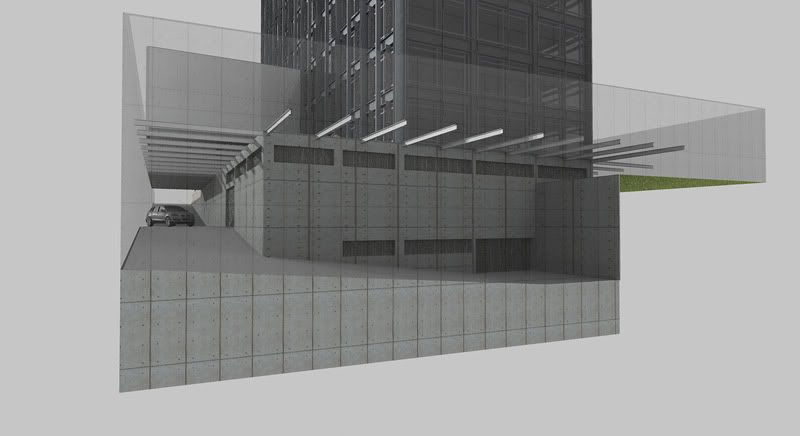
this is my latest design effort: the Institute of Architects of Brasil HQ in Curitiba.
-
Yet another beauty, Edson!
-
Very good work, design and rendering!
-
Top-notch renders. As the structure and spaces are so simple (with elegant proportions), should the interior materials be somewhat "richer" (like wood and stone with a more pronounced grain) for the design not to read as "bland"?
Anssi
-
thanks to all for your kind comments.
@ansi,
the idea is for the wood and stone to give some warmth to the design. perhaps my renders do not get that across but this is the idea. all in all, my intention is to achieve a neutral setting for the people who are going to use the building and who will give it color and movement. i am wary of too strong an architecture and very much prefer to call this kind of space neutral rather than bland (mind you, not that you are saying this). -
I would like to hear more about the screen system you are using!
-
@mirjman said:
I would like to hear more about the screen system you are using!
i trust you refer to the screens on the short sides of the tower/slab. well, it is a perforated steel panel with square holes (2,5cm/1 inch) that is repeated many times over a steel frame made of tubes. the idea is to shade the glass wall that is the actual limit of the interior space. the space between them acts as a chimney and helps to keep the east and west facades from overheating.
i hope i answered your question. if not, let me know.
-
wow so beautifull...
can you give me trees models and grass texture?
tnx!
-
@unknownuser said:
wow so beautifull...
can you give me trees models and grass texture?
tnx!
thanks, GdB. unfortunately, i cannot give those away as they are components sold at solo's place. some come from the 3D Garden pack, others from tomsdesk's pack. they are excellent components at a terrific price.
Hello! It looks like you're interested in this conversation, but you don't have an account yet.
Getting fed up of having to scroll through the same posts each visit? When you register for an account, you'll always come back to exactly where you were before, and choose to be notified of new replies (either via email, or push notification). You'll also be able to save bookmarks and upvote posts to show your appreciation to other community members.
With your input, this post could be even better 💗
Register LoginAdvertisement


