DWanimations | Vray winner | New render
-
Hi all,
It`s a long time ago that I posted here.
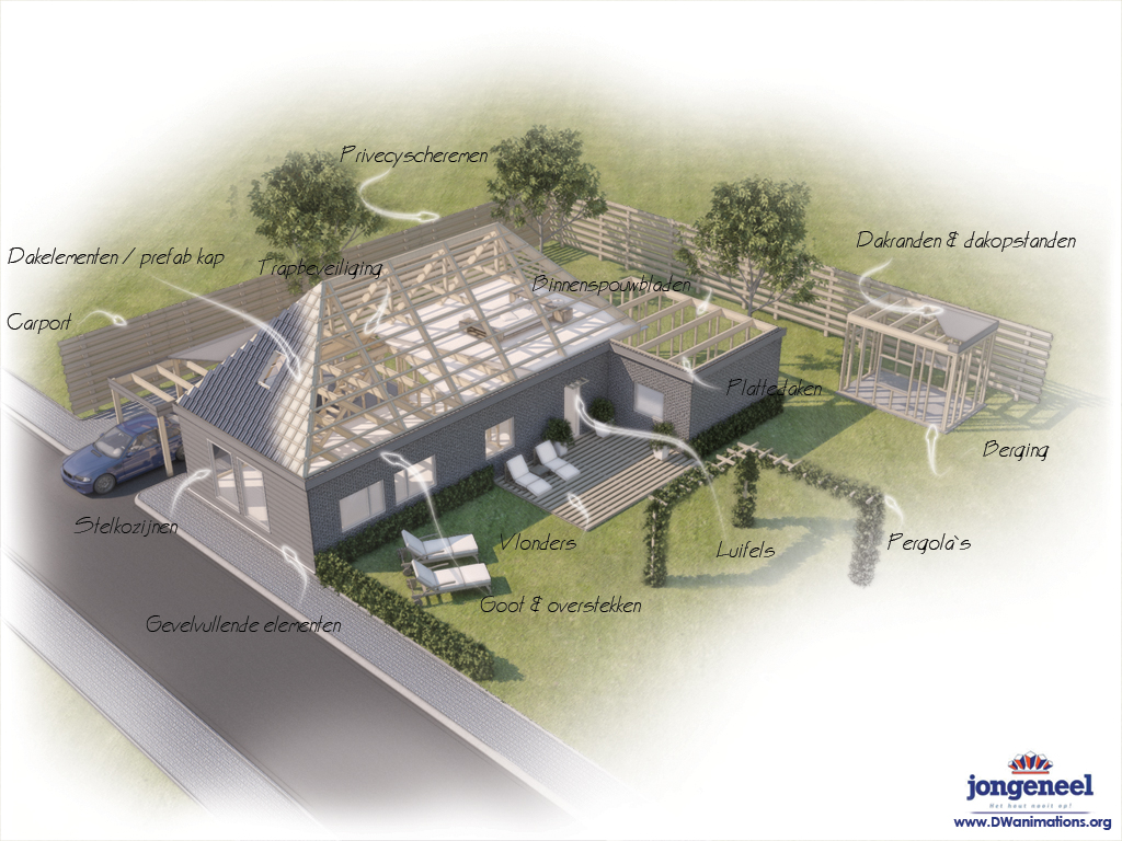
I have created some new renders one of them is shown below. It was a first time for me to create an render like this. I hope you like it, C&C most welcome. It was made for a Dutch company.
And I am very pleased to say that I have won the First Vray-render competition. check it out on: http://www.facebook.com/note.php?note_id=61221925841&ref=mf
Dirk de Jongh
http://www.DWanimations.org
-
Dirk, nice presentation. Congratulations.
Although, I must say... the arrows have a resemblance to a certain male biological matter.... (please don't make me say it!)
-
I'm of a pure mind, so I only see tadpoles.
-
hi dirk ive seen your work since your first post on vray for skp gallery, and i like your style, more on interiors, but the exterior for me its too flat, or maybe thats the concept of the visual design, i mean its only my opinion, but on interiors i think you make a great work,,,also your web page its really cool..see ya bro.
-
@tinanne said:
Dirk, nice presentation. Congratulations.
Although, I must say... the arrows have a resemblance to a certain male biological matter.... (please don't make me say it!)
That is great. I got the same impression, but I figured that it was just my own warped sense of humor. Either Tinanne is also warped or this is an indication that the perception could be wide spread. Anyhow it provided a good laugh.
-
Dirk,
Nice presentation technique and Congratulations.
-
-
thanks for all the reactions...

teofas:
You find my exterior stile to flat... ? Than I would really be interested in explaining what you ment whit that and advice me how to do it better.
Thanks all
-
Goodlooking image, Dirk.
I spotted spelling errors, though (and the use of capital letters is odd, too). As a customer, I would not be pleased with those.Congratulations on winning that contest. Helemaal verdiend.
-
Being dyslexic simply isn't an excuse if you are doing this professionally.
-
John's right, Dirk. Look, I get it. I got dyscalculia. Couldn't do maths with a gun pointed at my head. So I use a calculator.
Besides, in this case the text is an integral part of "the work", isn't it? Just have someone check it.
-
Oke thanks
-
i mean its a little desaturated, no contrast on colors, etc, also the render quality its just ok, compare to your interiors,,,please dont take this the wrong way, i just feel to say this because i think you can make it better, but this is only my point of view and i can be wrong,,,anyway this is a good job!

Hello! It looks like you're interested in this conversation, but you don't have an account yet.
Getting fed up of having to scroll through the same posts each visit? When you register for an account, you'll always come back to exactly where you were before, and choose to be notified of new replies (either via email, or push notification). You'll also be able to save bookmarks and upvote posts to show your appreciation to other community members.
With your input, this post could be even better 💗
Register Login


Advertisement