Product rendering
-
Hi there guys....

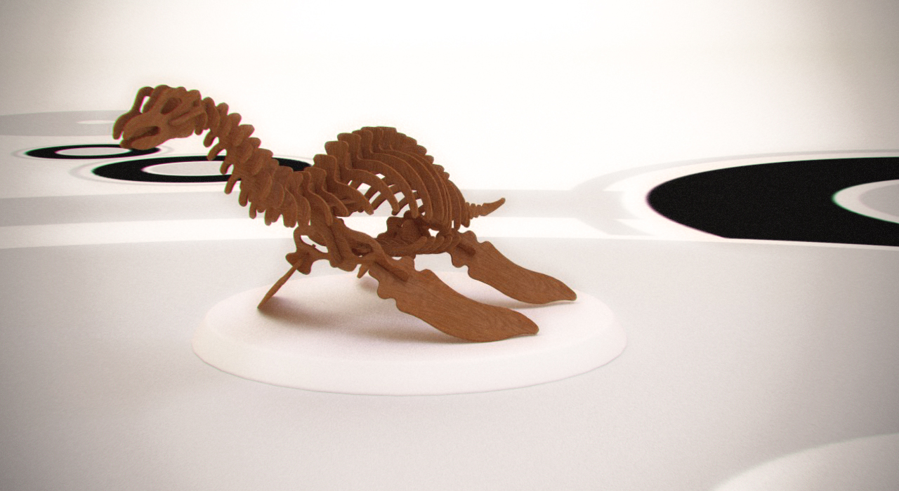
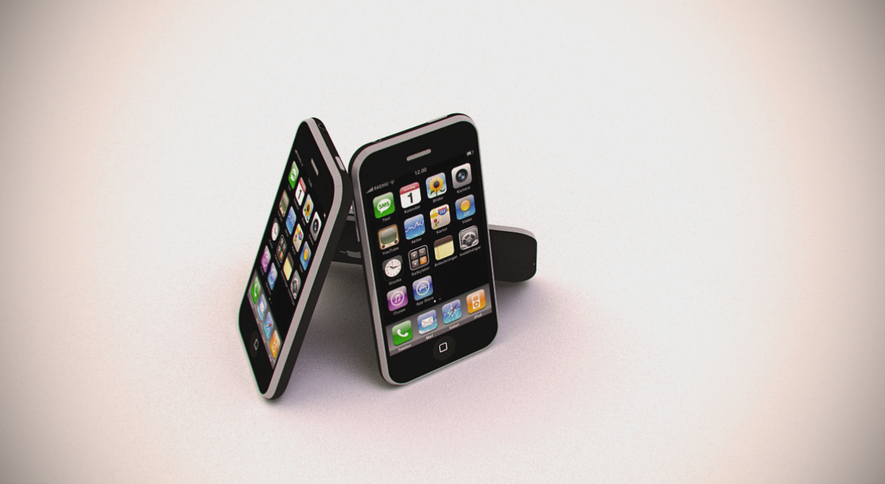
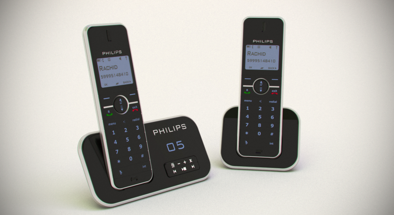
i'v been trying to perfect my product rendering skills and decided to get some 3DWH models to render them out...
I used V-Ray for SU 1.5...and for Post-pro I used PSCS4
the models are in a STUDIO setup i created for small product renders, still need to work on the large scale studio.
Some comments would be much apreciatted so i can keep perfecting my renders.Kind regards,
Rachid de Wind


-
Very nice work, Rachid!!!
-
perfect rendering...

-
Two thoughts.
The lighting looks too flat. I think two things contribute to the problem. One the white background seems to overwhelm the product. This effect is strongest in the wood dinosaur. I would put a spot light above and behind the dino so that it strongly highlights the top edge of each rib/spine element.
I would also layer the image in photoshop. Make two copies. Label one product and the other background. Then use levels to optimize the background tone in the "background layer" and to optimize the product in the "product layer". Put the product layer on top and erase the areas around the product with a soft brush to let the optimized background to show through.
I think you will be amazed by the difference.
What I don't understand is why there is color fringing around the dinos head (most noticeable at the enlarged size). It is as if this were a photo taken through a cheap plastic lens. How does a rendering engine do chromatic aberration unless there is a cheap lens filter in the software. Very odd.
Thes are good renders but might be able to show more life if the lighting issue are addressed.
-
I think the fringing has been done postpro Roger. Anyhow, excellent renders you have there - looks like you have Vray mastered!
-
thnx guys for your comments, really makes me feel better about my renderings.
@roger said:
Two thoughts.
The lighting looks too flat. I think two things contribute to the problem. One the white background seems to overwhelm the product. This effect is strongest in the wood dinosaur. I would put a spot light above and behind the dino so that it strongly highlights the top edge of each rib/spine element.
I would also layer the image in photoshop. Make two copies. Label one product and the other background. Then use levels to optimize the background tone in the "background layer" and to optimize the product in the "product layer". Put the product layer on top and erase the areas around the product with a soft brush to let the optimized background to show through.
I think you will be amazed by the difference.
I will try that out when i get home......
@roger said:
What I don't understand is why there is color fringing around the dinos head (most noticeable at the enlarged size). It is as if this were a photo taken through a cheap plastic lens. How does a rendering engine do chromatic aberration unless there is a cheap lens filter in the software. Very odd.
Thes are good renders but might be able to show more life if the lighting issue are addressed.
Like cadmunkey said, it was done in post-pro, the dinosaur was my first attempt at the studio rendering and the effect in photoshop...
I then went on for the phones...wich to be honest came out better than the dino because i changed some settings for the phones.@cadmunkey said:
Anyhow, excellent renders you have there - looks like you have Vray mastered!
not exactly mastered but thanx for the comment, i do have a lot of the setting/parameters of v-ray down...still learning though

One problem i still have with this setup is the lighting as mentiond above by Roger....
i have little to no understanding of studio setups
i made this one based on a concept I saw on a tv ad
but as far as lighting go, i do not know where to place these, because i tried to make a nice silver effect today, but because of my poor setup of lighting it came out really flat, you can barrely see that it is actually silver.
if anyone can help me out with this, i would really be greatful....thnx again to everyone for your wonderful comments...it gives me the confidence to continue with my work.


-
Rachid, photography is less about the subject and more about controlling the light that falls on the subject.
For products you want to construct a very large surfaced even light source. You want to wrap light around your product so highlights are long, and continuous. When you do this the shape of the highlight will define the shape of the product.
See the ipod at:
http://images.digitalmedianet.com/2007/Week_35/t63buhsr/story/iphone.jpgDon't fixate on the product, but look at how specular highlights actually define the shape. Now try to create the same effect in your renders. Your lights need to be large and very close to the subject.
Think of the sun. It is 93 million miles away and takes up a very small space in the sky. The lights rays hitting earth are almost parallel and the shadows are harsh. Now imagine a late after noon storm with the light rays hitting cumulo nimbus clouds that are several thousand feet high and yet relatively close to the ground. That kind of reflected light makes old ladies young, the stupid smart, and cars look twice as fast. So in your virtual studio, you want even light from a broad source placed close to the subject. Do a series of low quality small renders and move the light around relative to the subject. You will soon be able to discover which position creates a highlight that best complements the objects shape.
-
Very good post Roger, thanks for sharing.
-
@roger said:
photography is less about the subject and more about controlling the light that falls on the subject.....................
thnx for your advise roger, I'm currently working on the tips you gave me, to make a new and improved product studio. i will post my results when i get it done....i'll be test rendering the philips phones.

-
Bon dia. Kon ta bai?
-- Roger
-
@roger said:
Bon dia. Kon ta bai?
-- Roger
 hahaha yup that's my native language,
Bon dia = Good Morning
Kon ta bai? = How are you?how did you know that??

-
My wife is from Caracas and has relatives in Curacao.
-
@roger said:
My wife is from Caracas and has relatives in Curacao.
cool....

oh and back to the topic....i really suck at lighting as i found out these 2 days

i've been trying to setup my lighting but comes out worst every time i try a diffrent setup.
don't you know anyone who can help me with this....i can post my studio setup and vray settings here so anyone can help me out.
-
Yes please post and I will try to help.
Are you using bounce light or false emitters?
-
@roger said:
Yes please post and I will try to help.
Are you using bounce light or false emitters?
not sure what you mean by this but i uploaded my SKP and VRAY setting so you can have a look.
-
It is 2AM and my brain is not functioning, so I will work with this later in the day.
-
Rachid the attached tutorial is only a starting point.
- The enclosed skip shows no lighting effect whatsoever. It is just a rough physical layout.
- Studio is closed on all sides to fully control the light. The glass efect is ony for you to see in during the tutorial. The walls need to be opaque for the render.
- Even the front wall is closed with just a small hole for your virtual camera to peek through.
- The phones must be very close to the front wall and very far from the back wall. This distance to the backwall will control the darkness of that wall. The farther from the light the darker the wall. I want the back wall dark transitioning to a white floor/foreground so the top light can paint a highlight on the edge of the phones.
- The farther the backwall is placed the wider the cyclorama and the higher the ceiling will have to be so the edges will not be seen by the camera.
- You can also narrow the field of view of the camera which I have already done.
- I may have the light/emitter too high, but it needs to be partly behind and to one side of the phones to paint a nice highlight on the edges. You may have to lower the light or increase its size.
- All the walls and ceiling can be painted to influence the reflections on the phone. This calls for a lot of quick experiments to get it right. Do at small size, low res and a rapid render mode so you can try a lot of variations. You can paoint the walls or introduce dark objects to modify the reflections.
Any questions or problems just ask.
-
@roger said:
Rachid the attached tutorial is only a starting point.
- The enclosed skip shows no lighting effect whatsoever. It is just a rough physical layout.
- Studio is closed on all sides to fully control the light. The glass efect is ony for you to see in during the tutorial. The walls need to be opaque for the render.
- Even the front wall is closed with just a small hole for your virtual camera to peek through.
- The phones must be very close to the front wall and very far from the back wall. This distance to the backwall will control the darkness of that wall. The farther from the light the darker the wall. I want the back wall dark transitioning to a white floor/foreground so the top light can paint a highlight on the edge of the phones.
- The farther the backwall is placed the wider the cyclorama and the higher the ceiling will have to be so the edges will not be seen by the camera.
- You can also narrow the field of view of the camera which I have already done.
- I may have the light/emitter too high, but it needs to be partly behind and to one side of the phones to paint a nice highlight on the edges. You may have to lower the light or increase its size.
- All the walls and ceiling can be painted to influence the reflections on the phone. This calls for a lot of quick experiments to get it right. Do at small size, low res and a rapid render mode so you can try a lot of variations. You can paoint the walls or introduce dark objects to modify the reflections.
Any questions or problems just ask.
thnx for the tut Roger, right now I can't get a look at it, because i'm currently not at home, and i'll be back home this coming week.
and i'll give it a go then, but with your tut/sugestions i think there won't be anymore troubles now
-
The difficulty will be creating the proper angle for the main light. In the real studio I can just move the lights until the lighting looks right. In the virtual studio it can involve a lot of slow iterations. I recommend test runs at the smallest size and fastest render method.
Can't wait to see how it works for you.
Hello! It looks like you're interested in this conversation, but you don't have an account yet.
Getting fed up of having to scroll through the same posts each visit? When you register for an account, you'll always come back to exactly where you were before, and choose to be notified of new replies (either via email, or push notification). You'll also be able to save bookmarks and upvote posts to show your appreciation to other community members.
With your input, this post could be even better 💗
Register LoginAdvertisement


