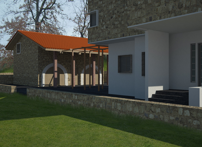
Latest result
-
Dear all,
been playing around with vray for Sketchup since december. Had a hard time on it, especially when I did'nt understand settings and other things. Lately did a job for a friend of mine, who asked me to have the most "perfect" view possible of his project. Took me a week of tweaking model and texture, but I am really happy with this one
Hope you like it!

-
Nicely done, the grass is looking particularly good. I think the stone wall could do with a little more bump though.
-
Looks good.
I know it is accurate but most of your image is in shadow. It would be nice to see some more sun on this image. -
I'd also desaturate the tiled roof in pp too. It is very over powering with regards to the rest of the materials in the image. Apply these points above and I think you'll have a much better image


-
Nice work my friend. In the environment rollout of Vray, try increasing the size of the sun to 8 and then in the same section, increase the shadow subdivisions to 24 or so. This will really soften the shadows. Also you may want to see if you can find Fredo's Round Edges plugin and take to slightly rounding, some of the edges. Set it to 1/4" and 4 divisions. The sharp edges make it look unrealistic. You are almost all the way to tricking people into thinking this is a photo. Keep up the good work.
-
thanks to everybody for the feedback

-
Like Eric said I'm not sure why you have cast the building in shadow! For me the grass looks a bit felty, needs some bump and desaturate. Great start though!
-
Looking good.

-
Good works "broomstick" , but I think the Stairs so darking!
cheers
-
Good looking render. Just the roof material and the post material seem to stick out. I'd be fooled if it wasn't for them.
Hello! It looks like you're interested in this conversation, but you don't have an account yet.
Getting fed up of having to scroll through the same posts each visit? When you register for an account, you'll always come back to exactly where you were before, and choose to be notified of new replies (either via email, or push notification). You'll also be able to save bookmarks and upvote posts to show your appreciation to other community members.
With your input, this post could be even better 💗
Register LoginAdvertisement


