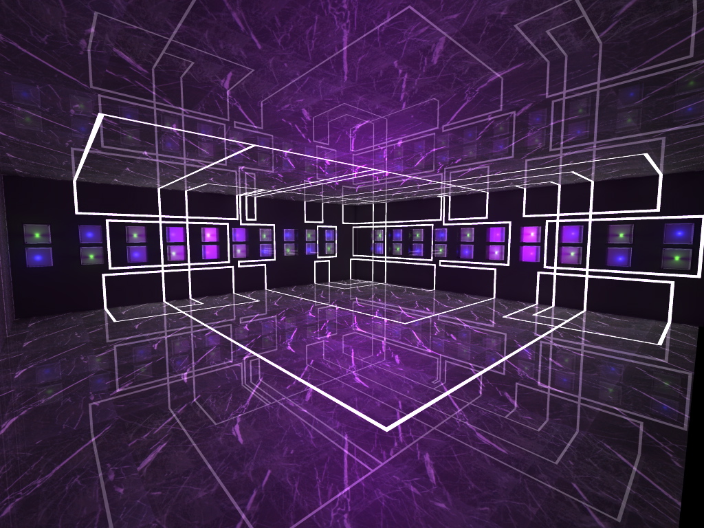
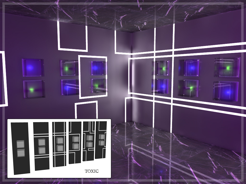
Retail Display Wall
-
Hello Everyone
I have been around for a while and never posted as I can not offer much with the company I work for not letting me display the work I do.
But I have been making some components recently and thought I would share and ask for your comments as it helps us improve.
This is a very quick render of the object I have made for retail you put the product in the glass box and off you go. This can be added to renders for interest after you have designed the external shell of a building for quick projects.
Hope you like it (have a look at my other submitted models if you have any comments I would love to hear them)

-
interesting idea: i like the conbinations you can make with this modular elements.
What is it desigend for? I cannot exactly imagine what kind of item are you going to show in the glass boxes: it looks to be something tiny and hi-tech like a smartphone or some other electronic gadget.Let me say that the colors you used are a little bit scary - I would hesitate before entering in this "dungeon"
 have you thought about some warmer color combinations?
 -
Its exactly for what you said gadgets and phones or art galleries. I find when I am doing large visuals of shopping centres its better to fill the shops with some background basic objects so you can focus on the main space design but also have interest in the render.
I also design leisure and theme park attractions so the render kind of reflects the current concept I am working on haha
Thanks for the input
-
Toxic,
Nice work, I like it. This kind of design is very popular in mobile phone
showrooms. Where do you plan to obtain fittings, have them made or buy
finished ? I do a lot of retail design and did a couple of similar interior
designs. Here is a good recource for similar shop systems I used on
one occasion. Two series Fluo wall and Fluo partition:
http://www.fluosystem.com
Hello! It looks like you're interested in this conversation, but you don't have an account yet.
Getting fed up of having to scroll through the same posts each visit? When you register for an account, you'll always come back to exactly where you were before, and choose to be notified of new replies (either via email, or push notification). You'll also be able to save bookmarks and upvote posts to show your appreciation to other community members.
With your input, this post could be even better 💗
Register LoginAdvertisement


