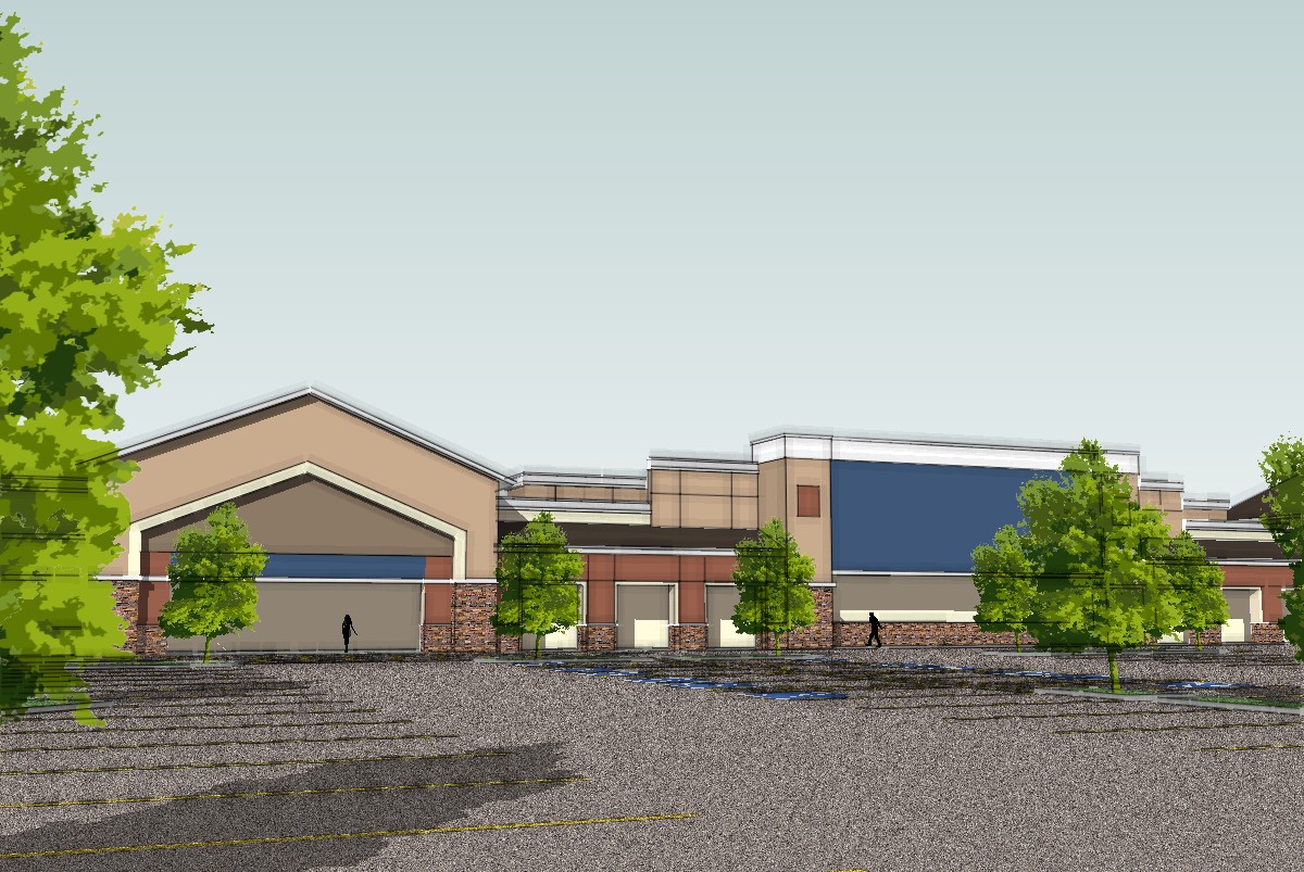
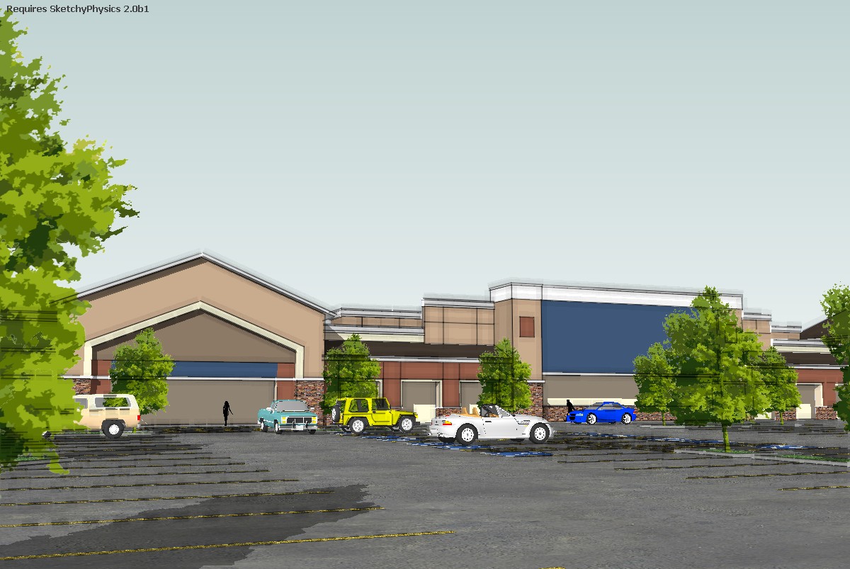
Some recent work
-
I like it Mike! There is a lot of sky in the last 2 images that I might trim down a bit but I like the style... so is it a Lowe's or Wal-Mart?
-
Mike, I like the style. The modeling is well done but the parking lot texture is very distracting.
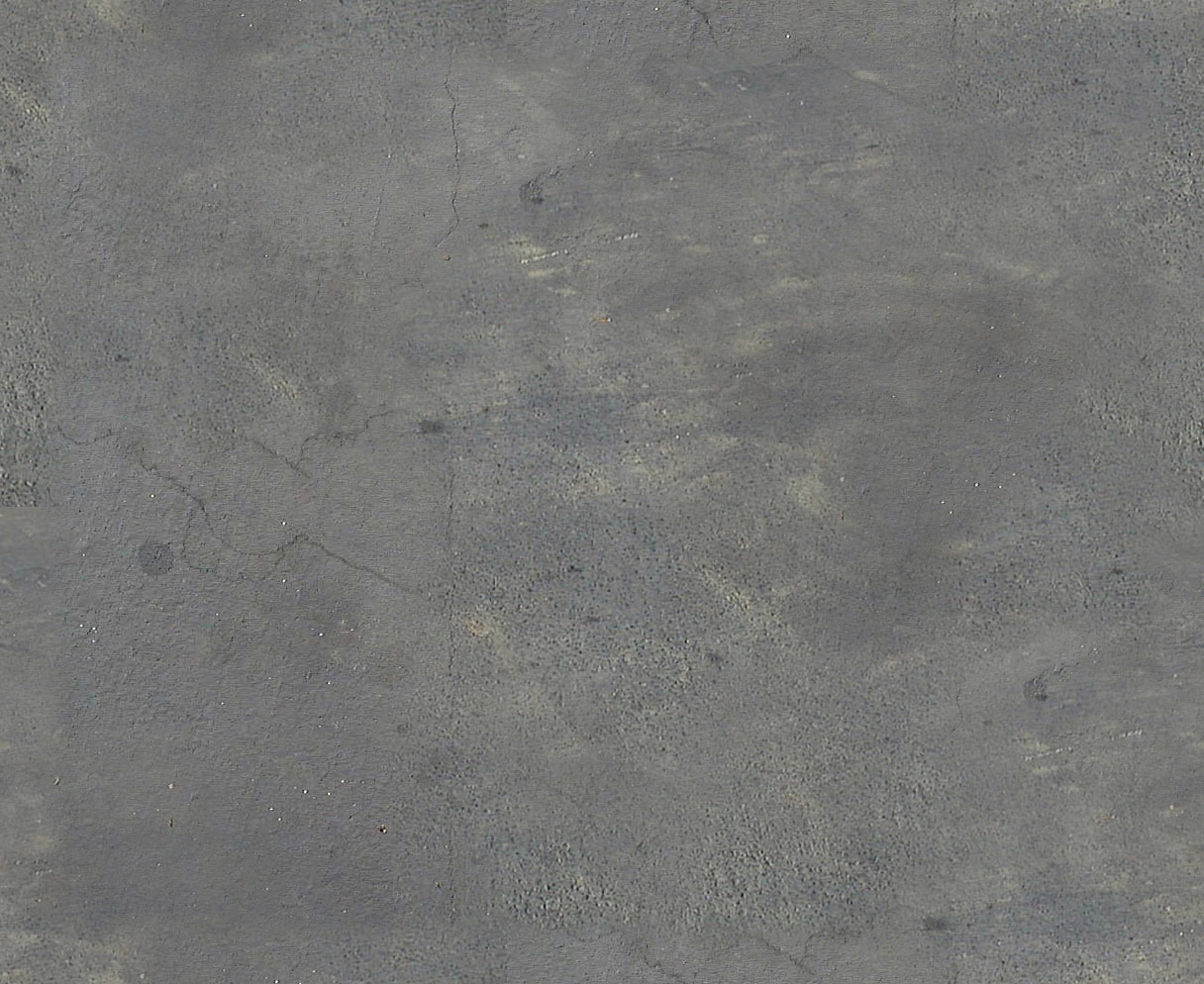
Try this one compliments of solo (Pete). Scale it to 30' and it works great.

-
thanks guys for the comments
david
it is a WalmartBoo
i will reapply the material and repost images. -
I don't mind the high skies actually. It's a big building and from a person's eye level, when viewing it from a distance, it gives the space. Maybe the second picture (the first with the big sky) makes it a bit easier with that tree poking in from the left.

-
Very nice, Mike, but I would populate the parking lot, otherwise the building looks vacant.
-
Boo
thanks for the asphalt image, and thanks to solo for for creating the image
i thing it made a major improvmrnt in the rendering.


-
Yeah, definitely better!

-
thanks
csaba -
nice work, i like the trees and nice style and colour choices too..can you upload the trees? or post a link for them?
 thanks
 -
Nice. Parking lot texture made a big difference. Nice trees too.
-
Mike
If I could make one suggestion, in the first image you posted, the bright white roof is quite distracting too. Perhaps it needs to be dulled down. -
Much better Mike. I would also hide the lines on the parking striping. They seem a bit heavy.
Nice work.
Hello! It looks like you're interested in this conversation, but you don't have an account yet.
Getting fed up of having to scroll through the same posts each visit? When you register for an account, you'll always come back to exactly where you were before, and choose to be notified of new replies (either via email, or push notification). You'll also be able to save bookmarks and upvote posts to show your appreciation to other community members.
With your input, this post could be even better 💗
Register LoginAdvertisement


