The Castle
-
Cool stuff matt. I particularly like the first one

-
Good day Matteo,
This is a very nice work. I love the first one.
Just one question, normally, the walls are white, aren't they ? -
hi Luis,
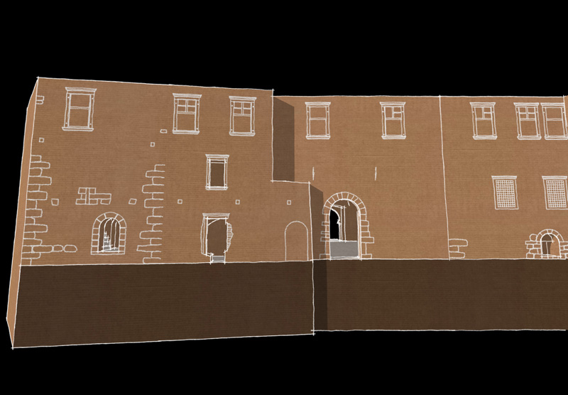
the walls are very old look greysh. The stone walls are partially covered by a plaster that was white or rose. Since I didn't have a good set of photo references I decided to apply a generic cardboard texture for the esxterior walls, and white paper texture for the interiors. All the wooden elements are texturized with a generic balsa wood.
Where I live, about 90 km far from the castle, the rocks of the Alps look reddish, due to the presence of a certain amount of iron oxides, so that many old castles look brown-red.
Elysium, here are some floorplans, also made with skethup: i find very nice the sketchy styles combined with colored lines.
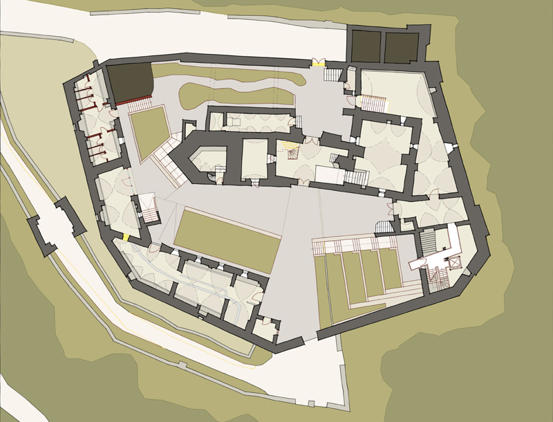
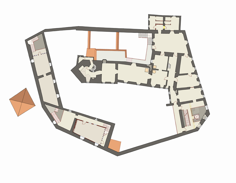
-
Well done Matteo. That job must have had your brain tied up in knots but you unraveled everything okay

Mike
-
WOWzer! What fun...congrats, Matteo!
-
yup! Mike and Tom you both are right: it was a pain and at the some time a fun.
Here some wip images.
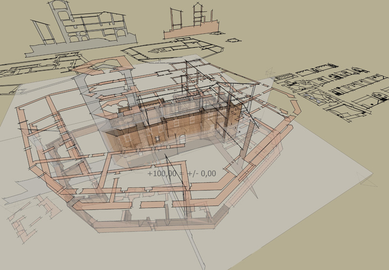
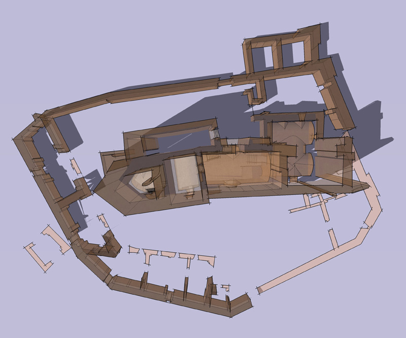
-
Looks great, Matteo.
-
Very nice, I love the sections
-
Matteo, I really like the look of this, great job.
-
Wow, this is really incredible. Great job. I love the presentation of the last WIP images. Really beautiful.
-
Those section shots are absolutely fantastic!
-
Great job, congratulation!
-
Finally!
I've seen some of these when cleaning "orphaned attachments" in the admin panel (sigh... work first all the time) and thought that I'd see some beauty once I get to the Gallery (which is generally the last forum I can visit
 ). Now I'm here and yes, great stuff, indeed!
Please, post some more shots if you can (simple, easy SU output is just fine!) -
Thank you all for the kind comments.
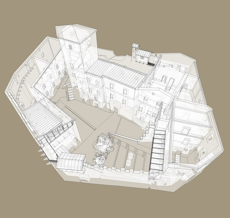
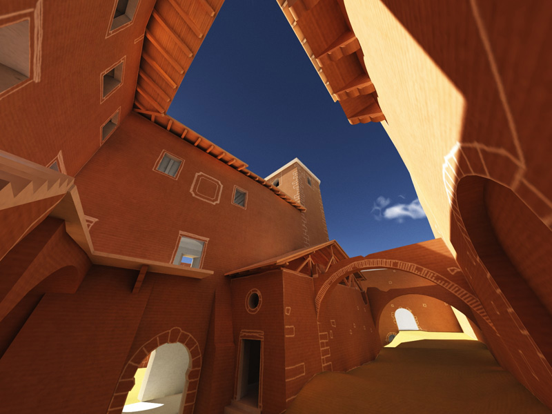
here a quick x-ray shot and another wip, quasi fisheye shot, rendered with vue 6, I used for a while as desktop wallpaper.
Hello! It looks like you're interested in this conversation, but you don't have an account yet.
Getting fed up of having to scroll through the same posts each visit? When you register for an account, you'll always come back to exactly where you were before, and choose to be notified of new replies (either via email, or push notification). You'll also be able to save bookmarks and upvote posts to show your appreciation to other community members.
With your input, this post could be even better 💗
Register LoginAdvertisement


