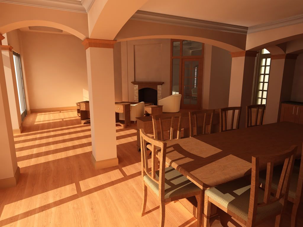
Living Room
-
Heres a living room I am working on...Render done in Podium 1.6

-
Good start. You need to work on your wood textures, they are all running in the same direction when in reality they wouldn't. The door, for example, would be probably be a stile and rail construction - the stiles (vertical components) would have a vertical grain, while the rails (horiz. pieces top and bottom) would run horizontally. Likewise on the chairs in the foreground.
-
good job my friend...nice render...but i was confused,which area that would you like to focus?on dinner room or on family room?sorry if my english is bad,i hope that you understand it..thanks

-
I noticed that a number podium renders posted have their colors balanced "non" white (don't know the proper term). Is there a podium reason for this, or is it personal preference?
-
I like the lighting but the render itself needs some more elements. It almost feels like a picture of a house in the process of moving into it.
Scott
-
A very good start. I agree that more furnishings, plants, etc. are needed. Also, I don't know Podium, but I would try increasing the reflectivity of some of the surfaces (floor, table, chairs) to be more realistic. If you use Photoshop you might also try using a cooling camera filter or try auto color. The color balance seems to far on the warm side.
-
@honoluludesktop said:
I noticed that a number podium renders posted have their colors balanced "non" white (don't know the proper term). Is there a podium reason for this, or is it personal preference?
i believe the term is called 'color bleeding'. its a natural phenomenon where the surface reflects part of its color onto surrounding surfaces. in render engines which support SI (global illumination) its mostly present.
some clients raise their brows when they see this phenomenon. and i am a victim of it several times myself with many different render engines. there are ways around this though... but at a risk of losing physical accuracy wrt to materials and light.
sorry for the off topic rant.nice scene btw!!!
 more objects on the table and wall hangings and chandeliers and fire in the fire place can make this a real winner!!!!

Hello! It looks like you're interested in this conversation, but you don't have an account yet.
Getting fed up of having to scroll through the same posts each visit? When you register for an account, you'll always come back to exactly where you were before, and choose to be notified of new replies (either via email, or push notification). You'll also be able to save bookmarks and upvote posts to show your appreciation to other community members.
With your input, this post could be even better 💗
Register LoginAdvertisement


