Welcome to my world
-
-
I think you forgot the attachment.

-
No, that would be an imageshack image. I thought it's only me (again). It doesn't load and when I ping the server, 100% of the data packs are lost.
Patience... Imageshack is always that lousy.
-
Gaieus,
OK, thanks. I never knew that. Very odd.
Gus
-
Hmm. This should be better.

-
Definitely better - however the Imageshack thumbnail now turns up, too (it only often has problems, not always).
Also I like it - but I'm not the best at crits here. Definitely a recognisable "Stinkie style" image

-
I'm surprised as well, Coen. What an odd question.
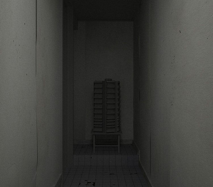
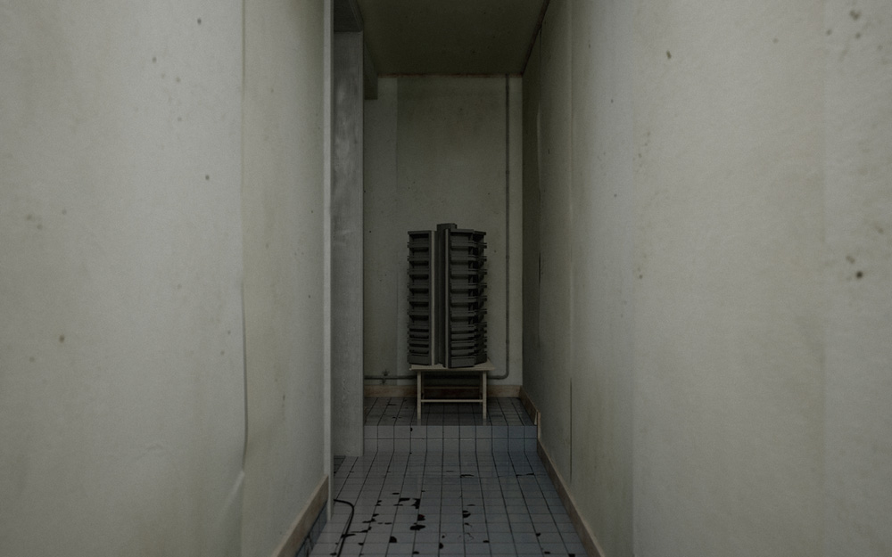
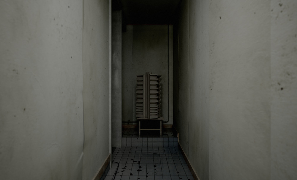
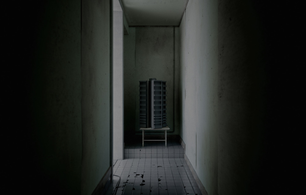
It's a room. In it are:
-
a small table
-
a scale model, loosely based on Lasdun's Keeling House
Pretty WYSYWYG.
-
-
A lot of mood in this rendering. The lighting, the hallway add a bit of drama if not a tinge of fear. As if though we are looking down the hallway of life. The building model at the end is almost a reflection of a discarded dream.
-
Yes this scene reeks of Stinkie! Dark, barren, peeling wallpaper, the tile looks dirty, and the model and table are somewhat obscured by the darkness. It looks like someone stole a fine architectural model of a building and are hiding it in a low rent housing project, with very little lighting!
Cool render Tom... definitely strikes a mood....like I need to go look for my anti depressant medication..
-
I think Ewan McGregor must be in the next room spilling his guts out...
Nice approach. Quite an extraordinary 'pied-de-stal' to put architecture on.
Not sure if I want to live in your world though?
If it would have been my theme, I would have added some glamps of hope in the image... Like that little light in the darkness you aim for... a bulb...any thing.I just watched Eraserhead the other day (you know, the black and white David Lynch movie) and I was amazed how he used both pitch black as pure white light to make very expressive scenes. A movie like that could be great inspiration to you and the themes you are playing with.
On the technical side: did you use MOI for the curling wallpaper?
The details look very good. -
@gus r said:
A lot of mood in this rendering. The lighting, the hallway add a bit of drama if not a tinge of fear.
Yup. That's what it's all about - fear, horror even. I'm really glad that came across.
@fella77 said:
Cool render Tom... definitely strikes a mood....like I need to go look for my anti depressant medication..
Thanks, David. You do know I run an online pharmacy, don't you? Get your Seroxat and Xanax at Stinkie's Dope House! All my stuff is a wee bit past it's expiration date, but hey, the older the meds, the cooler the side effects.

@kwistenbiebel said:
If it would have been my theme, I would have added some glamps of hope in the image... Like that little light in the darkness you aim for... a bulb...any thing.
I actually considered adding a bulb. Decided against it, as I feel it'd make the image 'too Kabakov'. And too cheery.

@kwistenbiebel said:
I just watched Eraserhead the other day (you know, the black and white David Lynch movie) and I was amazed how he used both pitch black as pure white light to make very expressive scenes. A movie like that could be great inspiration to you and the themes you are playing with.
Saw that one in high school. Didn't understand one bit of it, but it did leave an impression. Should check it out again. We got the dvd around here somewhere, I believe.
@kwistenbiebel said:
On the technical side: did you use MOI for the curling wallpaper?
The details look very good.Thanks. I was a bit worried I overdid it. No MOI, all SU - divide a plane, manipulate some points with the Move Tool, run SDS, turn on hidden geometry, use Scale Tool for further editing. Solo's Tablecloth Method, basically.
Final image will be here in a week or so. Hey, I am using Maxwell.

Cheers! -
@unknownuser said:
Saw that one (the movie Eraserhead)in high school. Didn't understand one bit of it, but it did leave an impression. Should check it out again. We got the dvd around here somewhere, I believe.
Well, if you would watch it again and look at it just from the esthetical point of view, you'll be amazed on both composition as the light he uses. 'Claire-obscure', the 'rule of thirds', the 'diagonal rule'...It is all in there. Great learning resource.
And the story, well...it is David Lynch
-
Okay, these are the final renders. I used Vray, as I didn't feel like waiting for 6 days or so.


-
Creepy yet stunning. I love them.
Although I won't be changing my desktop wallpaper

-
Wow ....like these Stinkie....stick with Vray

-
Thanks, lads. Don't you think the shadows in the two last images could do with a little more subtlety, though? I just can't tell anymore - been rendering and re-rendering all day.

Paracetamol! Please!

-
looks like a crack dealers place.


Great work stinky one.
-
While its not exactly Disneyland. . .

Hello! It looks like you're interested in this conversation, but you don't have an account yet.
Getting fed up of having to scroll through the same posts each visit? When you register for an account, you'll always come back to exactly where you were before, and choose to be notified of new replies (either via email, or push notification). You'll also be able to save bookmarks and upvote posts to show your appreciation to other community members.
With your input, this post could be even better 💗
Register LoginAdvertisement


