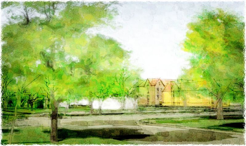
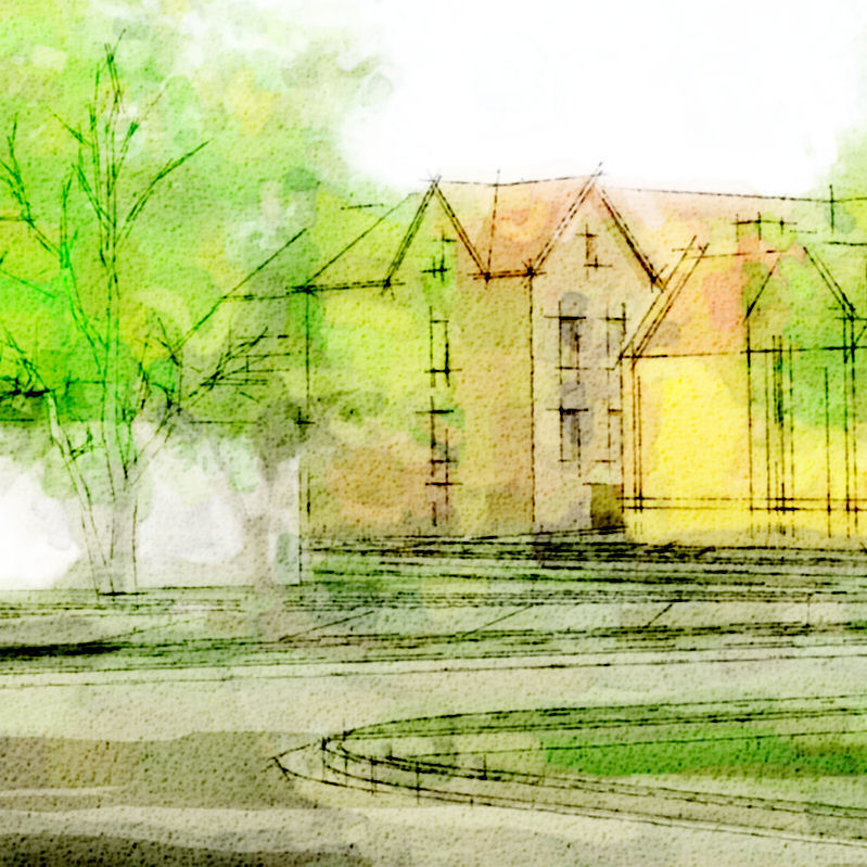
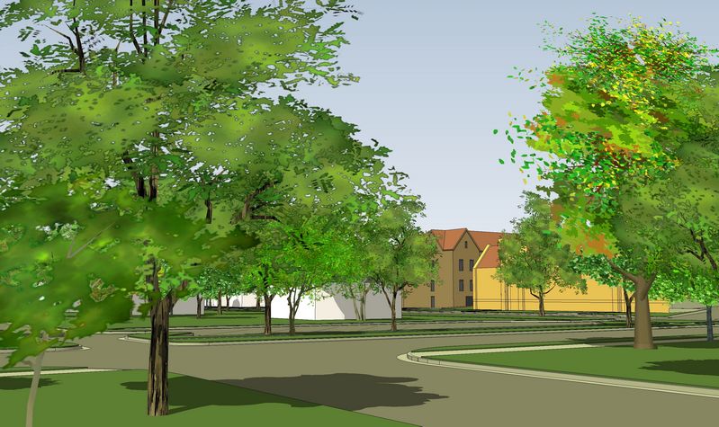
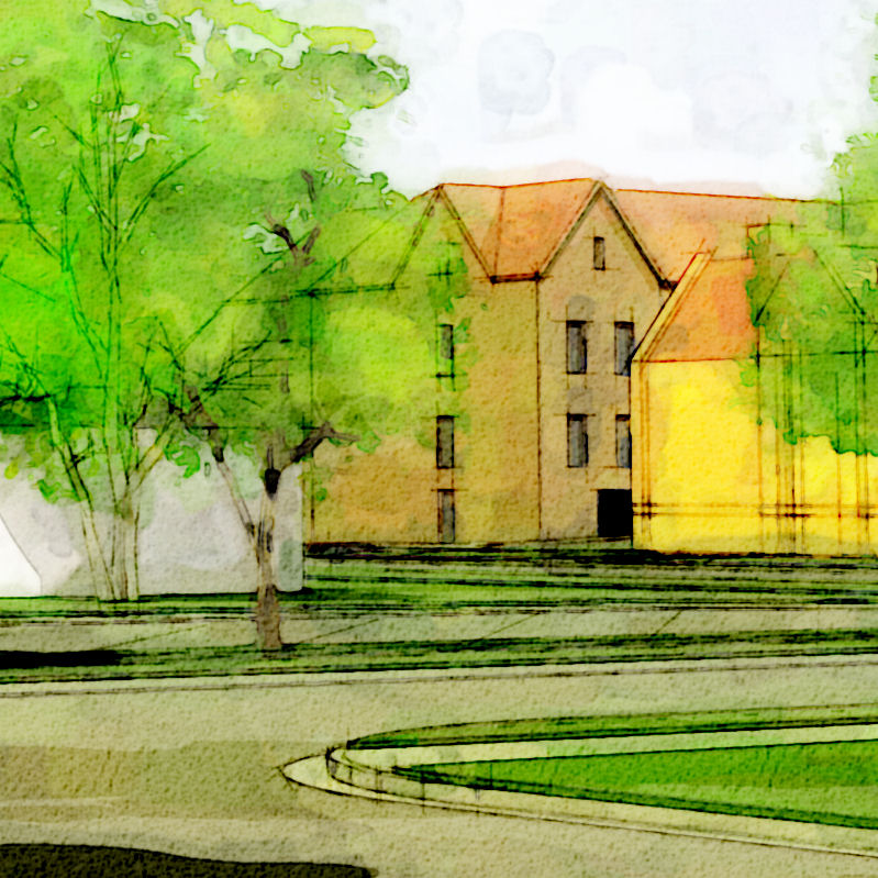
New project, new image...
-
...wha'da'ya' think?
-
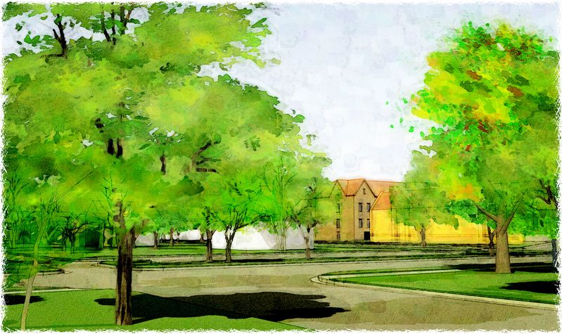
a bit more illustrative...?
-
Tom,
Those were some of the nicest looking watercolors I've seen in some time. I'd like to hear from the people that used to actually take brush and a pot of water but if I didn't know better, I would have thought that's exactly what you've done.
Hope you do well with them and the project. Happy holidays and wishing everyone a better 2009.
Allen
-
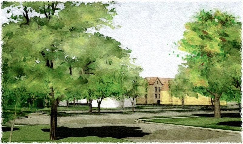
I agree they are very effective and I've enjoyed studying them. I prefer the second more 'illustrative' set as the trees have a bit more definition.
Tom have you ever tried using any colour shifting plugins on your images? I'm thinking it might be interesting to see how these might look without your trademark bright yellows & greens.
Regards, Ross
-
In the first series I'd've preferred the last one the first two being a bit more "watercoloured" than my liking although it was obvious that the buildings themselves do not have that "tomsdesk" touch perfectly.
Then I like the second series better but now what I'd really like I think (but that's only my liking and taste) would be a combination of the style of the buildings in the second series and the trees of the third image in the first series.
Maybe long the lines with what Ross said about the tree colours (and details).
-
Tom - I had a few minutes to play. I hope you don't mind that I tried some additional processing on one of your images (the first from the second set). I used a free photoshop-compatible from Cybia called ColourWorks to make a grayscale version. I then overlaid your colour version and gave it transparency so it visually merged with the grayscale underlay. The only other change was I applied some new sandstone texture just to freshen up the texture a bit. I think the resulting image reflects a more 'realistic' and less agressive colour palate. While I can appreciate your typically bold colour palate of bright caustic greens and yellows I suspect they might be too vibrant for the taste of many who see those images. Of course you are the artist and must do what you 'feel'.
Your fan, Ross
-
In my eyes the first two are the most beautiful of the bunch. Of course, to demonstrate an architectural project they might be too ethereal, but I would love to see a good novel (Jane Austen?) illustrated with images like these.
Anssi
-
That's a totally different question, Anssi, and I DO have to agree with you!
-
Beautiful work Tom.
My favorite is image2 but I like them all. -
First: Thank you, thank you! High praise, indeed, from the likes of you guys! So glad to hear hours of study and gigs of practice pleases more just than me.
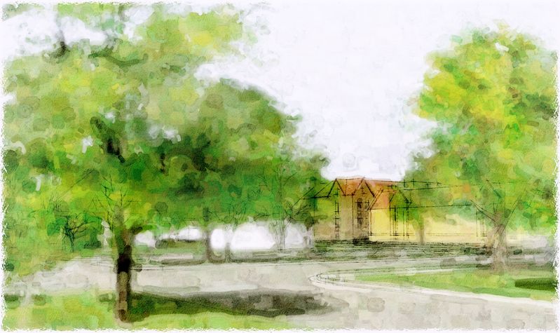
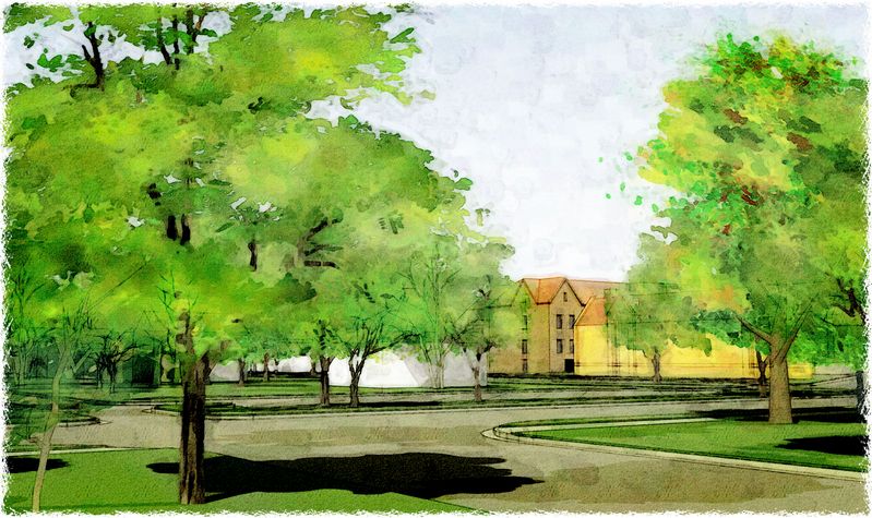
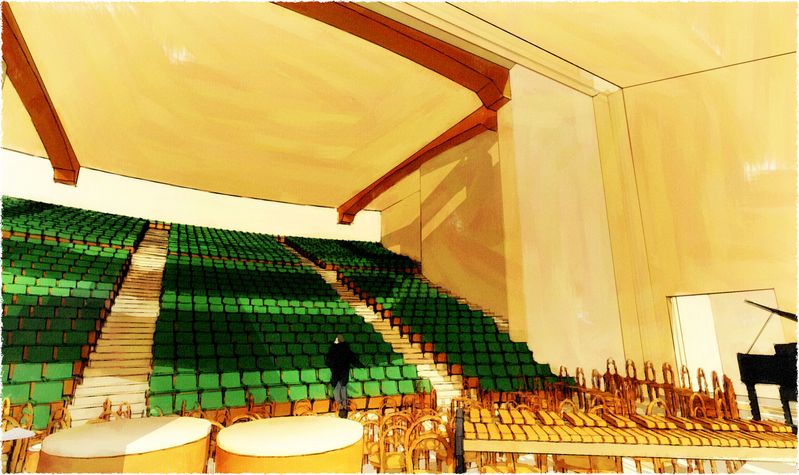
Ross, the greyscale layer tip will be used alot now, thank you (I remember reading something similar in one of Mateo's tuts, but promptly forgot about it: which happens a lot lately...more each year :`) I haven't had time to play with it much, but here's a start...I put another "hot" color layer under the greyscale, then erased out the grey layer to intensify, and erased out the top transparent color layer to diminish. The result (I think...?) is a control of the atmospheric perspective, without dulling the vibrancy, like I've never had before:
Hello! It looks like you're interested in this conversation, but you don't have an account yet.
Getting fed up of having to scroll through the same posts each visit? When you register for an account, you'll always come back to exactly where you were before, and choose to be notified of new replies (either via email, or push notification). You'll also be able to save bookmarks and upvote posts to show your appreciation to other community members.
With your input, this post could be even better 💗
Register LoginAdvertisement


