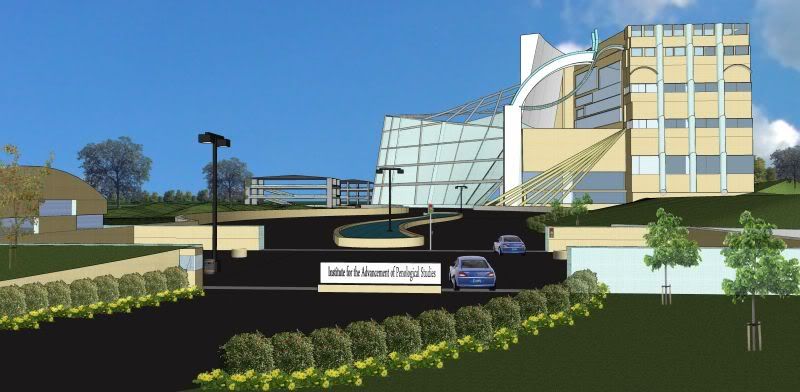
Institute for the Advancement of Penological Studies
-
First sketch for project idea. Feed a man fish and he will again be hungry, but teach him...(etc)
-
Alexander, is this your design? It's very unique.
A couple of comments....
The glass is not registering as glass. such as on the top "atrium".
Road is too dark.
There is something funky going on with the perspective which is very noticeable in the placement of the shrubs in front.
Vary your shrubs and flowers, either by using different ones or resizing each individually.
The scale of the trees on the right look a tad small.
The cars look like they are hovering (need shadows) and the style of the cars is to different from the native output of the structure.
Put cars in your parking structure.
Use different cars, not two of the same car right next to each other.
Try turning shadows on. This usually makes a building pop.Please don't take these comments the wrong way. They are my suggestions for making your rendering even better! I really like the building and think with these improvements you will have a really beautiful rendering for your client.
Thanks for sharing.
-
Thank you soooo much for the feed back, that is the only way that I can learn. I am definitely no stranger to criticism, as a listener it tends to be the refreshing truth that lots of people avoid or cannot take (based on self righteous reasons).
I have been having problems with glass for a while, I just got a couple of books on 3d etc. to attempt to understand refraction and reflection. The truth is, I kind of attempt to mimic what I see while at the same time attempting to create my minds image.Thanks again
dee -
I agree with Tinanes comments. On the subject of glass, unless you are doing a detailed photoreal render it is often better not to make it transparent. This is because you then have to show detail behind it otherwise the empty shell of the building is revealed. I also wouldn't worry too much about showing refraction/reflection unless you are rendering the building and then the software will do it for you. Also If you look at most buildings in real life, the glass is usually dark grey or black, not blue.
In terms of overall presentation, try adding more detail in the foreground as it's not clear what the function of the space is. Also in the foreground try some 3D trees and shrubs. You might also want to experiment with some different styles such as sketchy lines etc. I use sketchy styles a lot as you can get away with less detail in general.
-
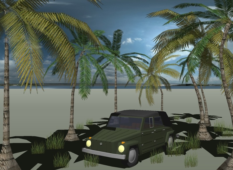
I agree with the others. As for me though, I'm not a fan of sketchy edges. I personally like no edges, shadows at dark>20, light>85, and my personal advice: background watermark. Oh, and 3D trees WOULD be nice. Here's an example of everything I mean:
Hello! It looks like you're interested in this conversation, but you don't have an account yet.
Getting fed up of having to scroll through the same posts each visit? When you register for an account, you'll always come back to exactly where you were before, and choose to be notified of new replies (either via email, or push notification). You'll also be able to save bookmarks and upvote posts to show your appreciation to other community members.
With your input, this post could be even better 💗
Register Login


Advertisement