Refer Madness!!
-


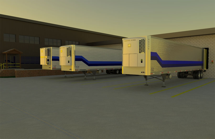
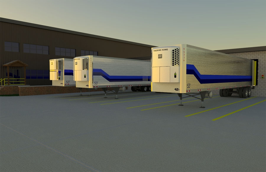
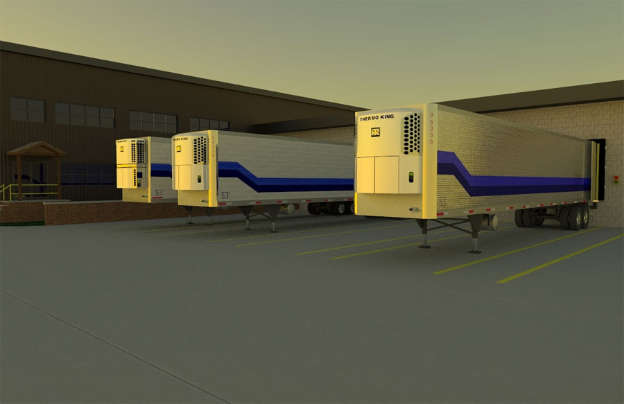
Enclosed are three pics of a project I am about to deliver. This is my first full render of a project.
I would appreciate your input and any help you choose to share.
What do you think and feel also why.
thanks,
chad -
I added the code as instructed, but I don't see any thumbs only urls. That was not my intention.
chad -
ccs, I corrected it best I could, depending on your monitor size the images may seem cut off, the best post size is 600 x (any hieght)
Nice renders by the way.

-
Pete,
I have rescaled the drawings to 655x425 How can I post the new ones and remove the overly large ones? -
I perfer the second one best.
- There are better reflections in the windows
- Its brighter
- The cut in the concrete isn't over obvious (doesn't draw the eye away)
- I like the texture on the concrete
- And it's all a lot clearer than the last one.
These are just my opinion and may differ from others

-
I like them. THey evoke the idea of a trucker getting up at 5 in the morning, cup o' joe in hand backin' the cab up to the trailer getting ready to head out on the road for the long haul. . .what a lousy job. . ..

-
Thank you to all for the comments. This is how we as a community will continue to grow.
Without the company name and logo they look a little bare. Sorry! This dock area is ten doors wide. The whole idea was the new trailers and the proposed graphics. I tried a number of different renders (47) until I found a scheme I liked.@unknownuser said:
Nice renders by the way.
Solo: It's people like you, Tom, Lewis, Bruce, Fletch... and all the others that have shared their time, project drawings and help that has brought me to this point. So to all of you Thank you!
Pavement:
This was the biggest hurdle. I still haven't found a way to make the pavement look the way my minds eye sees it. The later you move the clock forward the brighter the concrete became. When I get some time tonight I am going to move the grid closer to try to narrow the pavement presence. -
whoa man nice trailer!
Hello! It looks like you're interested in this conversation, but you don't have an account yet.
Getting fed up of having to scroll through the same posts each visit? When you register for an account, you'll always come back to exactly where you were before, and choose to be notified of new replies (either via email, or push notification). You'll also be able to save bookmarks and upvote posts to show your appreciation to other community members.
With your input, this post could be even better 💗
Register LoginAdvertisement


