sketchucation logo sketchucation
    • Login
    ℹ️ Licensed Extensions | FredoBatch, ElevationProfile, FredoSketch, LayOps, MatSim and Pic2Shape will require license from Sept 1st More Info

    Toledo Zoo Children's exhibit

    Scheduled Pinned Locked Moved Gallery
    17 Posts 10 Posters 1.8k Views 10 Watching
    Loading More Posts
    • Oldest to Newest
    • Newest to Oldest
    • Most Votes
    Reply
    • Reply as topic
    Log in to reply
    This topic has been deleted. Only users with topic management privileges can see it.
    • T Offline
      tomsdesk
      last edited by

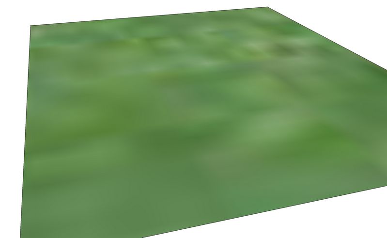
      Chris...may not be your cup of tea: but this is SU's standard grass texture with the scale bumped up from 3' to 153' - my quick way of doing a color blend?


      tn_grass.jpg

      http://www.tomsdesk.moonfruit.com/
      2.5D Trees & Shrubs!

      1 Reply Last reply Reply Quote 0
      • Chris FullmerC Offline
        Chris Fullmer
        last edited by

        Thats not bad. I think I'd want to modify it to be even more subtle on the gradients, but thats a great idea to just take an existing image and scale the heck out of it to blur it. Maybe if I get a chance I'll play with that. Thanks Tom,

        Chris

        Lately you've been tan, suspicious for the winter.
        All my Plugins I've written

        1 Reply Last reply Reply Quote 0
        • RichardR Offline
          Richard
          last edited by

          I have to agree with mike!!! Completely new style and refreshing! Like marked001 suggests very suited to the context, playful love it! Might like to see the shadows darkened just a bit to add bit more depth and better separation. In some foregrounds the images become just a little too flat particularly around the peeps and rocks!!!

          REALLY GOOD STUFF MATE!!!!!!!

          [BUILTBRAND.COM.AU](http://builtbrand.com.au/)

          1 Reply Last reply Reply Quote 0
          • Chris FullmerC Offline
            Chris Fullmer
            last edited by

            Now that you mention it, a few of those images do struggle with a loss of depth. Maybe I should try going back with fog and making a depth field layer and then do something of a blur or fade to help add depth....might be interesting. I've wanted to play with the technique, but haven't found a good opportunity. Maybe this is it.

            I won't be getting to any of this tonight though. I'll be upp all night rendering the next video for a freeway driving simulation.....

            Chris

            Lately you've been tan, suspicious for the winter.
            All my Plugins I've written

            1 Reply Last reply Reply Quote 0
            • L Offline
              linea
              last edited by

              Really beautiful style Chris 😄

              1 Reply Last reply Reply Quote 0
              • DanielD Offline
                Daniel
                last edited by

                Beautiful design and presentation, Chris. Also noticed the inclusion of handicapped children - nice touch.

                My avatar is an anachronism.

                1 Reply Last reply Reply Quote 0
                • Chris FullmerC Offline
                  Chris Fullmer
                  last edited by

                  Yeah, those are there on purpose, not just forr show 😄 We are something of a leader in that area. The firm specializes in inclusive design that allows all children to play and explore and enjoy the site. So it was important to show. Thanks for noticing.

                  Chris

                  Lately you've been tan, suspicious for the winter.
                  All my Plugins I've written

                  1 Reply Last reply Reply Quote 0
                  • Chris FullmerC Offline
                    Chris Fullmer
                    last edited by

                    ok, so i got a chance to play with the depth of field blur process. Its interesting, and I'm sure I need to refine my technique. I'm not sure if I did it too much, or way too little. Or maybe its just not the best "photo" to add depth of field to.... But here is what I came up with quickly on my first attempt. The first image is the fog mask I used to create the depth of field blur. The second image is SU plain, the third one is both images together.

                    Chris

                    http://farm4.static.flickr.com/3173/2722992169_9fa7177b0a.jpg

                    Link Preview Image

                    http://farm4.static.flickr.com/3279/2723737760_9b7f34df0e.jpg

                    Link Preview Image

                    http://farm4.static.flickr.com/3186/2723732168_230243608d.jpg

                    Link Preview Image

                    Lately you've been tan, suspicious for the winter.
                    All my Plugins I've written

                    1 Reply Last reply Reply Quote 0
                    • V Offline
                      vkirchner
                      last edited by

                      Chris,

                      Nice work, it always makes me happy when I see that someone lives close to me. I live in Tiffin, Ohio. My Wife and I travel to the Habitat for Humanity Reuse Store close to the Zoo at least once a month. Possibly I'll meet you close to there sometime. 😍

                      1 Reply Last reply Reply Quote 0
                      • DanielD Offline
                        Daniel
                        last edited by

                        Chris, that first image (B&W) is interesting. The only difference I see between 2 and 3 is that some backgound objects in 3 are blurred, and it's kinda uncomfortable (I guess the eyes automatically try to focus them).

                        My avatar is an anachronism.

                        1 Reply Last reply Reply Quote 0
                        • S Offline
                          Shaun Tennant
                          last edited by

                          Chris,

                          Long time no see 'eh! I love the images, very cute and fitting for the subject. The popping primarys and the whimsical outlines are very effective. Not sure I would say the same on a different project with less flora and different subject matter, but it all seems very original to me.

                          Very cool man.

                          Whether they find a life there or not, I think Jupiter should be called an enemy planet.

                          • Jack Handey
                          1 Reply Last reply Reply Quote 0
                          • 1 / 1
                          • First post
                            Last post
                          Buy SketchPlus
                          Buy SUbD
                          Buy WrapR
                          Buy eBook
                          Buy Modelur
                          Buy Vertex Tools
                          Buy SketchCuisine
                          Buy FormFonts

                          Advertisement