Hand rendering Style
-
Actually, I kind of like it. It has a nice feel to it. Don't know the purpose but it feels not so much dumbed down as really preconceptual and just getting some ideas down.
Allen
-
Hi Remus,
why not try to paint them on real canvas?Instead of mimicing water colour it would be more interesting to see it done for real.
A couple of years ago, doing watercolour with Sketchup and/or Piranesi was done a lot (mostly a US thing), but I have to admit I only like those things when done with real paint on real canvas.I know Nomeradona combines both photoreal CG rendering with handcraft oil painting, as two seperate means to express creativity.
But I give you a Yay as encouragement.

-
Kwist, i might give the real thing a go at some point, although itd be quite a big step for me as ive never really painted before
 Gotta be worth a try though.
 -
-
Would you like an automatic modeller with that?

-
Yup my dream car McLaren SLR
-
Cool drawing Pete

Is that a Merc? (judging by the tail lights)
Or a BMW roadster? (judging by the air intakes at the side) -
@remus said:
Kwist, i might give the real thing a go at some point, although itd be quite a big step for me as ive never really painted before
 Gotta be worth a try though.
Every now and than I try some painting myself.
Maybe I 'll take some photo of one of the things I did earlier. Amateur stuff though... -
Was it just a straight drawing or was there a model involved as well?
Very good either way (forgot to mention that before.)
-
Id be interested to see that kwist. Its always cool to see what everyone gets up to, other than SU stuff of course.
-
Ok, some hand painted things I made...but as I said, I am really quite the amateur....but I enjoy it which is the most important thing to me.
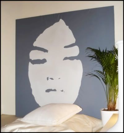
And an unfinished one (playing with the 'pshychological eval test' idea):
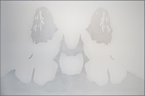
-
@kwistenbiebel said:
why not try to paint them on real canvas?
I sat there thinking "Hmmm, 'Real Canvas', I haven't heard of that software before. I wonder if its better than Photoshop or painter somehow? I'll have to look into it...."
lol@me
I like them. I think they are definitely a style worth developing. Maybe theres some depth that could be improved and some shadowing. But thats stuff that you figure out in time (or so I keep telling myself). But the sketchy style is nice and simple. Its abstracted enough that it doesn't make specific materials come to mind, but leaves it op to choose what the actual materials are. But its not so abstract that you are left to mentally design the lamp. So I think its a good mix of design intent and abstraction.
Well done, and keep with it.
Chris
-
@allen weitzman said:
Actually, I kind of like it. It has a nice feel to it. Don't know the purpose but it feels not so much dumbed down as really preconceptual and just getting some ideas down. Allen
Maybe "dumbed down" even in quotes was the wrong term, sorry...I meant basically the same as you, Allen, like these:
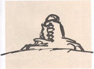
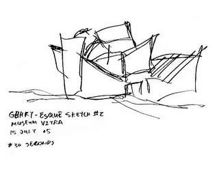
-
I love Frank Gehry sketches (though I realize the one you included says Gehry-esque). He does a great job working at the level of initial concept. His sketches just begin to hint at his shape and form intentions. Its a great start. He doesn't get in to materials and exact dimensions. Just some general shapes and spacial relation. Excellent.
But once you have the actual design shape more or less down, and you want to move on to colors and materials, I think that this style you presented fits quite well.
-
While we're at it. Here is a link to Freestyle, a research project for Non Photoreal Rendering and simply the best I've found.
It's actually usable though not very easy to use. Build a little like the Renderman language.
Here is the link to the project page: http://artis.imag.fr/Projects/Style/Ps. On the project page there is the name Frédo Durand. Is that "our" Fredo?
In that case my respect for him grows to worship.
Sorry for the large example images.
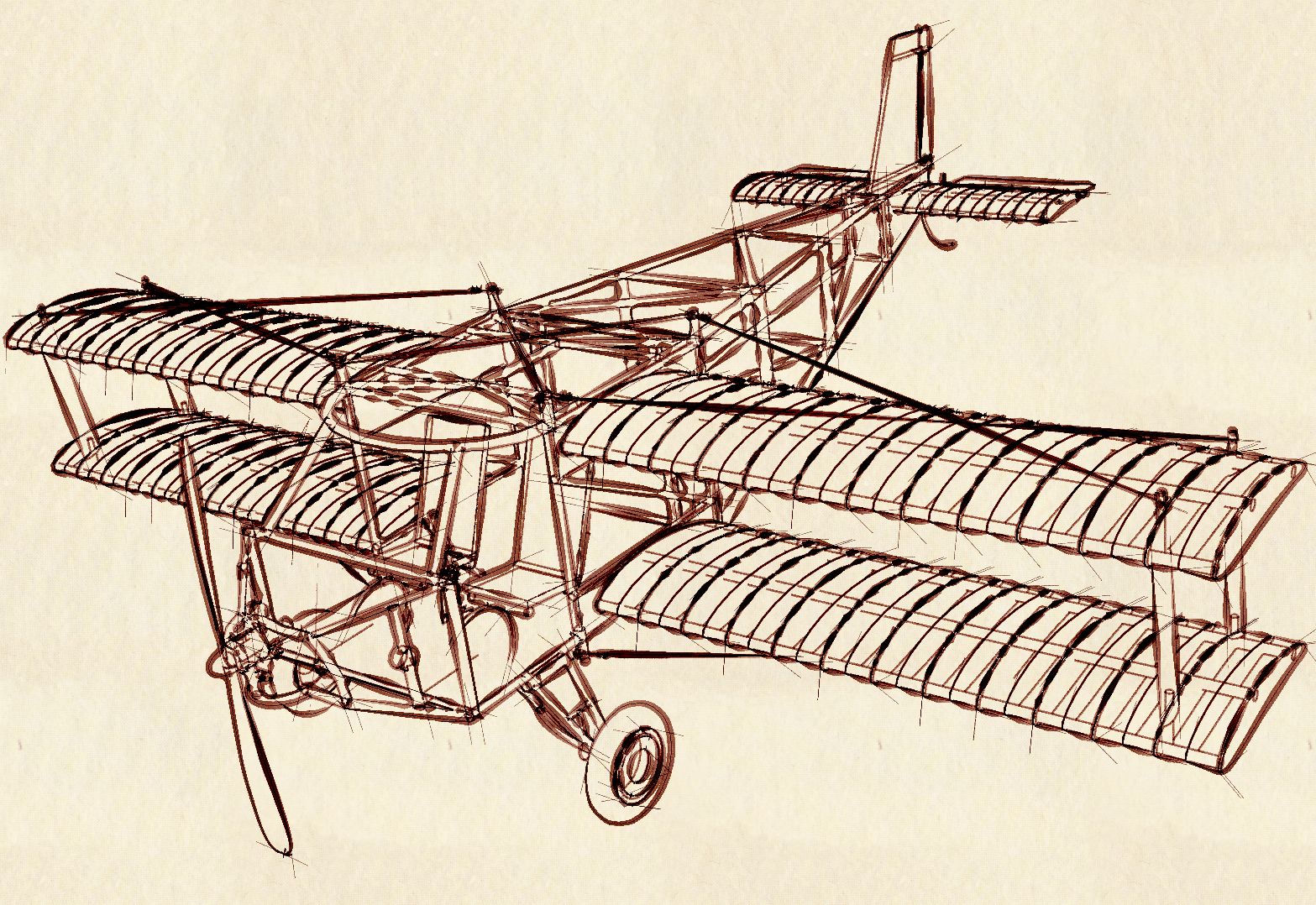


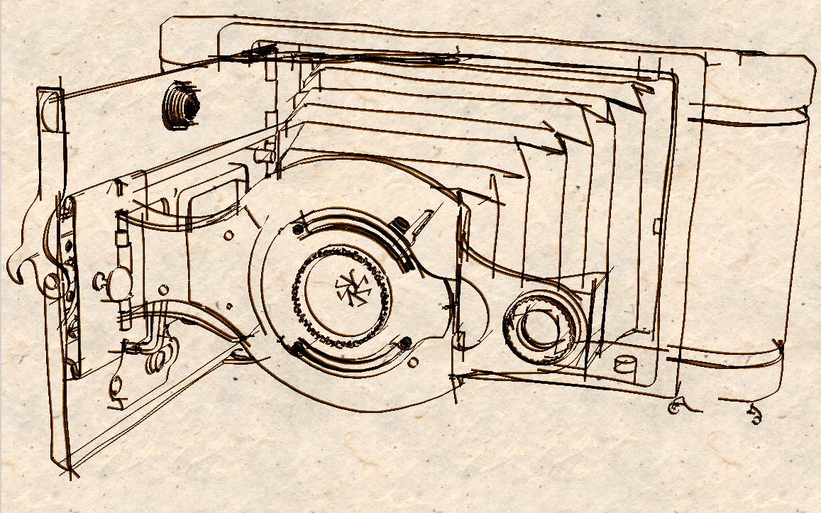
-
[flash=640,480:qp43n7v2]http://www.youtube.com/v/c0gQBpgY_UI[/flash:qp43n7v2]
-
Hope im not unwantedly chiming in here. But, yeah it would be really cool if there were programs that can really make renderings look like they were done by hand (and im sure there are), but there is something about knowing that they are actually done by hand that makes them more impressive. In my opinion, I love rendering and im sure many know that but it seems to me that hand renderings kinda help you feel the space a little bit more in a way. There is emotion in the image and sometimes you get an even better feel for the design and the designers concept by the way the displayed it. It can be a nice break from photo-real renderings. But there are a lot of people that mix media like nomer, that have great success and kinda pull of the same thing. I dont know, i may be totally off base but thats just my impression. Heres a few from my previous works and sometimes I feel more proud of these than any of my computer renderings.


-
-
Really nice stuff steeler, thats the sort of thing i was aiming for in a round about sort of way.
I know what you mean about stuff being done by hand being more impressive (not really the right word
 ) just because you know someones sat down and spent some time doing it.
And it does make for a rather nice change form photoreal stuff.
-
Yeah i guess "more impressive" was not the right way to put it but i think you know where i am coming from. Never the less, I think that it all works hand in hand. U learn ways to improve your skills by doing various types and styles of illustration. To me, an artist is an artist no matter what media they use. I dont know many people that would be able to do the modeling and rendering that you see on here if they did not have an interest & skillset in other areas of design and illustration. I just think it is important, especially as a student still, to make sure that people dont lose skills due to the computer; being able to do things by hand is very important and it helps you understand how things work a little more.
Hello! It looks like you're interested in this conversation, but you don't have an account yet.
Getting fed up of having to scroll through the same posts each visit? When you register for an account, you'll always come back to exactly where you were before, and choose to be notified of new replies (either via email, or push notification). You'll also be able to save bookmarks and upvote posts to show your appreciation to other community members.
With your input, this post could be even better 💗
Register LoginAdvertisement


