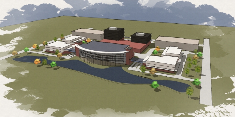
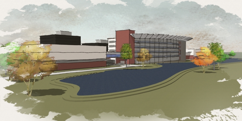
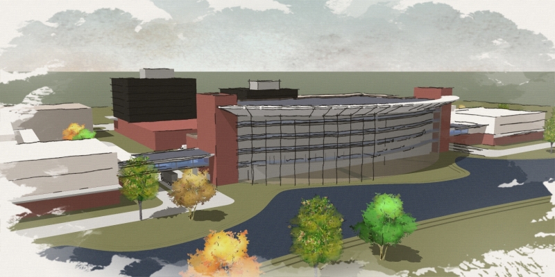
My WC attempt
-
Needed to do a series of sketchy images for a development meeting for one of our sales guys. Had to be very generic example of a potential medical campus. Used Tom's WC trees among others, and an edited black WC style from this site. Thanks everyone for sharing. For 4 hours work I was pleased with the results - but I would probably try the reflective water trick the next time along with some other changes.
I would be interested in some constructive feedback!

Bytor


-
Good job, seems like you managed to fulfill the criteria very well.
Only crit i can think of is to try and fill the entire ground plane in the first one, apart from that- superbly done.
-
Simply effective: dy-no-mite!
(now on the wall to study and steal :`)
-
Looks great, Bytor. I'd tone down the bright green trees, so they are more in tune with the other trees.
-
I would suggest using unique masks for the brush effect around the edges. especially if multiple views will be displayed next to one another. not sure that most people would notice, but...
nice presentation!
-
Thanks for the feedback guys - great suggestions!
As I intend to use this method again - I will likely work on a whole library of WC tree variations with more coordinated and seasonal colors. Nick - I really like the edges suggestion. That could be a big difference in a series of images like this when viewed together. While there is not s much control as other methods - to be able to quickly crank this type of output straight from SU with styles is very cool!

Bytor
Hello! It looks like you're interested in this conversation, but you don't have an account yet.
Getting fed up of having to scroll through the same posts each visit? When you register for an account, you'll always come back to exactly where you were before, and choose to be notified of new replies (either via email, or push notification). You'll also be able to save bookmarks and upvote posts to show your appreciation to other community members.
With your input, this post could be even better 💗
Register LoginAdvertisement


