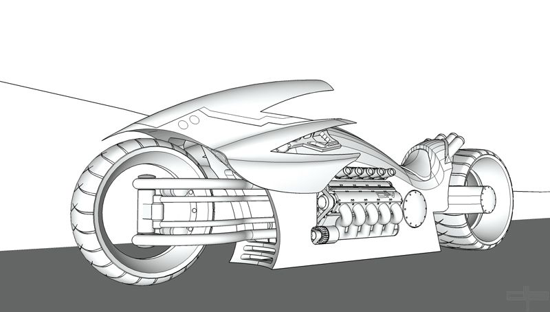
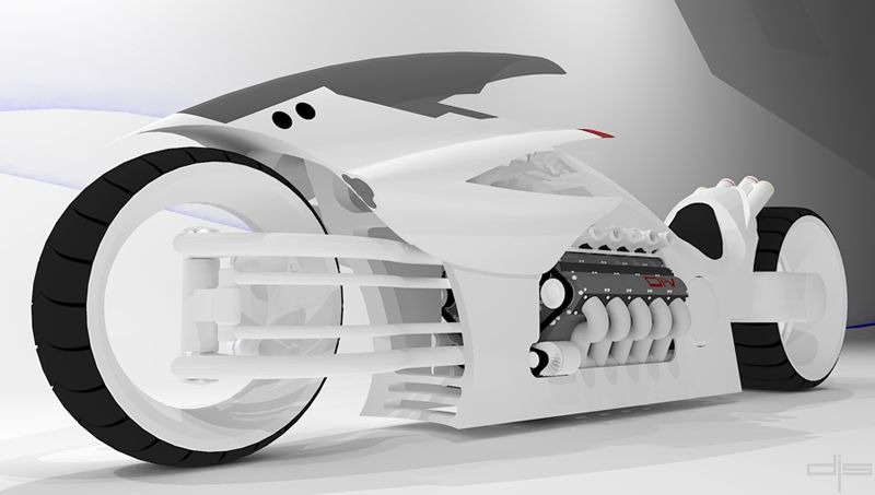
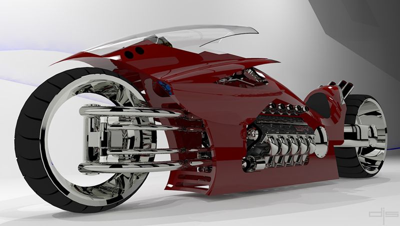
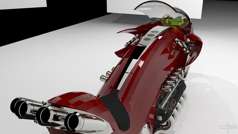
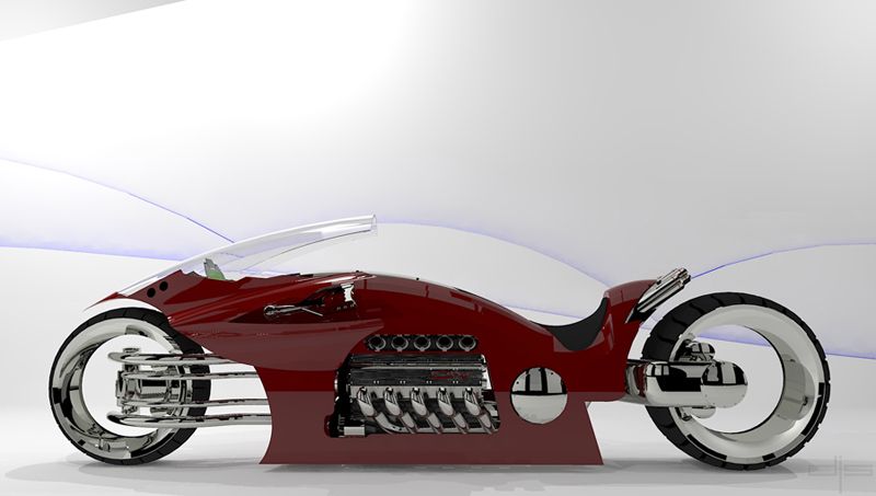
Concept Bike
-
looks like 2 inches or so
-
Thanks guys, the SU side of things was easy enough but I think I have a long ways to go with KT. The rendering was to be set in a SEMA show case scene display hence all the "Bling".
Here are a few early test renders with differant color and background.
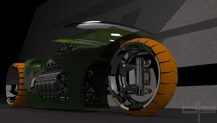
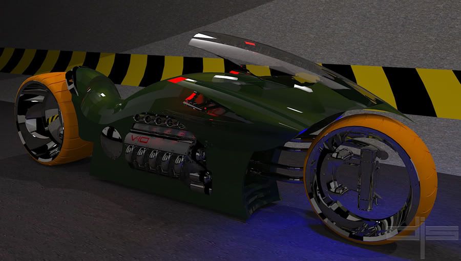
-
Really nice model.
couple of crits: lighten up the background a bit and make the chrome bits a little less shiny. Kind of feels like the rest of the scene is being overwhelmed by these 2 things, still its a very good render.
Edit: just saw those 2 new ones, kind of makes most of my post really piintless, apart form "really nice render"
-
i hate myself because i don t know to render

-
Thank you for your comments, still a WIP I'll fine tune this bike although I'm still learning my way around KT... I have a long way to go yet.
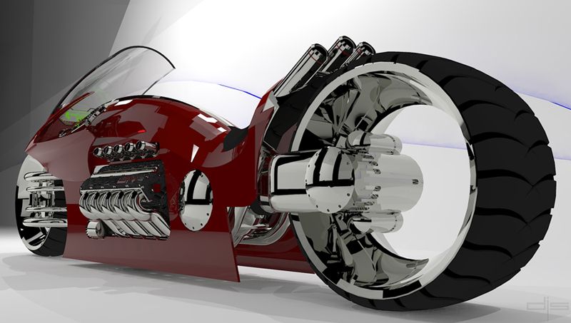
Here are a few closeup detailed shots.
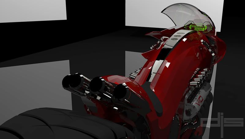
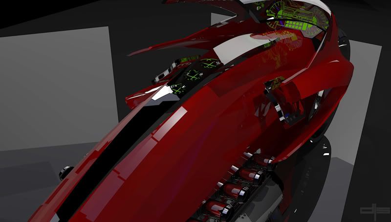
In this pic I integrated the "Stop" and "Park/Signal" lights right in to the tailpipes......smooth ahhh!!!
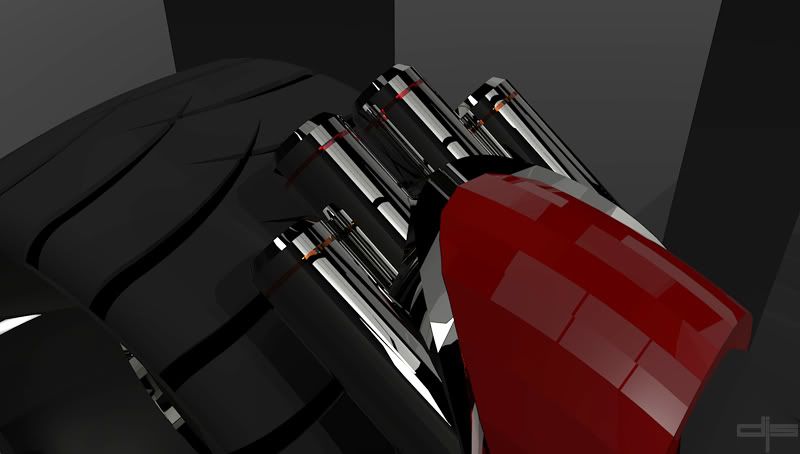
danny

-
this is awesome..love the swing arms..really cool..
renderings are definitely getting brighter as you go..how about a gloss or diffuse white studio background so we can see all these great details you've got in there?
-
I'm working on that right now, as you can see I'm still getting a grip of rendering but I think I'll get there with some help from you good people.
-
-
Great work Danny, well done.
-
Wow Danny, that was fun to view. Great work and well done.
BTW when ou have it built be sure to only go straight with
no turns
Mike
-
great job!
 american chopper should build one of that
 -
Wow.
-
hey would you mind showing us how you started your bike? I've been trying to make a motorcycle but i need help he he

-
Danny,
You must have known how to draw bikes before su, every pcs looks good and in place. Did you model all the pieces. Nice model and nice rendering as well.
-
hey, my only sugestion is that the bottom of the (really nice) bike seems a little too flat. this is especialy apparent in the last render. try adding some swoop-y lines too go with the windscreen and rest of the bike.
i like all the little details (i call the "greebles") on the dash board displays and on the swing arms. i love the idea of hollow wheels, it gives such a clean and modern look. great job!!!*edit: i just realized i looks startlingly like a dodge motorcycle concept from a couple years back. it was powered by a v-10 engien from the dodge viper, and had a body style similar to yours. im not saying thats a bad thing, its really a good thing.
-
Hi everyone and thanks for all the positive comments. I'm sorry for being MIA for a while but I have a medical emergency with my dad and I'm out of the country right now and can't access my files.
@RayOchoa, No problem my friend, I just have to get back home to do it. Updates soon
@igor, since my last update I have redone the bikes body design and tweaked a few things and it looks a lot cleaner now. I have taken some of your and others suggestions, so thanks. When I get back home I'll post the updated bike.
@lapx, Yes, I created all the components. This is my first bike ever in SU...I guess I just have an eye for it.
Danny

-
yeah, great eye can't wait
-
Absolutely FANTASTIC! I love it!! ...when can I get a ride!?

Great work! Thanks for sharing and keep it up!

Cheers,
- CraigD
Hello! It looks like you're interested in this conversation, but you don't have an account yet.
Getting fed up of having to scroll through the same posts each visit? When you register for an account, you'll always come back to exactly where you were before, and choose to be notified of new replies (either via email, or push notification). You'll also be able to save bookmarks and upvote posts to show your appreciation to other community members.
With your input, this post could be even better 💗
Register LoginAdvertisement
