Making my first portfolio...C&C welcomed
-
thanks for your comments ...
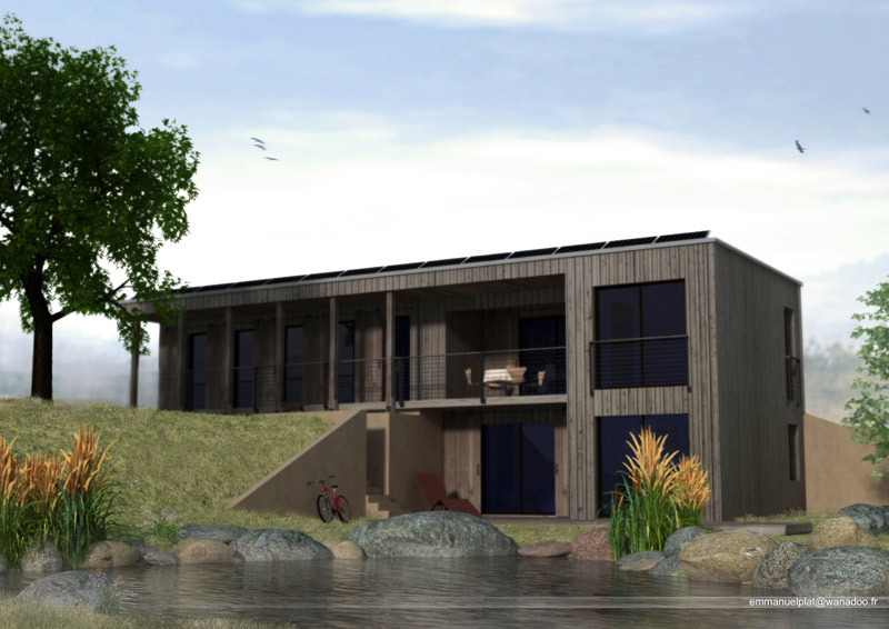
yes I admit I somewhat applied too much blur on the entourage ...actually I find it quite difficult to have people sit well in the global picture ... no matter what I try they always look goofy...I'll try to have another take on this part.
if you have some tips to share on this subject...
as for the color scheme, beeing raw concrete and light grey tiles I find it difficult to make it different ...in fact I already tweaked the picture with a yellowish filter and played with the levels...maybe not enough...
back to work... -
When incorporating 2d pictures of people into 3d renders its important to have a picture with basicly the same lighting. At least have it coming from the right direction. Then I use color correction, levels and curves to get it as close as possible. You can also brighten up the side towards the light and darkening the shadow side manually to make it fit in even better. Its hard to describe in this short form but if you're really interested try searching for tutorials on matte painting. http://www.mattepainting.org/ for example.
These guys can do wonders.
Im sure there is people who are puritans and say: "I want the rendered image to be perfect and I'm not going to "cheat" and fix things afterwards in Photoshop".
I believe that it is the final image that counts and not the way there. 3D is also a "cheat" you know and even a photo isn't the real thing.About the colors, I think you should look at some photos that have basicly the same materials and lighting and mood your after and go for that. Some times the mind tricks us and we see what we know instead of what we actually see with our eyes.
Grey is such a color. We know it is grey but often it looks greenish, pinkish or yellowish.
I dont know what look you're after but I know that people usually think warm, bright images have a more positive feeling to them so if this is what your after... -
@ pixero
hmmm, you enlighten me about this one.
-
thanks for the link...I just started a few weeks ago investing the matte painting field...lots of things to learn for post work in there ...
agree with you about the range of colored greys ...
only now do I realise the mood implied by my scene is not exactly what I meant it to be ...
anyway here are 2 more renders...
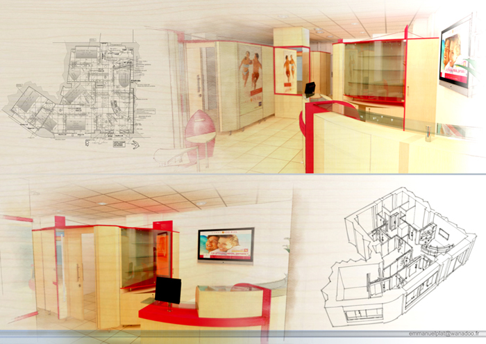
I suspect them to feel somewhat cramped with so many things crammed in so little paper space ... waiting for comments on these...
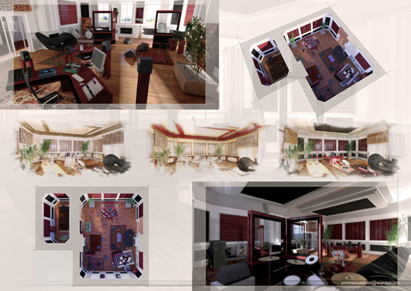
thanks to Kwistenbiebel for the plants, Bytor for the armchairs and Urgen for the hofner bass in the music studio space...
-
I like these better. Especially the first. The second have to many images.
Its hard to focus on anything. Maybe you could do two images with half the pictures on each. -
Nice renderings!
Concerning your first sheet, you might try warming it up by using warmer colors on your furniture, or maybe white. Purple is a cool color, plus has a limited appeal. -
boards updated ...

still got some work to do on the living room ...
-
quick update ...
-
congrats for all those things... they a very nice!


-
Great Renders!
I review a lot of portfolios (thousands and thousands over the years) and there are some things I appreciate.
- Display your work in a clean "space", show your work in a graceful simple manner wether it be on a piece of paper, or web page.
- Make it easy to find. If you are showing it on a web site don't hide it behind fancy flash animation. Art directors sift through a lot of portfolio's and have little time to hunt for things on your page. I'm patient, but most will just move on and not look at all your work, they'll look at two images than move on, frustrated.
- If other people worked on the piece with you (happens often in my field) clearly define how you contributed to the work.
- Know what your potential employer is looking for, and craft your portfolio for them.
I'm not trying to be mean, just stating a few easy things to keep in mind when crafting your portfolio. I see so many missteps in this area, that it makes me want to start a portfolio coaching business. I can't believe schools aren't teaching this nowadays. In my day that was essential. And you can tell the schools that teach how to do it and those that do not.
Your first image is a tad busy. I love the images but you could do with just one and I'm not a fan of the background texture. It's a tad distracting. My eye wanders all over the page not quite knowing what I should look at. I'm looking for your work, not looking at your packaging. You have great work, show it off.
Your second piece is great. The layout suggest a path for my eyes to follow and it tells a story. I'd lighten the background behind the plan view at the top left corner, and make it pop.
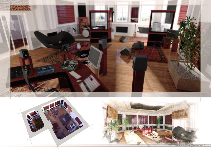
#3 is great as well. But perhaps a tad busy. My eye does move on the page pretty well. Not sure what the 3 images represent in the middle - are they day to night? I'd take out one of the top down views, it appears that the second one does not show anything new.
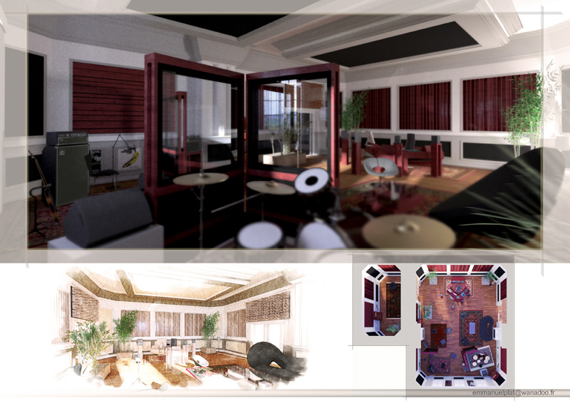
#4#5 are great versions of the last one. If you were to show these to me in person can you talk me through each page and each image, giving me a reason why you put each image on the page? It appears that you could, so that's a great thing.
#6 The layout on this image is a too weighted to the left for my taste. I want to see that tree as a whole and give my eye something trace to the structure. This is a hard one because the green area is obstructing the face of the building a little. If I where to shoot a still of this in real life (or shoot for a movie) I'd move my camera to the right, show the left tree in full, get as much of the building front as I could, and show off the minimal detail on the side of the building (but not too much). This angle might also provide a peek up those stairs which looks incredibly inviting, and I want to look up them
All in all great work! Honestly. Better renders and layouts than 90% of the portfolios I see every day. If this is truly your first portfolio, you are well on your way! Of course keep in mind I'm not in your field, I'm in the visual storytelling, game design, animation field (whatever that means).
-
wouahou...

thanks for all those constructive critics ....I'll keep it in mind for the next set of pictures...
back to work now ...trying to keep things simple ... -
The hand drawn look images are my favorite....
gian
Hello! It looks like you're interested in this conversation, but you don't have an account yet.
Getting fed up of having to scroll through the same posts each visit? When you register for an account, you'll always come back to exactly where you were before, and choose to be notified of new replies (either via email, or push notification). You'll also be able to save bookmarks and upvote posts to show your appreciation to other community members.
With your input, this post could be even better 💗
Register Login


Advertisement