I thought this an interesting mix...
-
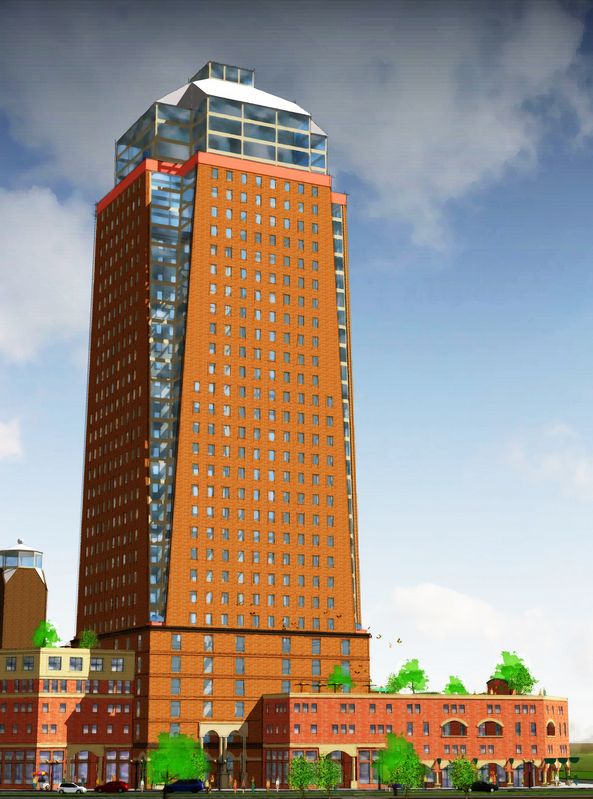
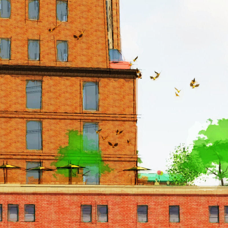
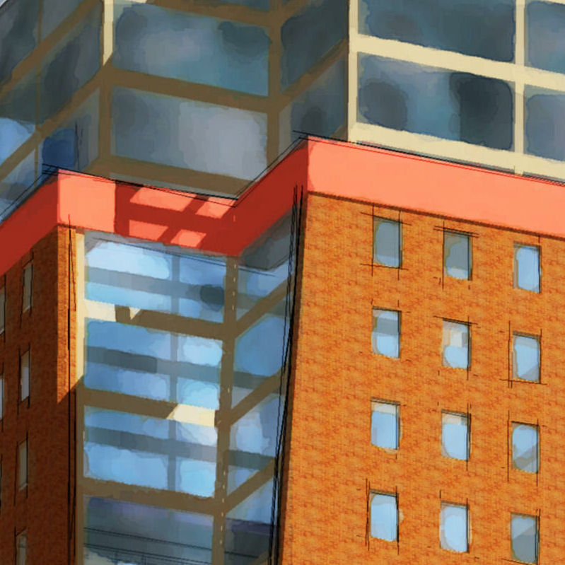
...but my taste tends to a bit wierd, so what do you all think (thanks in advance):
-
Did you do this one?
It's okay, just not WOW. It could use a little more interesting gradiation of colour on the main surfaces; not only to add interest and complexity but also to suggest depth/perspective. For the same reason some foreground stuff and possibly midground stuff would go a long way to suggesting depth also.
This one can't so easily get away with the "simple" look because it really isn't all equally simple.
-
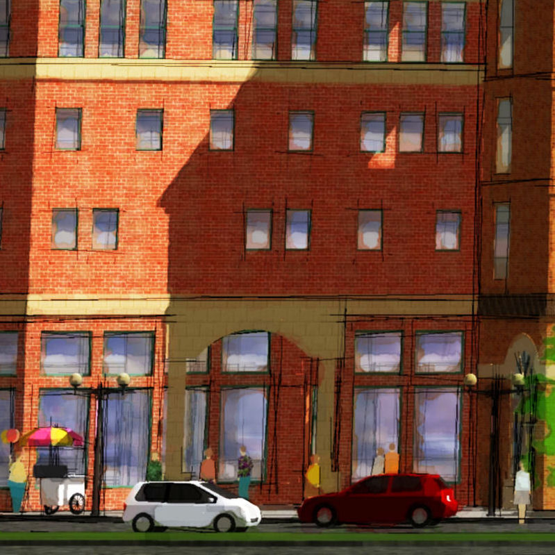
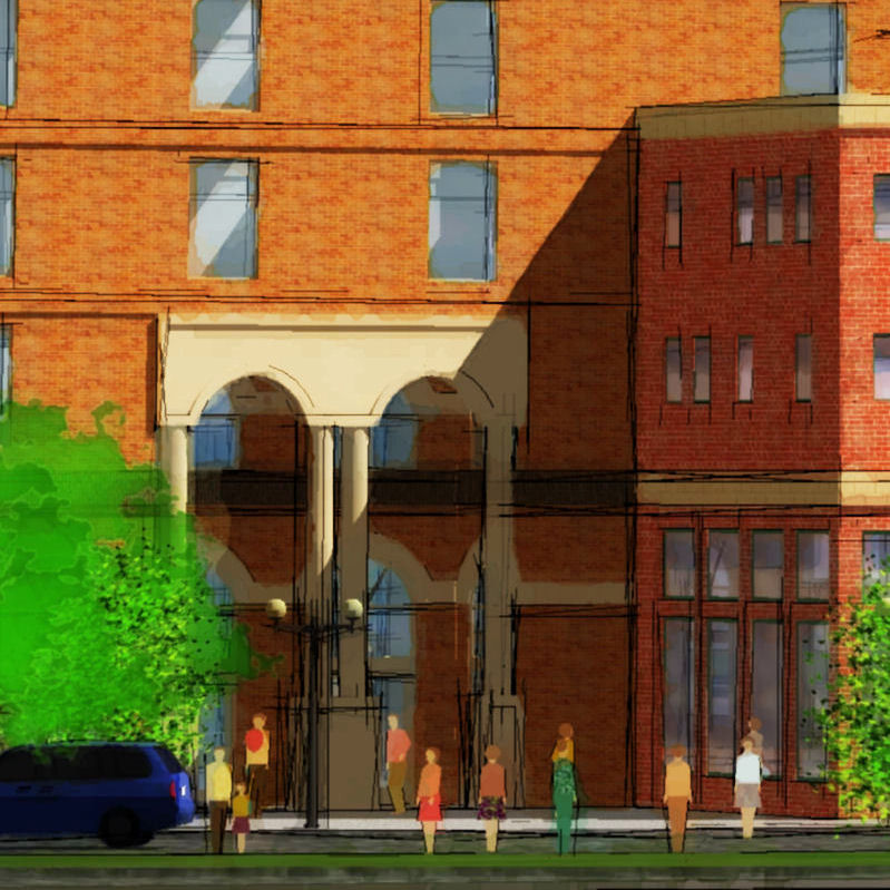
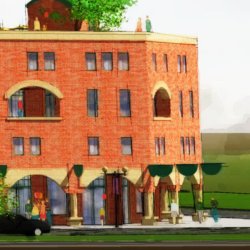
A couple more details since the image is large (4000x5400...2.8meg):
-
Details are very lovely but I would still add gradiation of colour upward and away from the viewer.
-
examples from my favourite illustrator re gradiation of colour on building surface:
-
Now she is talented Susan!
They are wonderful. I would like some of those hanging up in my house. -
Yes, Susan, she is great...the ethereal quality of her images is just the level of strange-ness I find intriguing and hope to attain in other ways. I had lost her link (and name) so thanks a bunch for reposting it.
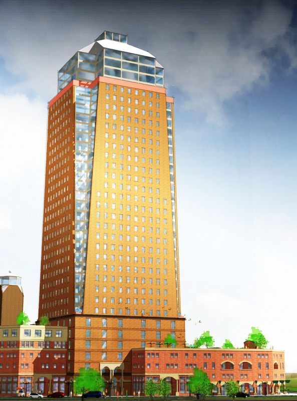
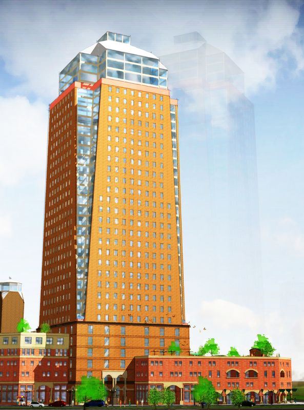
And your comments are absolutely right-on...I was again focused in on one specific part of the image: the textural quality. Here's a couple of studies of a fix:
-
Tom, I think that is very much improved. It adds a whole level of sophistication and interest. I think perhaps I like the first one better of the two. I am so glad we all have each other here as a sounding board. I have benefitted countless times from your input.
-
Those are really fantastic Tom.
Hello! It looks like you're interested in this conversation, but you don't have an account yet.
Getting fed up of having to scroll through the same posts each visit? When you register for an account, you'll always come back to exactly where you were before, and choose to be notified of new replies (either via email, or push notification). You'll also be able to save bookmarks and upvote posts to show your appreciation to other community members.
With your input, this post could be even better 💗
Register LoginAdvertisement


