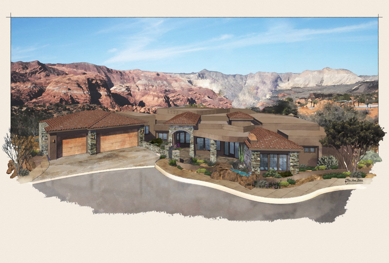
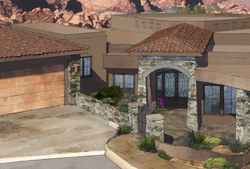
Latest Render
-


-
very nice, tina... watercolor background looks great...love the composition with the landscaping busting out into the white space! been awhile since we've seen anything from you..
-
Hi Tinanne,
Lovely! -
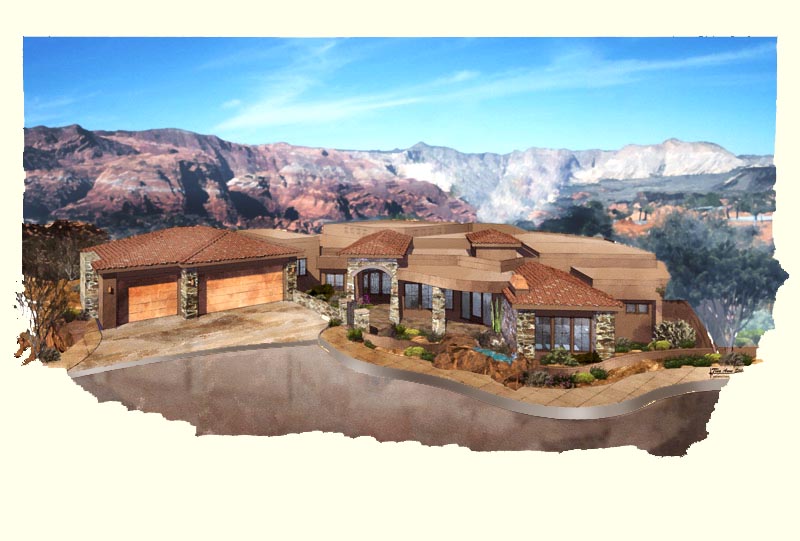
I just tried some ideas to see what they would do.
I understand the concept of having a building blend with the environment in the real world. However in a render, you may want to separate the building from the environment to make it stand out for the client.
Here are the things I tried:
1 Darkened the fronts of the hills and lightened the tips
2 Made the whole hill area bluer and the whole foreground warmer.
3. Made the hils ever so slightly out of focus.
4. Darkened the edges of the rendering
5. Curb was distracting as a white cut through the art so I darkened and modulated it a bit.

-
Beautiful render tinane
-
Thanks everyone, I appreciate the comments and suggestions.
Roger, I made the changes you suggested and submitted the rendering. Thanks for catching the curb thing. I couldn't place what was bothering and that was exactly it!
Thanks all! Off to pack some more boxes

-
Beautiful Tina.
-
Lovely image, Tina!
Hello! It looks like you're interested in this conversation, but you don't have an account yet.
Getting fed up of having to scroll through the same posts each visit? When you register for an account, you'll always come back to exactly where you were before, and choose to be notified of new replies (either via email, or push notification). You'll also be able to save bookmarks and upvote posts to show your appreciation to other community members.
With your input, this post could be even better 💗
Register LoginAdvertisement


