That lil' big project is still kickin'...
-
...and we're prayin' for a miracle :`)
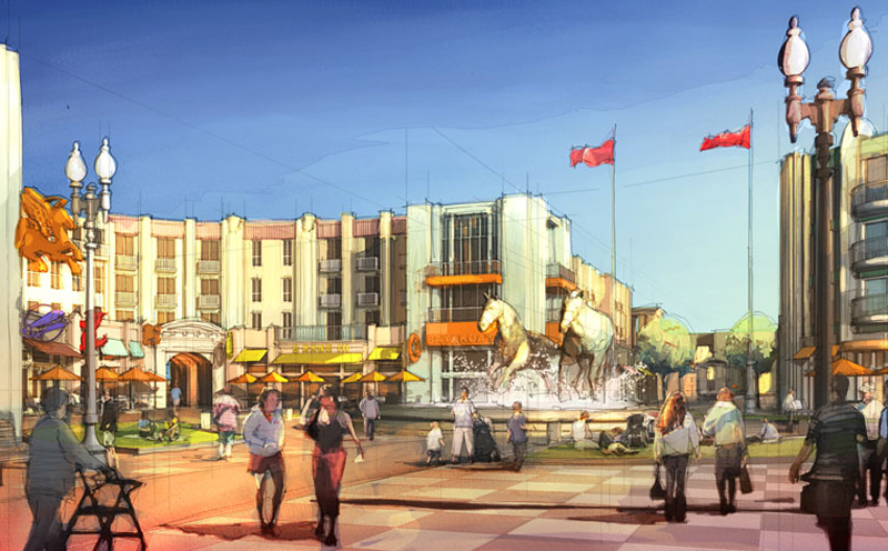
This view is about showing the relationship of the "project" to the buildings in the background: which is one of the city's big transportation hubs. The renders are about showing some life and excitement on the perimeter of the "project". Though the street is a main artery, there is a museum across it (on the left out of view, creating the shadow on the street), so traffic slows enough in the area for some mid-block pedestrian interaction (and pedestrians in this neck of the woods aren't at all bashful).
My question, besides the usual plea for C&C, is if they are successful as intended. Also, wondering about your preferences on the wet/less-wet issue...this architect likes the wet, my other clients like the less-wet. I'm kinda partial to the wet at this stage in my rendering skill development...I can claim it's just a sketch :`)
-
Tom the first of the images look more "human". The second is more graphical.
Tom,....Tom... I totally LOVE this image. It is uttery charming and eye catching and adorable.
-
Wow! Susan, I'm...speechless. Thank you for such kind words.
But I gotta ask: adorable? Not a word in my arsonal so can't quant/qual-ify with any reasonable understanding of what aspects to repeat...I think?
-
Great images Tom.
In my opinion Your images would benefit even more
and have a greater architectural feel if You added some
loose pencil sketch overlay and maybe extended edges.
I would also prefer to keep the sky simple.
I think have an image in my reference library that I think
shows what I mean. It was done by Dennis Allain,
illustrator . It was probably done in other techniques
but You will catch the drift.You can see more of his work here:
http://www.dennisallain.com/Dont get me wrong, once again You images are great
this Is just a matter of opinion and my personal
taste.Cheers,
Mateo

-
Mateo, that is a somewhat more complex style. Yes, very pleasing.
Tom, I guess I mean that the style is sort of "primitif". Capturing the essence of child-like simplicity of style and colour, happy, uncomplicated, gay ( in it's original meaning) etc etc. -
Susan, thanks for the clarification...now I'm even happier! Kinda what I'm going for artistically right now...a simple little smile, maybe a barely audible giggle here and there (about all I have the skill for so far :`)
Thanks, Mateo, for the reminder...I have a shortcut to Dennis' site on my desktop (as one of many to aspire to) but haven't been a'studyin' in awhile. (Haven't a clue yet how to get there from here, but even baby-steps will get you anywhere you want to go.)
-
I like the wetter technique because the wet sky has a closer link to the rendering of the building. IE same style. In the other the clouds are too photo realistic for the rest of the picture.
-
@roger said:
I like the wetter technique because the wet sky has a closer link to the rendering of the building. IE same style. In the other the clouds are too photo realistic for the rest of the picture.
Those were my exact thoughts.
-
Hello! It looks like you're interested in this conversation, but you don't have an account yet.
Getting fed up of having to scroll through the same posts each visit? When you register for an account, you'll always come back to exactly where you were before, and choose to be notified of new replies (either via email, or push notification). You'll also be able to save bookmarks and upvote posts to show your appreciation to other community members.
With your input, this post could be even better 💗
Register LoginAdvertisement


