Green Toaster's Car Sketches
-
. . . tossing on a few details before moving on to the next one . . .
-
Wow, it's been a while.
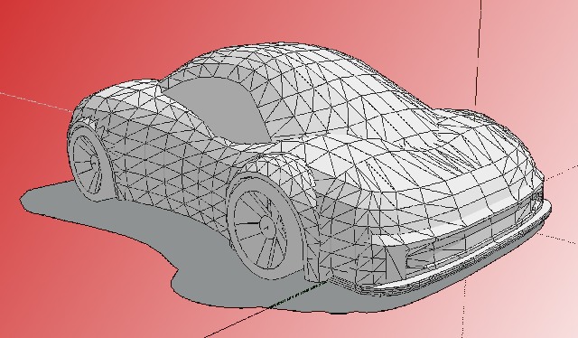
Here's a little warm up - something to help me get back into the swing of things.
Happy Sketching,
Brad


-
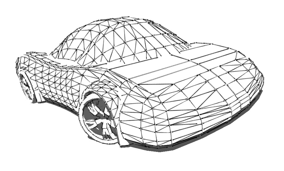
A two sides car

-
-
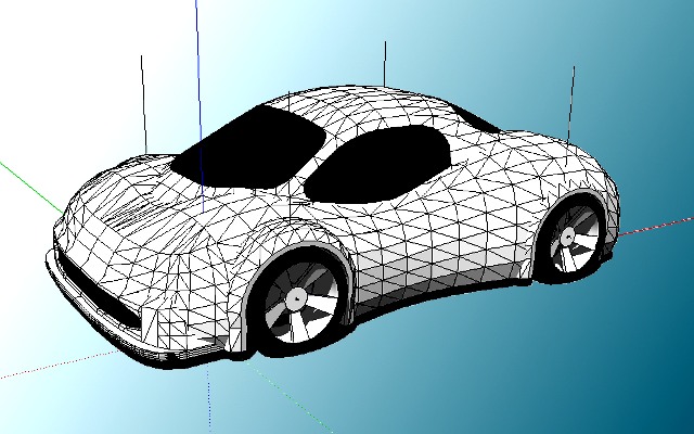
. . . typical GT . . .

-
-
Front & back - got it.


-
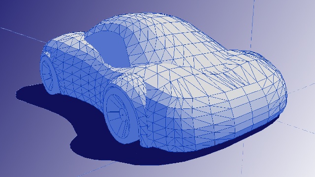
I like the idea of the front fender being visually larger than the rear. It may look like another "sporty" FWD car (at this stage) but it has this "Arr! I want to eat you, you piece of litter!" stance.
Let me rephrase that for you:


-
it probably wouldnt be very aerodynamic, if its vertically bigger
-
I know I don't know what I'm doing - my car proportions are really askew - I'm just playin' around, but I'm still enjoying it.
-
its like an Audi TT!!
-
i would have said a VW beetle

-
It's been a while . . . something quick and simple to get the ball rolling . . .

-
Hi Mr. G. how have u been lately ? Indeed long time no see!
Regarding the car...details needed ..

Take care!
Elisei
-
@ely862me said:
Hi Mr. G. how have u been lately ? Indeed long time no see!
I've been fine, thanks. I'm still using SketchUp at work, of course. I've also recently gotten back into robotics and I have a few new r/c cars. I'm working on an autonomous robotic follow-car for my high school students. It's very fun but challenging!
@ely862me said:
Regarding the car...details needed ..

Some things never change - ha.
-
Long time no see indeed. Glad to hear you're doing awesome stuff. Robotics and rc cars

Cheers.
-
Have u ever took a car and watch the wireframe? First time i used SU 5 and i saw the car by components(i was completely wordless)and i tuned it
 ; after this i wasn t happy it was really ugly then i start to make a new car i did it,was much better than that in components,then,second try using 2 pictures of a toyota supra and i did it amazing,not verry close like the totyota,but was a car,a real good one.Those were my trying with SU 5.now i m in spain for work and i get SU 6 and i was completely out of words when i saw what is in warehouse,i was thinking that those great,awesome models are made by sketchupers and i told myself i m busted,but somebody told me that those cars are imported from games and other 3d programs,that make me feel better,i wasn't that weak as i though,and i started to tune cars, after i learned some new tips and i saw the wireframes and geometry of the cars i start to build my first concept car,wasn t very good but was better than many others.
For good proportions u can use temporary the position of the wheels of a desired form of car(ex:u like to make a car like a mazda miata-take the wheels of a miata and start from them,for many times i started a car and i hadn't the right proportions and the project needed to be resized).
PS:sorry for my bad english
-
Hello Brad !
Where are you ?Kind of missing you around !
Cya !
-
@ely862me said:
Hello Brad !
Where are you ?Kind of missing you around !
Cya !
Thanks!
I've been goofing off, as usual.
When the storms of life seem to rage without ceasing, I find great solace in retreating to my isolated realm and simply designing things with SketchUp. I still embrace paper media along with virtually any writing instrument for hand-generated sketches. I still allow my left brain, and the requirements of life, to drag me over to the well structured, database/geometry management monoliths, teeming with overflowing functionality (does anyone actually use all that stuff - ha). But, that's really not me. I'm happier wearing t-shirts than ties and there's no reason to apologize for that. I'm too old to worry about working 72 hours a week while watching the corporation blunder itself into employee and customer ignored bankruptcy.
My students are still using SU - of course - but they're taking a brief respite to focus on a "very popular" solid modeling tool (SW). I believe it's critical to have a well-rounded set of skills for every architect, engineer or designer. Their eyes are becoming open and they are receiving knowledge. The shop has many tools, they leave the saw when it's necessary to drill a hole. With a little encouragement I could manage to share some of the projects my students have done - probably best on another thread.
I wish I had something "phenomenal" to share, some creative and amazing models I've created or some amazing projects I've been involved with. No, not really. I just keep puttering through life, enjoying what I do, loving SketchUp which serves well to express, develop and share ideas. The other tools certainly have their place but for creative concept modeling, nothing seems faster, more capable, intuitive or fun than SU and I don't think I'd ever truly appreciate this if I didn't have significant experience with the other tools.
Sorry to ramble - wow, it's been a while. How's everyone doing?
Happy Sketching,
Brad
-
My all-time favorite thread on SketchUcation....glad to hear you are doing well, Brad. I bet your classes are very popular!
Hello! It looks like you're interested in this conversation, but you don't have an account yet.
Getting fed up of having to scroll through the same posts each visit? When you register for an account, you'll always come back to exactly where you were before, and choose to be notified of new replies (either via email, or push notification). You'll also be able to save bookmarks and upvote posts to show your appreciation to other community members.
With your input, this post could be even better 💗
Register LoginAdvertisement


