Creating a backround Image for Montage/Presentation
-
hi, i recently made an entry into a shed competition and i thought i would do a quick tutorial about how i created the background image...
this process literally takes about 10 minutes depending on how much you want to fiddle with individual layers/elements the final product may not be the most professional looking image but it does the job!
This tutorial is aimed really for novice photoshop users, any expert users who see this- i apologies in advance for poor technical methods. Ok, lets go:-
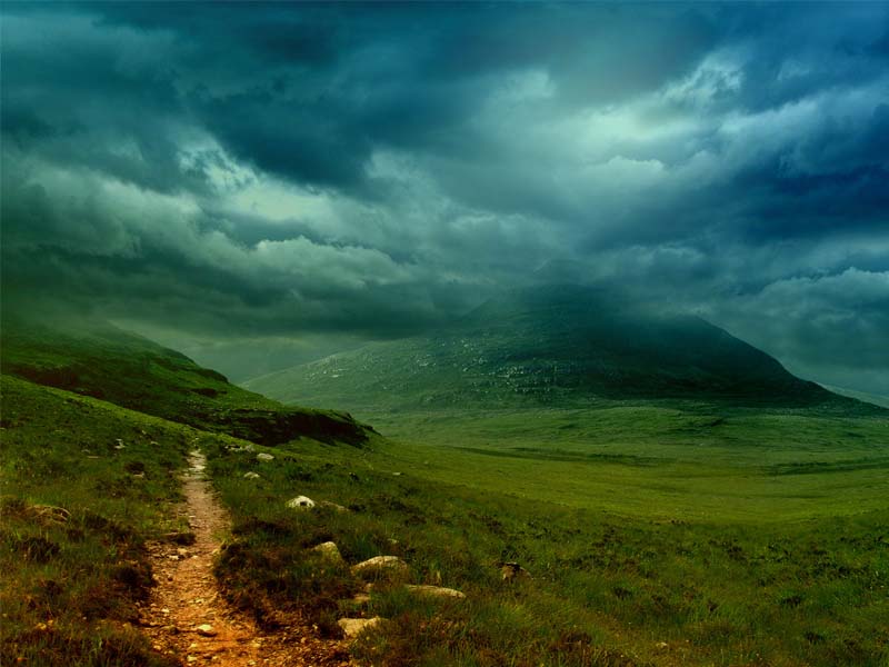
So first of all find a background (unless your working from photos of a real site which really helps). To find the one here I just went on Google image search and typed in ‘landscape night’ setting the image size to large to get a decent resolution
Here is the original image used & the link:

-
a little bit of minor editing to make the image a bit nicer to look at... so open up Photoshop and either
auto levels the image (image>adjustments>auto levels or ctrl+shift+l)
this will balance up the image quite nicely if it isnt already. A more advanced way of doing this for more specific results can be achieved by going through the
colour levels (ctrl+b) and brightness/contrast controls (image>adjustments>brightness/contrast).3)Optional further editing can be done.... so say if I want to alter the sky, all you do is lasso it up and change the brightness/contrast levels shown in the images below:
poster-Archi Rag
-
-
4)time for more detail... adding trees is pretty simple, google search it or http://www.formfonts.com has a good library so just find some that work well with the landscape and then copy/paste them in, a simple way to duplicate more trees without them looking the same is by altering the colour balance and using the Edit>transform controls to change them slightly....
- Now you have a base picture so save it as a JPEG and create a new file to the required size and 100-150 pixels per inch which can form the basis for your presentation panel
7)The next few steps are a matter of personal preference i have always had a fondness for the dark and back as a colour as well as being an easy colour to merge with, so resize your picture so that you can use some of the outside space to define your idea/show additional images and create a rectangle behind it.
- Go to Filter>Render>Lighting Effects- from here choose a lighting effect that can complement the picture making it easier to blend in with the background.
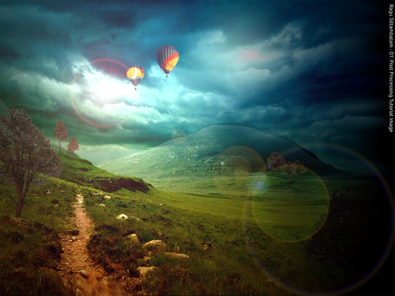
This is hopefully what we are going to produce-
poster-Archi Rag
-
just add a lens flare (filter>render>lens flare) and this is what you get...

-
Beauty Eh. Thanks for the tut.
-
I am so glad you posted this Archi, thanks.
Hello! It looks like you're interested in this conversation, but you don't have an account yet.
Getting fed up of having to scroll through the same posts each visit? When you register for an account, you'll always come back to exactly where you were before, and choose to be notified of new replies (either via email, or push notification). You'll also be able to save bookmarks and upvote posts to show your appreciation to other community members.
With your input, this post could be even better 💗
Register LoginAdvertisement


