Form Homes up and live!
-
Is this done or can I make a suggestion?
If it isn't and I can... It would be neat to have a black and white ground around the model. the same photo style in the presentation, but a top view printed on the paper that the model is mounted on. then when you pick up the model there is a floor plan under it.
just a suggestion... It looks great. it's sure to catch some eyes as is.
-
@krisidious said:
Is this done or can I make a suggestion?
If it isn't and I can... It would be neat to have a black and white ground around the model. the same photo style in the presentation, but a top view printed on the paper that the model is mounted on. then when you pick up the model there is a floor plan under it.
just a suggestion... It looks great. it's sure to catch some eyes as is.
Great minds surely think alike mate! That actually was the original intent - the models are rock solid so they could take the handling. However it's a very public exhibition, we considered that after the first time it is picked up it would never be put back in proper place!
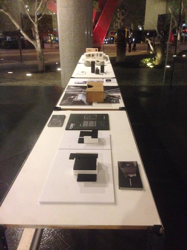
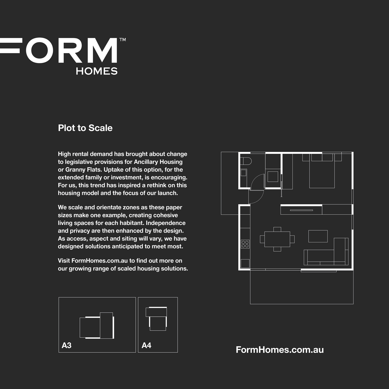
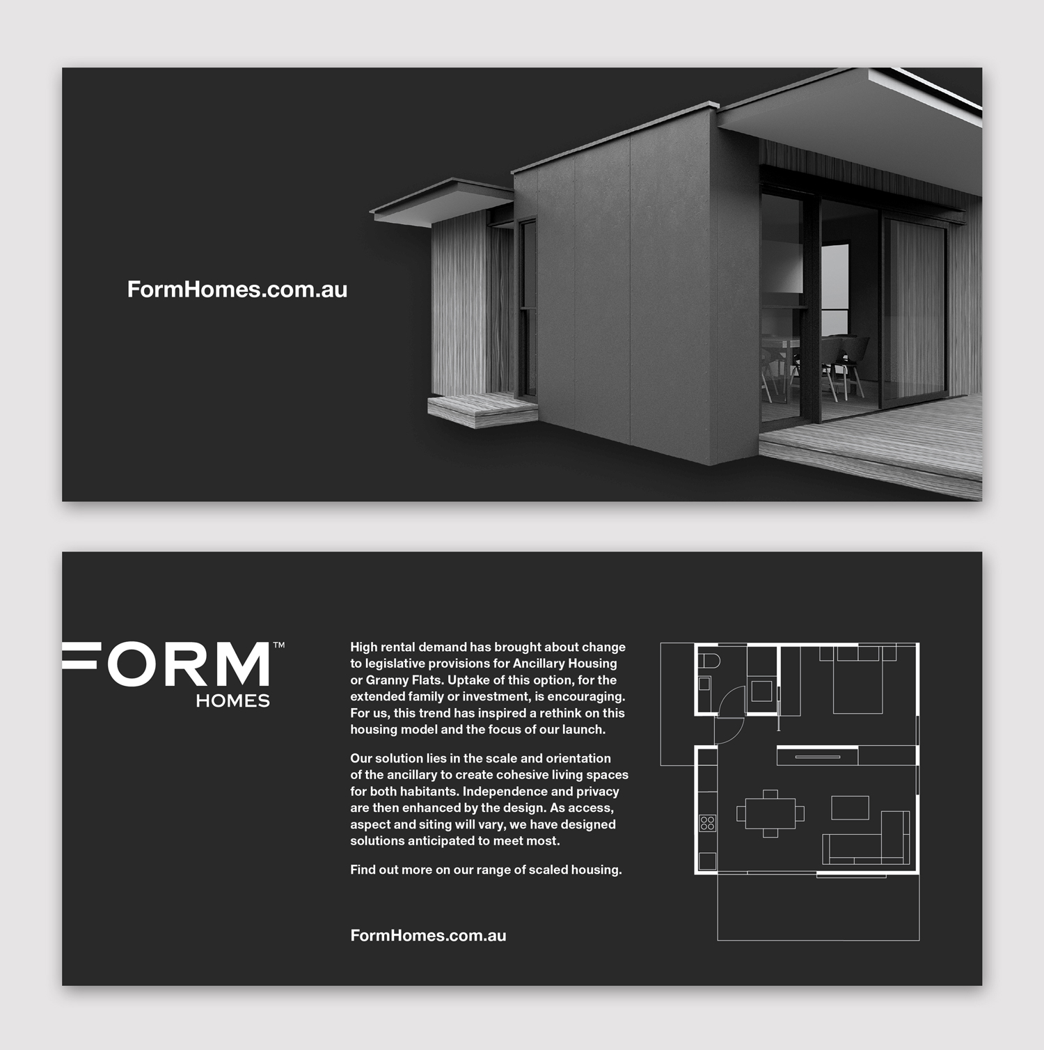
Here is a shot of the model installed in the exhibition, the accompanying text / diagram and a flyer to support it.


-

Never underestimate the natural OCD in normal people. I bet people would go out of the way to put it back right. if they even dared to touch it.It all looks very tight. What are the organic shapes on the table?
-
@krisidious said:
:thumb:
Never underestimate the natural OCD in normal people. I bet people would go out of the way to put it back right. if they even dared to touch it.It all looks very tight. What are the organic shapes on the table?
Actually you could be right with the OCD

Mate I'm not sure what the other shapes exhibited are. I'd love to go and check them out but the clients and the exhibition are 4 hours flying away (other side of the country) yet to meet them unfortunately!
-
An excellent concept and wonderfully executed.
I was only thinking along these lines the other day while looking at the backyard of my mother's house here in Sydney. There is enough room to built a nice granny flat and still have a courtyard style garden. There is a great market for this sort of thing in Sydney now that the zoning laws are allowing double occupancy.So with that in mind perhaps you should show some of the designs shoehorned into an urban environment, so people can see how well they can be incorporated sympathetically into a smaller area with existing structures.
-
@box said:
An excellent concept and wonderfully executed.
I was only thinking along these lines the other day while looking at the backyard of my mother's house here in Sydney. There is enough room to built a nice granny flat and still have a courtyard style garden. There is a great market for this sort of thing in Sydney now that the zoning laws are allowing double occupancy.So with that in mind perhaps you should show some of the designs shoehorned into an urban environment, so people can see how well they can be incorporated sympathetically into a smaller area with existing structures.
Mate the market in Sydney for Granny Flats is HUGE - We are limited to 60sqm where in Perth they have up to 70.
We are doing a brochure up to demonstrate siting options, though haven't worried to show them sited as this is our first launch, and we want the theme to run right through the other stuff we most want to do!
Your mum could certainly financially benefit from one - depending on where she is in Sydney they are fetching about $300 a week!!! Thats a good return on the investment. Mind you most product in Sydney is just crap and not at all helping the case for this model of housing.
I lived in a few as a young bloke for cheap rent by the beach, though then they weren't an authorised form of housing.
-
As far as mum benefiting, bugga that! I can live and work in the bloody thing.
Burwood, 3min walk to train, little chinatown, coffee shops, plaza and westfields etc etc -
@box said:
As far as mum benefiting, bugga that! I can live and work in the bloody thing.
Burwood, 3min walk to train, little chinatown, coffee shops, plaza and westfields etc etcThat would work!!! Certainly sound like the perfect spot for it.
These are of growing use for exactly that, the extended family. As you'd well know rents in Sydney are ballistic! The rent we pay each week ourselves for a tiny two bed place on the lower north shore could drag the economy out of debt!
-
They might be perfect client, but it may be they found the perfect guy for the job at hand. Good on you, mate!
-
Congrats Richard! Cool project, well done!
-
Thanks Guys, You could be right about the guy for the job at hand, we've found a rare match of minds, all driven by the same style and thoughts on housing.
-
It's when you do great work that a client gives you free reign. Excellent job, Richard!
Is this the project you were thinking about 3D printing a model of?
-
Rich,these are beautiful!There is an simple elegance to the images,I mean that in a good way.
Seriously,wonderful job. -
A real winner, good job

-
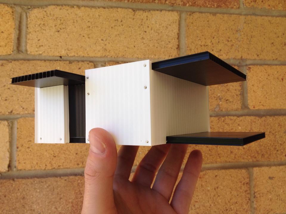
Curious about the walls on the physical models that stick up above the black roof material (or just flush?). Does this represent a sort of parapet and what is the purpose, other than looking interesting? I don't see it in the renderings.
Did you glue-up the models for the exhibit (instead of hair clips)?
Oh, and I assume the roofing will be light colored in the end--"cool roofs" etc.
-
so bloody slick it makes me angry!
haha great work Richard.
-
wow.. I love it all! great job Richard.
-
@d12dozr said:
It's when you do great work that a client gives you free reign. Excellent job, Richard!
Is this the project you were thinking about 3D printing a model of?
Thanks mate, this is one of the jobs mate - though the exhibition turned out to be a little sooner than the client had originally suggested.
I'm trying to talk them into have a model of each style done for the show home. Just got to see how that pans out. Problem with start-ups, so much money has to go in so many directions even before the first home is sold!

-
@davidh said:
Rich,these are beautiful!There is an simple elegance to the images,I mean that in a good way.
Seriously,wonderful job.Thanks mate! Means a great deal coming from you!
-
@pbacot said:
Curious about the walls on the physical models that stick up above the black roof material (or just flush?). Does this represent a sort of parapet and what is the purpose, other than looking interesting? I don't see it in the renderings.
Did you glue-up the models for the exhibit (instead of hair clips)?
Oh, and I assume the roofing will be light colored in the end--"cool roofs" etc.
Mate they are indeed parapets. They are on the render on the front side of the flyer I later posted. This home isn't in our range yet, it's a bit of a special to which we are still in the process of nailing all the details.
They are there for reason besides aiming to be a feature, we are constructing with a panel system and in this case the whole home is designed around standard panel heights so there are limited cut panels and minimal waste.
And yes the roofing will be white, Western Australia has a fairly warm climate, bloody hot in fact!
In the end I pinned the models together. Came out fairly cool.

Hello! It looks like you're interested in this conversation, but you don't have an account yet.
Getting fed up of having to scroll through the same posts each visit? When you register for an account, you'll always come back to exactly where you were before, and choose to be notified of new replies (either via email, or push notification). You'll also be able to save bookmarks and upvote posts to show your appreciation to other community members.
With your input, this post could be even better 💗
Register LoginAdvertisement


