Logo gallery - LAYOUT work [Updated 01 Feb]
-
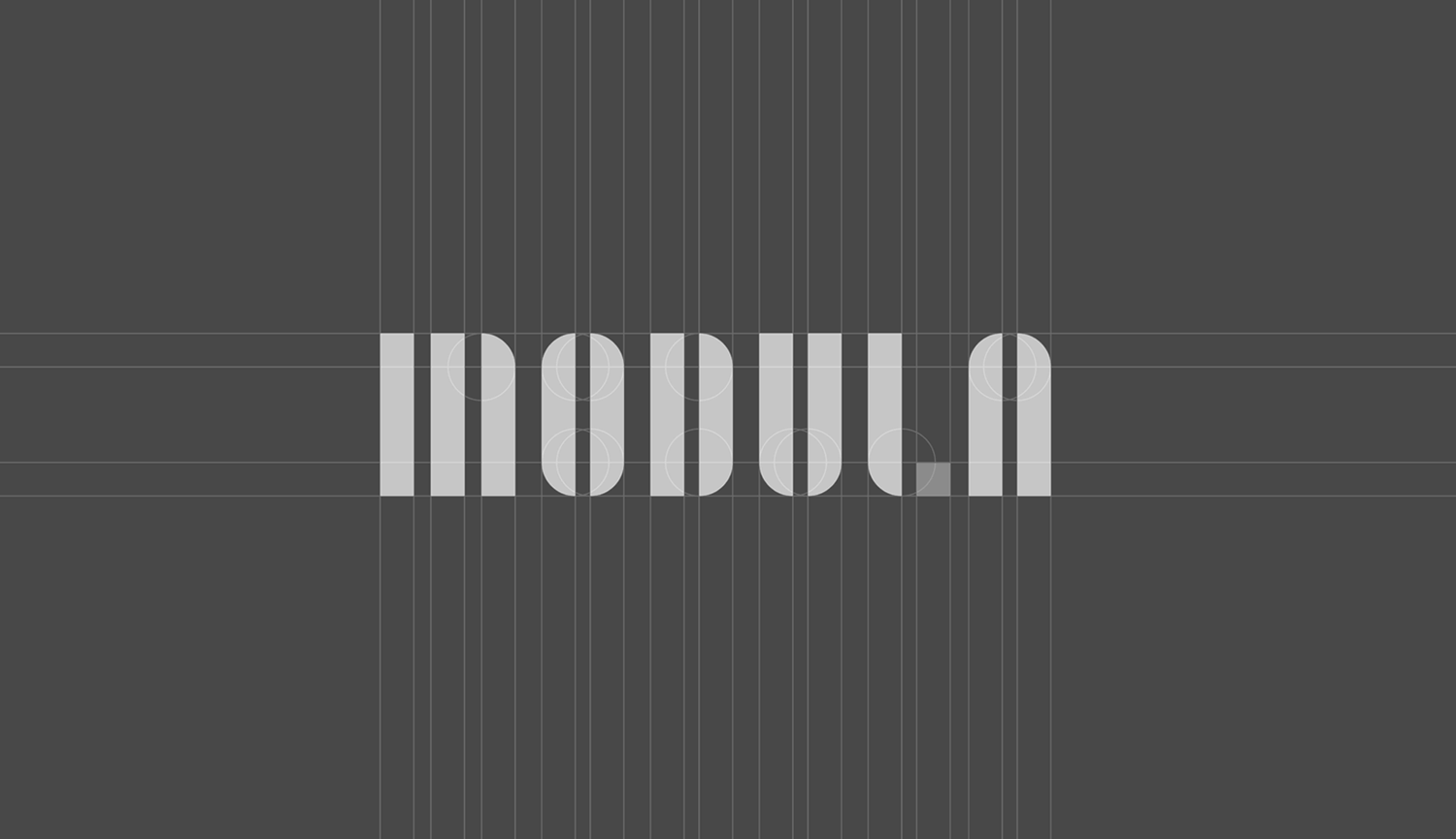
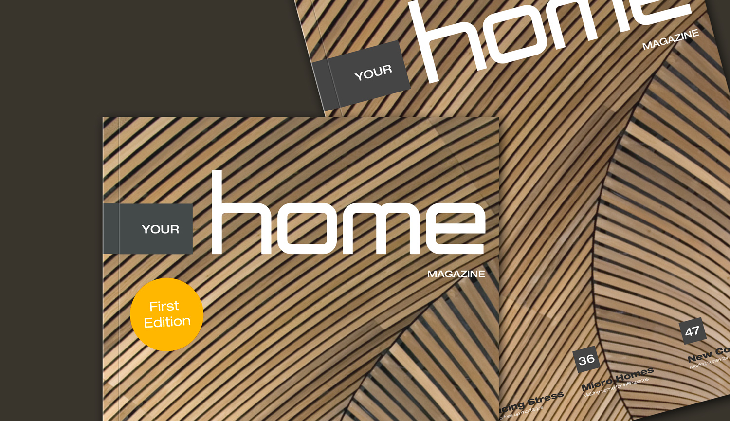
Managed over the christmas break to design a few more logos - again the tool of choice for shear simplicity - LAYOUT. All are custom made fonts.
I'm still on that promise to do a screen grab video of just how these are created using layout, I haven't forgotten!














-
All great. Better all the time in fact. Thanks!
Happy New Year Is it all over down under? I always like to see the videos of fireworks in Sydney. Hey you have a front row seat!
-
Excellent work Richard.
You are exposing us to different ways to use LO. It is interesting how each of us sees LO as something different depending on our work background.
I see LO as a simple way to create working construction documents and you use it to do graphic design. I love it.
I never thought about using it in that way. I even created my simple 2D logo in SU and now I see that I could have just created it in LO.

-
@pbacot said:
All great. Better all the time in fact. Thanks!
Happy New Year Is it all over down under? I always like to see the videos of fireworks in Sydney. Hey you have a front row seat!
Thanks a bundle mate!
Yes by the time you posted NY was all over!
Sydney Harbour certainly sets itself up well for a proper fireworks display. Nearly a million people have a direct view from their homes - then there are 100's of foreshore vantage points and at least 10x that running back up the hills either side. It means millions get to watch them live and relatively up close.
Up until last year my partner had an apartment 100m back from the harbour with direct views to the Opera House and Bridge about 2 klm away. As we could access the flat roof of the block we would head up there to watch. I'm sure we had one of the best vantages in Sydney - the small upturned edge coping allowed you to sit comfortably right on the edge 8 stories up by ourselves. A view uninterrupted for the full length of the harbour! Spectacular!!!!
Best wishes for the year ahead mate!
-
@jawsnaz said:
Excellent work Richard.
You are exposing us to different ways to use LO. It is interesting how each of us sees LO as something different depending on our work background.
I see LO as a simple way to create working construction documents and you use it to do graphic design. I love it.
I never thought about using it in that way. I even created my simple 2D logo in SU and now I see that I could have just created it in LO.
Mate what I love about LO for the type of stuff is the intuitive path slicing, joining and curve adjustment. Though there are some path editing enhancements it could greatly benefit from it is still pretty simple!
There are also some very funky ways to create projected UV maps for SU models working back and forth!
-
A few more added.
-
@richard said:
@pbacot said:
All great. Better all the time in fact. Thanks!
Happy New Year Is it all over down under? I always like to see the videos of fireworks in Sydney. Hey you have a front row seat!
Thanks a bundle mate!
Yes by the time you posted NY was all over!
Sydney Harbour certainly sets itself up well for a proper fireworks display. Nearly a million people have a direct view from their homes - then there are 100's of foreshore vantage points and at least 10x that running back up the hills either side. It means millions get to watch them live and relatively up close.
Up until last year my partner had an apartment 100m back from the harbour with direct views to the Opera House and Bridge about 2 klm away. As we could access the flat roof of the block we would head up there to watch. I'm sure we had one of the best vantages in Sydney - the small upturned edge coping allowed you to sit comfortably right on the edge 8 stories up by ourselves. A view uninterrupted for the full length of the harbour! Spectacular!!!!
Best wishes for the year ahead mate!
You moved out of that apartment, Rich? Where too now, Kirrabilly...?
 [Where the Ozzie Prime Minister resides...]
 -
@utiler said:
You moved out of that apartment, Rich? Where too now, Kirrabilly...?
 [Where the Ozzie Prime Minister resides...]
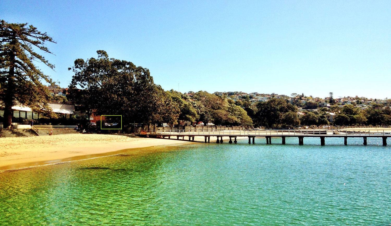
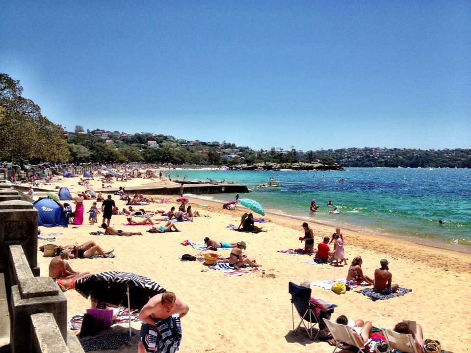
No mate, Leonie moved from that apartment when we moved in together - still on the beach at Balmoral, you must drop by one day when you get to Sydney - you'll do a bit of a jaw drop and drag when you see the spot! Walk straight of the front porch - across the road and you're on Sydney Harbour's most stunning beach with a view out through the heads!

This shot is from the baths over the road - you can see our place just through under the trees!
-
I knew there had to be a reason I didn't like you Richard... now I found it. So jealous.
-
@marked001 said:
I knew there had to be a reason I didn't like you Richard... now I found it. So jealous.
Dont worry mate it has it's drawbacks! Summer holidays for one - it's hard to work when tons of bikini clad women are walking past all day! And of course parking can be a bitch!
-
Another fun one added!
-
I'm on a ROLL!!!!!

-
Crap,what a place, Richard. Can I come stay--with my paddleboard!?
Diggin the logos. Are all these work projects?
-
Nice but is 7 degrees here and I don't need to look at your sunny beach.
Stop it, your killing me!

-
@pbacot said:
Crap,what a place, Richard. Can I come stay--with my paddleboard!?
Any time mate!!!! The place seems to be a mecca for paddleboarders. Every day there are literally maybe a 100 throughout the day, plus kayakers and ski paddlers oh and did I mention bikini clad women?
Thing that most surprises me though is the bunch of ocean swimmers who swim each morning WAY out in the harbour. There are sharks out there! It was only just a few years ago a navy diver got munched not far from the Opera House!
@unknownuser said:
Diggin the logos. Are all these work projects?
Mate the logos are done to support the 100's of domains I've secured relative to the building and development industry. I offer them as a package to new startups and once conversing normally pick them up as a full service client with everything from building design to renders, web design, print design, signage and market copy!
I've now got about 30 brand options completed to furnish a re-construction of my site for 2014 - then I just need to complete about another 100 or so! Just got to hope they don't start looking much the same!
-
@jpalm32 said:
Nice but is 7 degrees here and I don't need to look at your sunny beach.
You're right I shouldn't rub it in! 7 degrees - brrrrrrrr! You're always welcome to visit too!
-
Mmmm. Got to worry about a guys in dark glasses snooping around the beach with a camera....

Will take you up on that offer next time I'm down there, Rich!
-
A few added and a few updated.
The 2260 one is my favorite so far. Works with the postcode where a lot of coastal development is occurring and hopefully suits a development branding.
-
Soft shadows in LO? Did I miss this?
-
@pbacot said:
Soft shadows in LO? Did I miss this?
No Mate, you wished it! The logo is done is Layout and then post pro in photoshop.
Here's the layout file if interested!
Hello! It looks like you're interested in this conversation, but you don't have an account yet.
Getting fed up of having to scroll through the same posts each visit? When you register for an account, you'll always come back to exactly where you were before, and choose to be notified of new replies (either via email, or push notification). You'll also be able to save bookmarks and upvote posts to show your appreciation to other community members.
With your input, this post could be even better 💗
Register LoginAdvertisement


