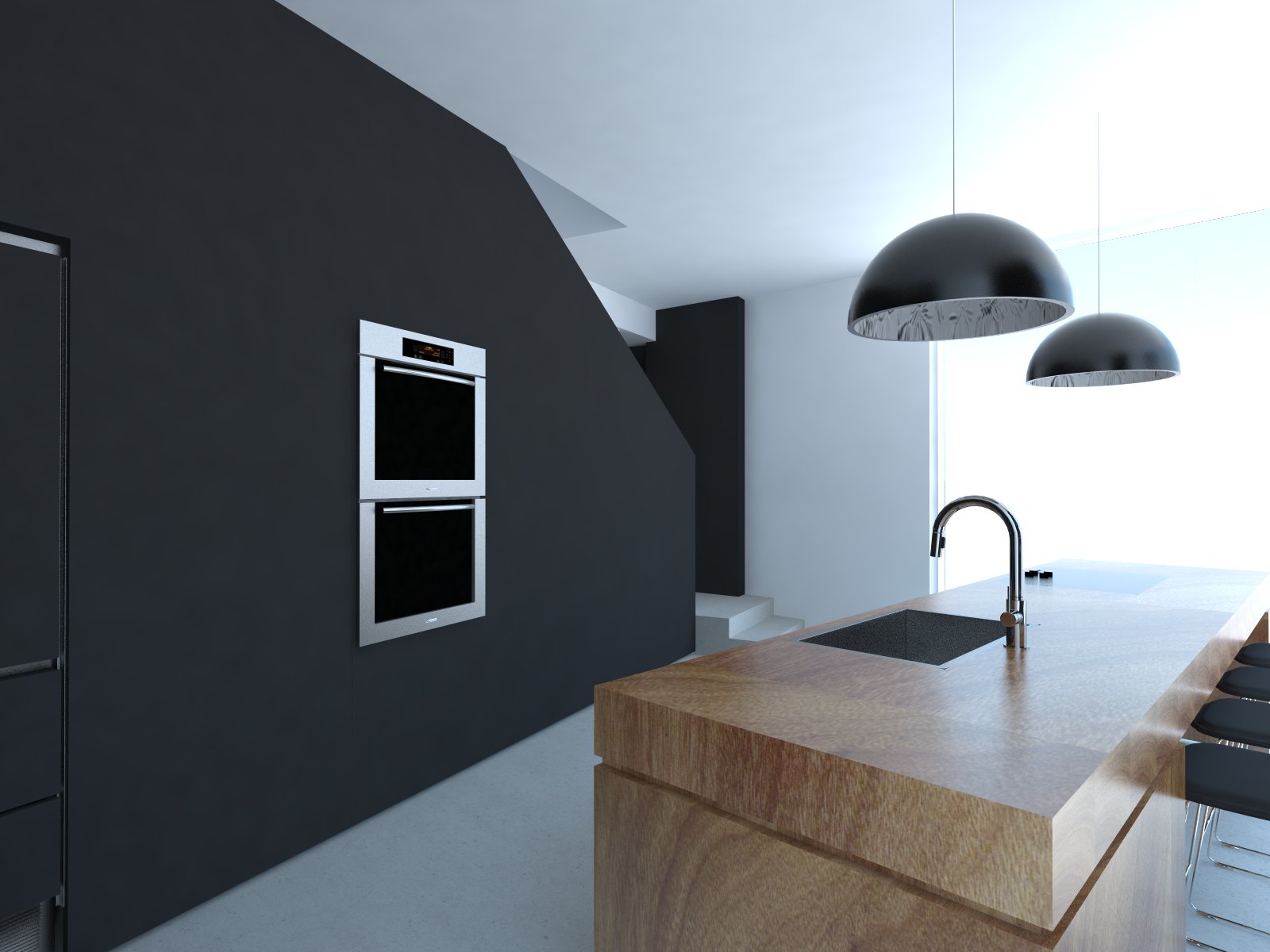
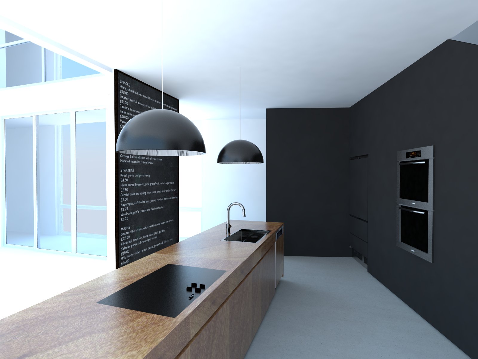
A Modern Kitchen
-
SU 8
Vray 2.00.23590
PS CC


-
Looks great
and so is my Mouse -
Good job, i like the clean uncluttered image. Perhaps i would have added a simple skirting.
-
If that were my kitchen, and I actually used it, it would look like that for 5 minutes...maybe.
Nice, minimalist design. It looks like one of the controls (rectangular piece) is floating above the surface.
-
WOW love the kitchen, a lot! Black is the stunner! Though I'd suggest your whites are way too white!
Hello! It looks like you're interested in this conversation, but you don't have an account yet.
Getting fed up of having to scroll through the same posts each visit? When you register for an account, you'll always come back to exactly where you were before, and choose to be notified of new replies (either via email, or push notification). You'll also be able to save bookmarks and upvote posts to show your appreciation to other community members.
With your input, this post could be even better 💗
Register LoginAdvertisement


