Light studies
-
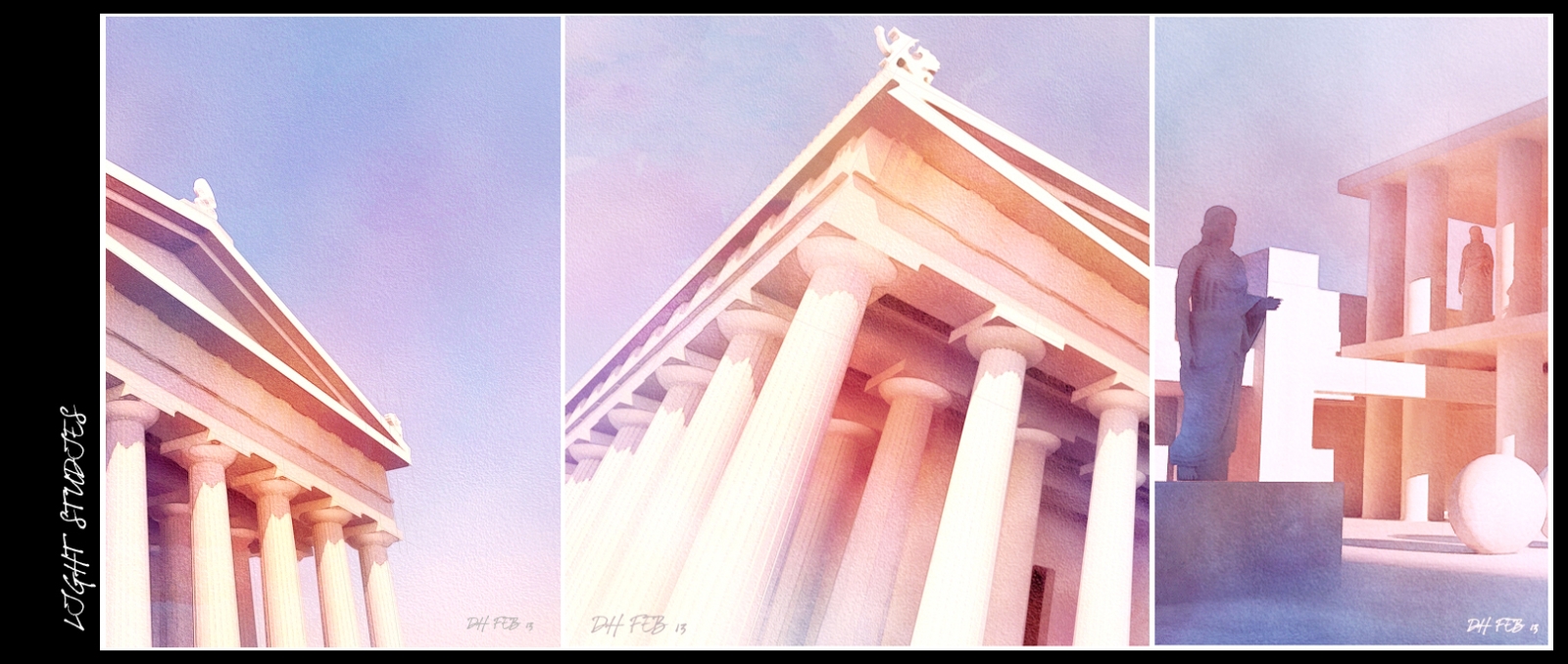
Attached are 2 very stylised images in 2 very different styles.
The first is an NPR watercolour based on a model I downloaded from 3d warehouse, renedered in Thea and post processed in photoshop.
I wanted to play around with 2 very basic colours,orange and blue and combine them to create different depths in the shadows.
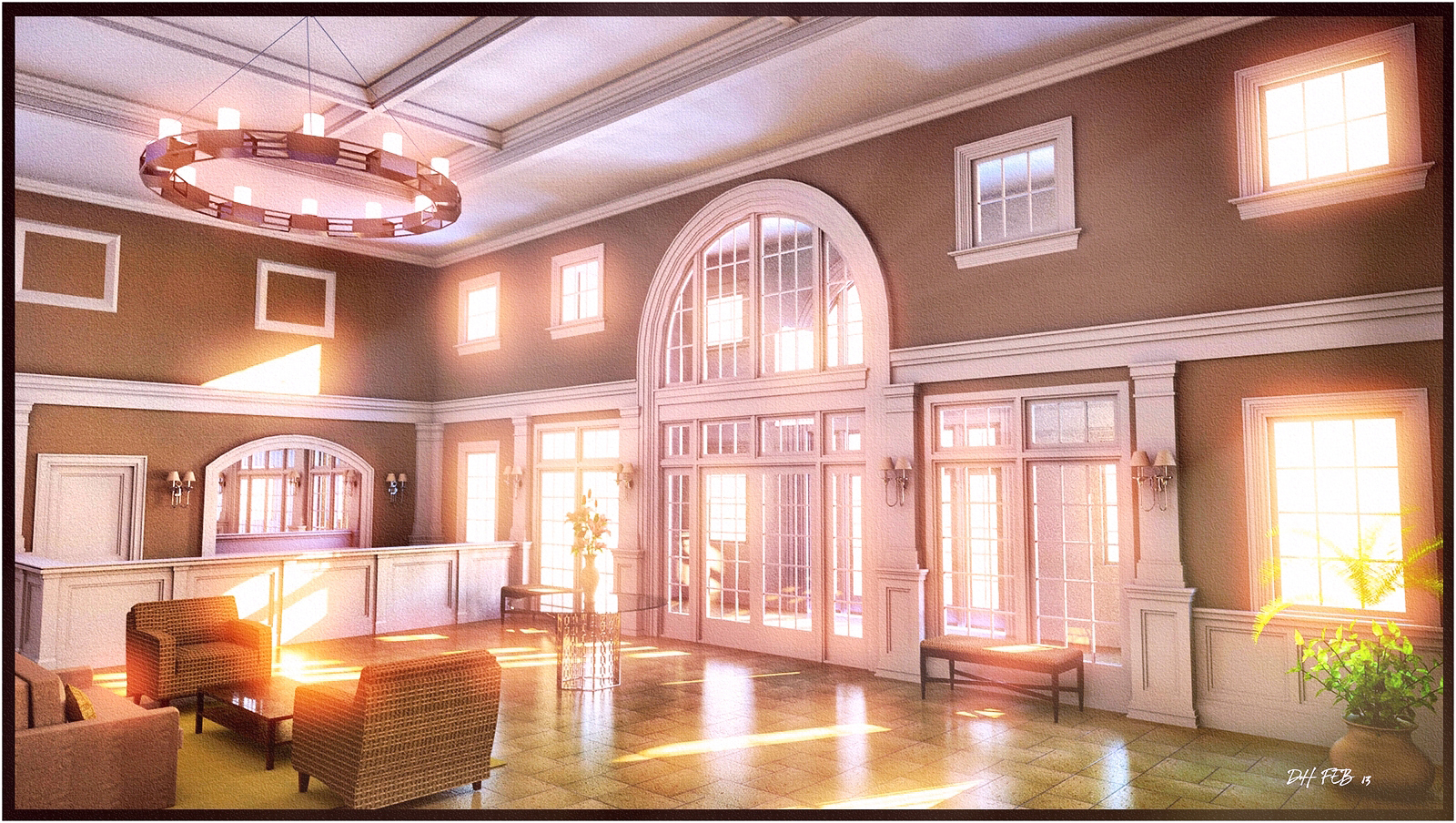
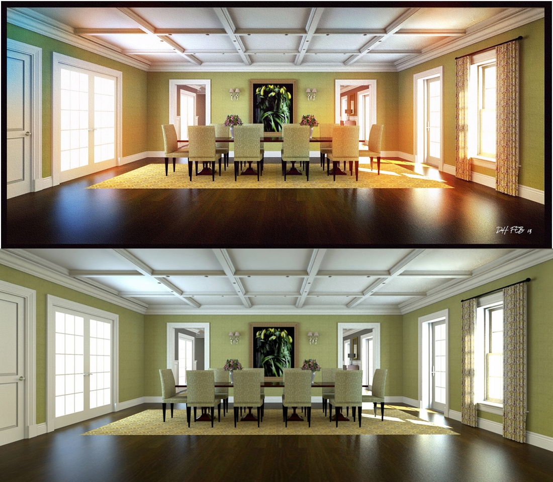
The second is from a project I worked on last year but really wanted to blow out the light coming thru the windows and see how far I could saturate the image without destroying it.(modeled in sketchup and rendered in Thea)
-
I think you succeeded on the first one, quite nice, and on the second for what you were aiming for, but I don't think I like it. Reminds me of 70's colour photos when they were not processed properly. Just personal taste really 'cos you've done it well.
-
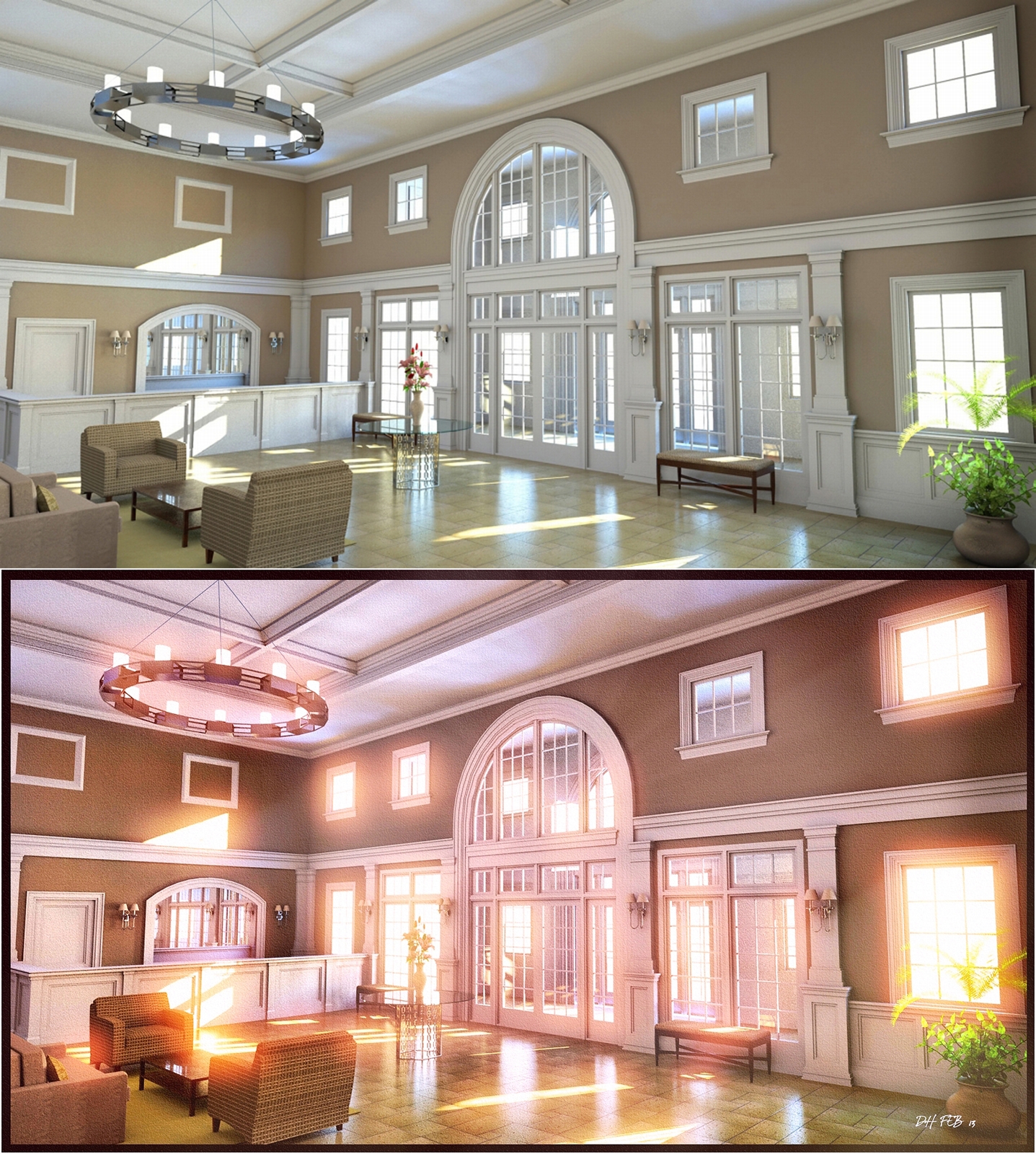
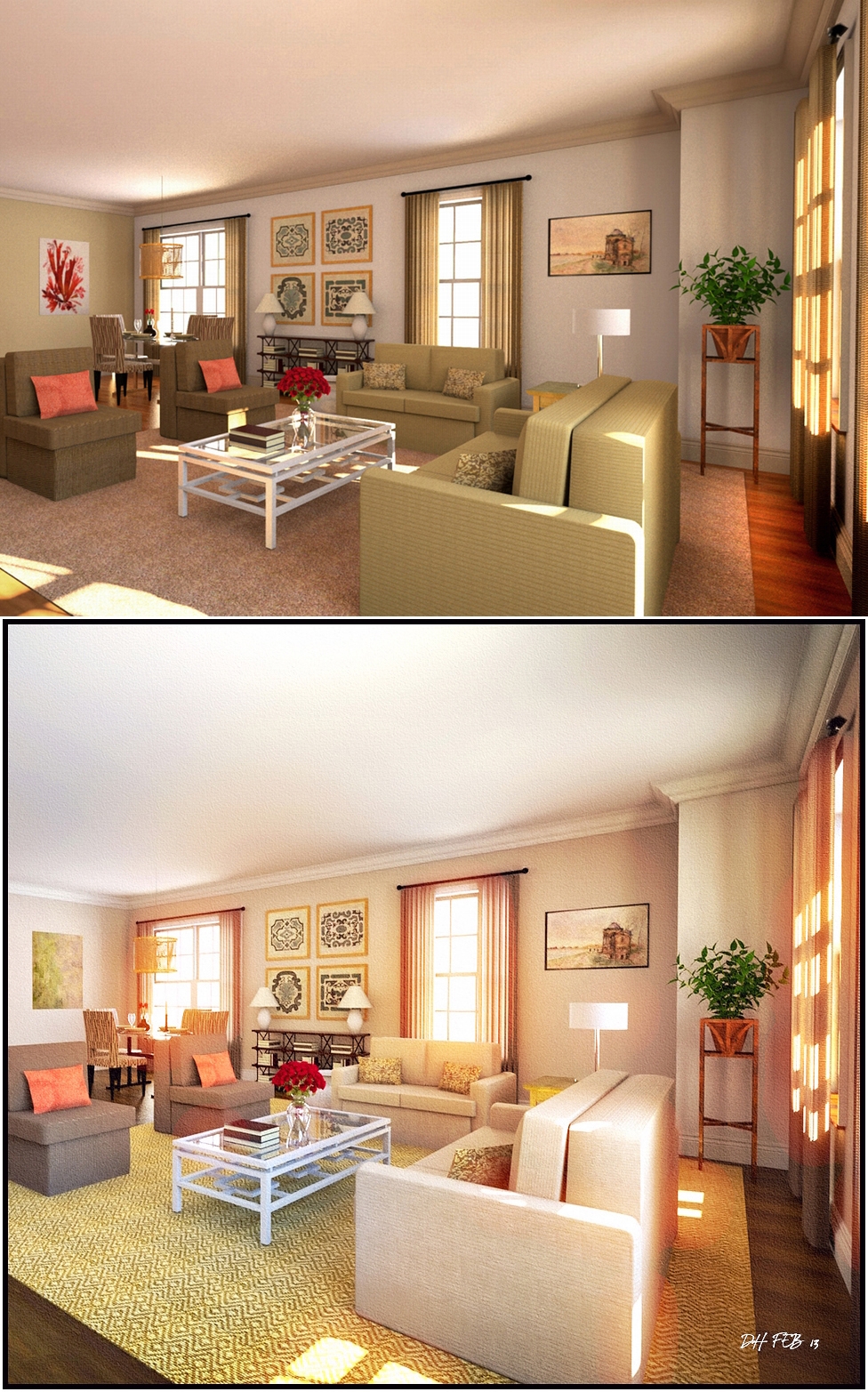
Heres a few more with the raw THEA render attached.
many more of my NPRs available here:
http://dhrenders.blogspot.ie/
-
Have you toned down the first one? Now that I see them with the originals the technique does breath more life into the images. Just thought the reception area(?) looked too pink one the first post.
Hello! It looks like you're interested in this conversation, but you don't have an account yet.
Getting fed up of having to scroll through the same posts each visit? When you register for an account, you'll always come back to exactly where you were before, and choose to be notified of new replies (either via email, or push notification). You'll also be able to save bookmarks and upvote posts to show your appreciation to other community members.
With your input, this post could be even better 💗
Register Login


Advertisement