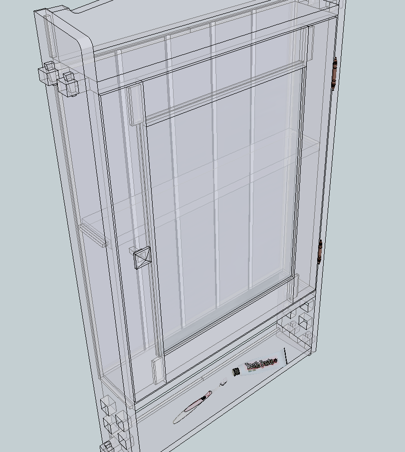
A Little Wall Cabinet From the Early 1900s
-
Nice. Maybe it is a trick of the light but your cabinet looks like it is a bit on the shallow side.
-
The inside depth is 3-1/2", which is 1/8" deeper than the Robern meds cab I have in the bathroom down the hall. I thought it was sufficient.

-
I'm sure it will be deep enough. What kind of wood will you make it out of?
-
It will be painted, except for the inside back, maybe the knob, and the pegs. Maple makes a good painted surface, and the local supply of "brown" maple (that not selected as clear all-sapwood) is plentiful and inexpensive.
The little pegs will be something dark, maybe walnut. Same for the knob. I've some nice old-growth heart pine pieces for making the grooved back, and it will be clearcoated.
-
Parts all mostly machined for a prototype. Done in eastern white pine. Through square holes are not easy. Very precise mark-out and scary sharp chisels required. May make router jig for doing it next time, then square corners with chisel and file.
Door rail tenons to be notched, top hanger rail needs to be shaped with bandsaw and cleaned up. Used full-size template print plug-in.
Am hoping it goes a little better in hardwood.
-
That's looking good, Gene. I wish I could get Eastern white pine that looks as nice.
For the hardwood version are you going to use white oak or something else?
Hello! It looks like you're interested in this conversation, but you don't have an account yet.
Getting fed up of having to scroll through the same posts each visit? When you register for an account, you'll always come back to exactly where you were before, and choose to be notified of new replies (either via email, or push notification). You'll also be able to save bookmarks and upvote posts to show your appreciation to other community members.
With your input, this post could be even better 💗
Register LoginAdvertisement


