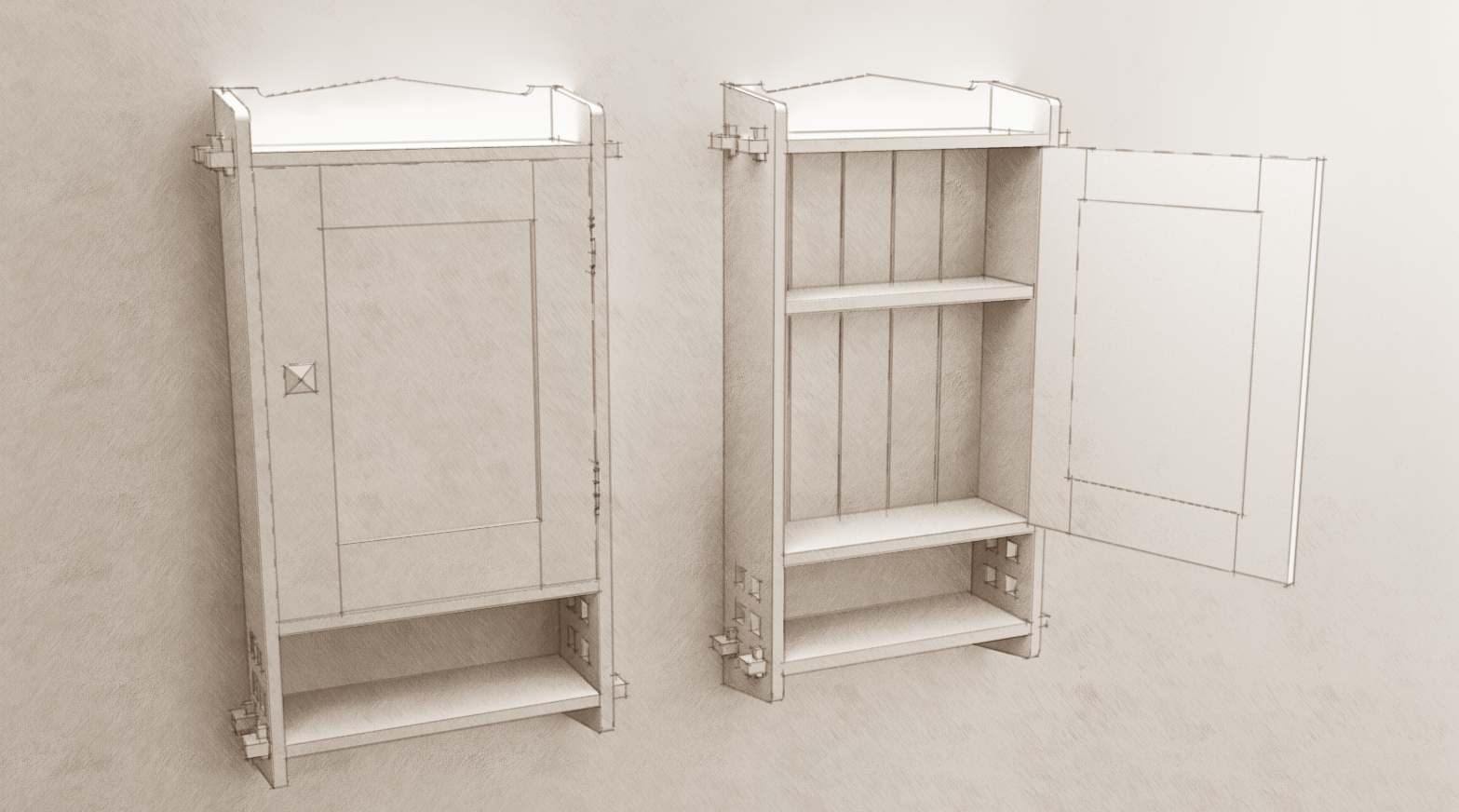
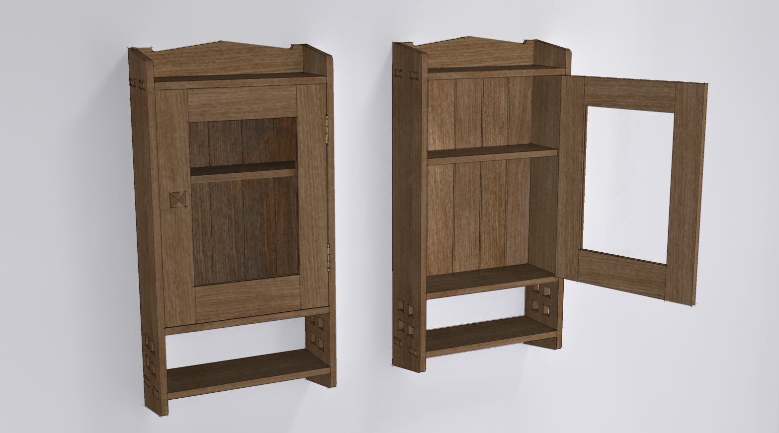
A Little Wall Cabinet From the Early 1900s
-

Another piece of Arts & Crafts period furniture.
-
Now that is nice. But the click to enlarge only brings up the same size image, can we have a bigger picture please, I need new glasses.
-
Nice
-
Thanks guys. Nick, try again.

-
Your mix of rendered image and NPR styles is getting better and better each time!
-
Pls put in 3D Warehouse and tell us keyword. Thks.
-
Thank you Carsten.
Sorry, Gene. I don't put my models on the 3D Warehouse and generally don't share the SKP files. Most models are done for paying clients and so I can't give them away. I do give away hours of my time teaching others how to use SketchUp. I just don't give away my models.
-
That's OK, Dave. I understand.
I'm sure I can get real close on my own. Might be nice to try a two-stage milk paint finish, with a little discreet rub-offs and nicks and dents.
There is a new bathroom in a summer-house in need of this.
-
Dave,
We seem to think alike. There's a very similar wall cabinet in "Mission Furniture: How to Build It," by H.H. Windsor. I adapted it last fall to use as a project for a SketchUp training class I was leading. (I'm not fond of wedged through-tenons.) It made a good project for people who have already dipped their toe in the SketchUp water. The book has plans for a number of interesting pieces, including a nice, small slant-front desk.
Best,
dh
-
Like it even more, thanks for the big picture. Question on the rear view of the door, the upright line on the inside edge of the stile is offset from the centre panel. Glitch or construction method? Genuine question, I am not a carpenter (although sometimes I try to be) but I do get involved in a lot of detail when designing cabinets for manufacture, so it caught my eye. And ditto on what Cotty said.

-
David, it is very similar indeed. I'm not so fond of the wedges either but I was trying to stay true to the original. Of course removing them and the holes would be much easier in SketchUp than in real wood.
Nick, the detail you noticed on the back of the door is a design thing and not a glitch. The panel in the door is supposed to be a mirror so there is a rabbet (rebate) cut in the rails and stiles instead of grooves as would be typical with a frame and panel door. The mirror would then be retained by glass stop--little strips of wood which I didn't put in. These strips could be removed if it ever became necessary to replace the mirror.
It would probably be neater to cut the shoulders on the rail tenons so the rebate on the stile could be cut all the way down its length and you'd wind up with a straight line. On the other hand, that means the tenon shoulder on the back has to be cut differently from the front which adds complexity and potential for error. Since it is on the inside of the door, maybe it's not worth the extra work. The rebate would be made after the door is assembled using a bearing guided cutter in a router. then the corners would be trimmed out square.
-
Thanks for the detailed reply, I get it now, but of course the mirror doesn't show in the render. I have actually used the router/corner chisel method myself (once, about 6 years ago) but didn't put two and two together. I hadn't allowed for modern tools being used on an old design.
-
I did play with creating a mirror in KT but didn't like the results and decided to move on.
I expect that while electic hand held routers weren't around, there were ways to make the rabbet like this. Probably would have just offset the shoulder on the rails and run the rabbet straight down.
-
I'm away from home and without my favorite woodworking tool, Sketchup.
But I'll be home soon, and will tackle this posthaste. I'm thinking of doing two different sizes, a mini and maxi, and will examine all the various choices in joinery, going for best practice, and foolproof machinery setups.
I've enough paint grade clear maple and heart birch for all the exposed parts, and for the v-joint inside back, there's some choice antique heart pine that will be clearcoated, and not painted like the rest.
Some chunks of qs white oak will be used for the knobs, with a stepped square shank, set through the door stile and wedged.
Some nice brass hinges with finials (from Whitechapel) should be a nice touch.
-
Fine example all around. So you would join the door with tenons?
Thanks for the component David! I want to check it out and might use it.
-
Peter, I would use tenons to join the door parts.
-
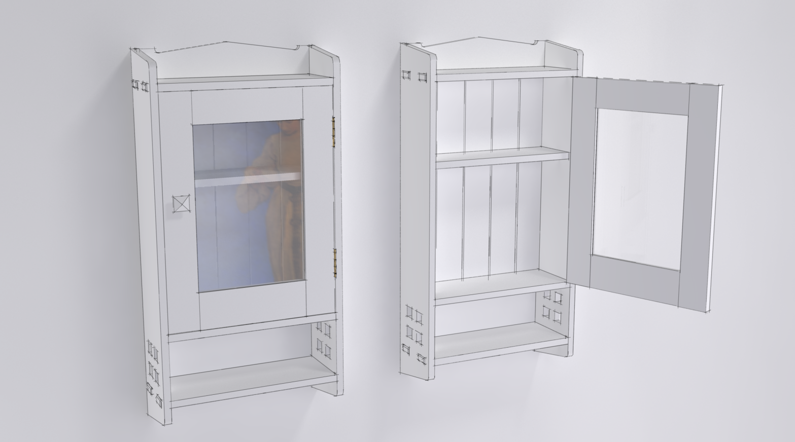
Well, I got rid of the wedges in the through tenons and shortened them up a bit. I also modified the door so the panel fits in a groove and I put a piece of glass in there.

Here it is without painted in white.

I need to figure out the how to make the glass nicer. I wanted a stronger reflection of its surface.
-
Dave,
Would it work to create a texture in Photoshop, setting the opacity to make it nearly transparent, then importing it into SketchUp? Or would the transparency disappear once it's imported?
Best,
dh -
David, you could do that if you save the texture image as a PNG. It won't have the same qualities as a reflection, even a rendered reflection but it could be done. It will tend to wash out materials behind and i think make those textures lighter instead of darker.
In the case of my textured image, I hid the panels in the textured image and overlaid the rendered image so the reflections would be there.
It might also be worth trying to make two separate image exports from SketchUp and laying one over the other. One image would be the textured image without the glass and the other would be similar to the white rendered image be without edges. So basically the reflection image applied to the class would be the only thing that shows.
-
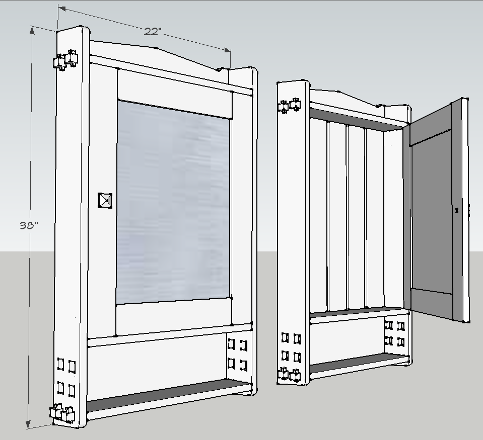
A quick first shot at sizing and design. Now for some subtle tweaking, then the joinery.
The through-holes look like they need to be a little larger. Other things need work.

Hello! It looks like you're interested in this conversation, but you don't have an account yet.
Getting fed up of having to scroll through the same posts each visit? When you register for an account, you'll always come back to exactly where you were before, and choose to be notified of new replies (either via email, or push notification). You'll also be able to save bookmarks and upvote posts to show your appreciation to other community members.
With your input, this post could be even better 💗
Register LoginAdvertisement


