SU Website UI Improvement
-
I posted about this before... and the re-design reinforces this on both a phone / tablet and workstation.
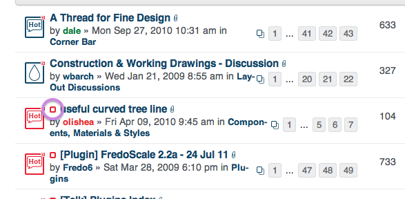
This icon is useless, takes up space, and does nothing when clicked:

This icon takes you to the newest post since you last visited. Incredibly useful. But it it very hard to hit on a phone / tablet. Its still sort of tiny on a workstation.

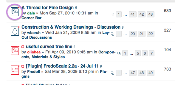
Why not make the larger item perform this function?
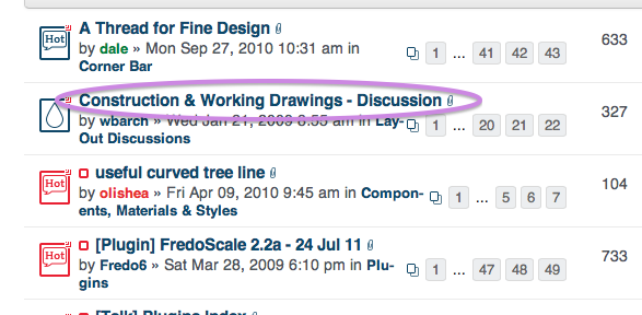
Or like many other forums, the text of the thread itself should take you to the newest post since you last visited. Once I subscribe, its pretty rare that I'd want to go to the first thread and re-read something. Usually I want to jump in where I left off.

-
Yes that is a good idea...
I am working on a "mod" in which it is already iterating the lists to check if there are unread posts, so I might as well add click functions for the large icon whilst within the iteration.
Gaieus will not have the test forums reset and turned back on until sometime after BaseCamp. And then we'll need a period of testing on the test domain before any "mod" could go live on the "real" SCF domain.
Hello! It looks like you're interested in this conversation, but you don't have an account yet.
Getting fed up of having to scroll through the same posts each visit? When you register for an account, you'll always come back to exactly where you were before, and choose to be notified of new replies (either via email, or push notification). You'll also be able to save bookmarks and upvote posts to show your appreciation to other community members.
With your input, this post could be even better 💗
Register LoginAdvertisement


