sketchucation logo sketchucation
    • Login
    Oops, your profile's looking a bit empty! To help us tailor your experience, please fill in key details like your SketchUp version, skill level, operating system, and more. Update and save your info on your profile page today!
    ⚠️ Update | Sketchucation Tools 5.0.8 released with licensing improvements and bugfixes Download

    Interior design

    Scheduled Pinned Locked Moved Gallery
    23 Posts 20 Posters 5.4k Views 20 Watching
    Loading More Posts
    • Oldest to Newest
    • Newest to Oldest
    • Most Votes
    Reply
    • Reply as topic
    Log in to reply
    This topic has been deleted. Only users with topic management privileges can see it.
    • cheddaC
      chedda
      last edited by

      Super images but i also agree about the heaviness of the ceiling. Most ceilings are white for a reason i think it is to represent height, the sky & reflect light. Paneled rooms also nearly always include the walls.

      Kraken Wrangler https://www.flickr.com/photos/132441293@N03/

      1 Reply Last reply
      Reply Quote 0
      • chrisglasierC
        chrisglasier
        last edited by

        @unknownuser said:

        ....
        Please if you have any suggestions about the design or questions let me know.

        I think if the ceiling panels were simply raised and fielded rather than bad fung shui pyramidal and the wood was bleached oak or something like that, it would be very sexy. Reminds of ceilings I have seen in Florence.

        You asked ...

        With TBA interfaces we can analyse what is to be achieved so that IT can help with automation to achieve it.

        1 Reply Last reply
        Reply Quote 0
        • D
          dirkkkk
          last edited by

          Let me try this with a white sealing.. I`ll get back to you... Thanks for the reactions so far. I apriciate it

          1 Reply Last reply
          Reply Quote 0
          • D
            dirkkkk
            last edited by

            The alternative.. What do you guys think is better..?
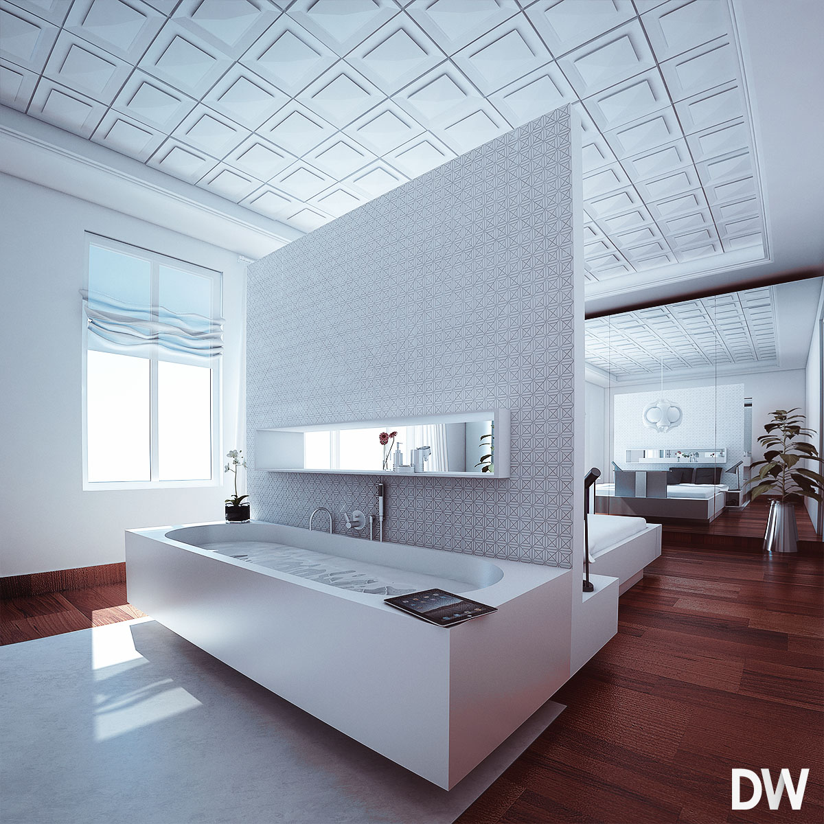

            C&C most welcome


            C&C most welcome

            1 Reply Last reply
            Reply Quote 0
            • J
              jpalm32
              last edited by

              Much better!

              1 Reply Last reply
              Reply Quote 0
              • Bryan KB
                Bryan K
                last edited by

                They are all very nice. Very, very nice!

                See my portfolio at https://delphiscousin.blogspot.com/

                1 Reply Last reply
                Reply Quote 0
                • CarlohC
                  Carloh
                  last edited by

                  very very nice images. but also in white i don't like the ceiling. it looks more like it belongs in a saloon in an old castle or something like that. I would rather go with a simple white plastered ceiling.

                  1 Reply Last reply
                  Reply Quote 0
                  • K
                    kilgo
                    last edited by

                    Nice!

                    Does the TV retract into the foot of the bed? If so, It kind of looks like there isn'y enough room for it to retract all the way?

                    1 Reply Last reply
                    Reply Quote 0
                    • mitcorbM
                      mitcorb
                      last edited by

                      Floor surface. Is that bump or displacement effect? Not too severe?
                      Nice feel in the space since the white ceiling.

                      I take the slow, deliberate approach in my aimless wandering.

                      1 Reply Last reply
                      Reply Quote 0
                      • john2J
                        john2
                        last edited by

                        wow!!! looks like a real photo!! 👍 😄 how much time did it take for render?

                        Sketchup Make 2017 (64-bit), Vray 4.0 , Windows 10 – 64 bit, corei7-8750H, 16GB RAM, Nvidia GeForce GTX 1050Ti 4GB

                        1 Reply Last reply
                        Reply Quote 0
                        • E
                          Ema
                          last edited by

                          Very nice. I like the sealing, it's like the accent of the composition and it's not too much because everything else is really clean and simple. The only thing I reccomend is to rethink your lamp choise in the bedroom. Maybe something that is either closer to the raster of the sealing or something simple.

                          1 Reply Last reply
                          Reply Quote 0
                          • beginnerB
                            beginner
                            last edited by

                            Dirkkkk
                            Looks good.
                            I would adjust the wooden floor - looks a little bit like a vinyl/carpet.
                            Too much bump?

                            Regards, SU 'beginner'

                            1 Reply Last reply
                            Reply Quote 0
                            • olisheaO
                              olishea
                              last edited by

                              great images.

                              I believe first set have more warmth and ambience than the second set. I would be more sold on the first set. The roof is cool, like an assault on minimalism!

                              Yes bump is way too much on the wooden floor but not the end of the world! Couple of sharp edges too that reduce the realism.

                              Only other crit is the crinkled blind looks a bit fake, the way they are rolled. Maybe it's just me. the curtains look great but the blinds disturb me.

                              oli

                              1 Reply Last reply
                              Reply Quote 0
                              • jo-keJ
                                jo-ke
                                last edited by

                                Very nice project.

                                I like it a lot.

                                personally I prefer the white cieling.

                                http://www.zz7.de

                                1 Reply Last reply
                                Reply Quote 0
                                • T
                                  the.pjt
                                  last edited by

                                  very nice interior pics .... awesome

                                  1 Reply Last reply
                                  Reply Quote 0
                                  • I
                                    imadamjad
                                    last edited by

                                    positive: wow, looks amazing,very detailed model, you've got to tell me how you got the lighting from the window so realistic

                                    negative: The texture for the bath looks unrealistic and flat.
                                    The flooring has too much bump mapping.

                                    1 Reply Last reply
                                    Reply Quote 0
                                    • ATLAStudioA
                                      ATLAStudio
                                      last edited by

                                      Looks good, I like the lighting and the curtain in the bedroom image.

                                      In modelling terms the ceiling looks unusual to me. It may just be a product or design style I've not seen before, but if you're going for a coffered ceiling the grid tends to project down and the squares are recessed:
                                      https://www.google.co.uk/search?q=coffered+ceiling&hl=en&prmd=imvns&tbm=isch&tbo=u&source=univ&sa=X&ei=kFtsUNnrKIjA0QWvyoDQCQ&ved=0CCcQsAQ&biw=1536&bih=860
                                      You might consider doing the downstands in plaster and the recessed areas in wood panel as some of the examples above show.


                                      http://www.atlas-studio.co.uk

                                      1 Reply Last reply
                                      Reply Quote 0

                                      Hello! It looks like you're interested in this conversation, but you don't have an account yet.

                                      Getting fed up of having to scroll through the same posts each visit? When you register for an account, you'll always come back to exactly where you were before, and choose to be notified of new replies (either via email, or push notification). You'll also be able to save bookmarks and upvote posts to show your appreciation to other community members.

                                      With your input, this post could be even better 💗

                                      Register Login
                                      • 1
                                      • 2
                                      • 2 / 2
                                      • First post
                                        Last post
                                      Buy SketchPlus
                                      Buy SUbD
                                      Buy WrapR
                                      Buy eBook
                                      Buy Modelur
                                      Buy Vertex Tools
                                      Buy SketchCuisine
                                      Buy FormFonts

                                      Advertisement